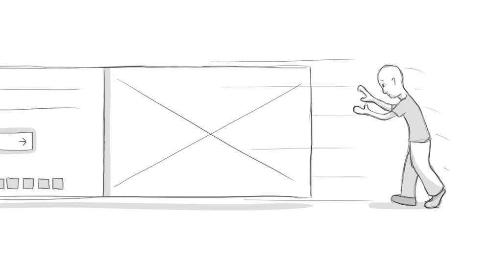
Illustration: Sunsetting Rotators
An official website of the State of Georgia.
The .gov means it’s official.
Local, state, and federal government websites often end in .gov. State of Georgia government websites and email systems use “georgia.gov” or “ga.gov” at the end of the address. Before sharing sensitive or personal information, make sure you’re on an official state website.
Still not sure?
Call 1-800-GEORGIA to verify that a website is an official website of the State of Georgia.
November 01, 2016
Most of us have them on our website — those wonderful rotators with photos and information that magically seem to morph into another image, making our sites look dynamic and professional.
Sorry to burst your bubble. It may seem magical and useful, but according to user research, they’re distracting and are hardly ever clicked on, they limit accessibility, and are downright annoying.
First of all, very few people click on them. According to a study at the University of Notre Dame, only 1% actually clicked on the rotator on a departmental website, and 89% of those clicks were on the very first image. That number climbed to 9.4% for a news site, but it was pretty consistent for departmental and executive sites. Our own statistics back this up as well; even though a large number of people click through the images, they rarely find anything that piques their interest, and they either click on something else, search, or go to another site.
Second, they’re distracting. We’ve put a pause on the rotators so that they will stop rotating if people want them to (giving control back to the user), but when you first load the page, they’ll rotate. People can’t focus on the main content on the page — content they may be looking for — because out of the corner of their eye, they’re seeing an image change, and it’s catching their attention. The result? They miss the main points of your site.
The great usability expert Jakob Nielsen chimed in on rotators and said readers with low levels of literacy have trouble reading the content before the image changes to something else, frustrating them. The same thing happens to people with disabilities, who may have motor skill issues that prevent them from clicking on something before it moves on to the next image. “It's just plain annoying for users to lose control of the user interface when things move around of their own accord,” Nielsen said.
Wider Funnel, a web optimization company, puts it quite frankly: “We have tested rotating offers many times and have found it to be a poor way of presenting home page content.”
It also adds up to a lot of wasted space.
We’ll be the first ones to admit guilt. Back in 2012, when we moved all the sites to Drupal, rotators were in vogue, and very little research had been done on them. We thought they were a nice way to highlight a program or issue on your site.
But if you have five rotating images, that means that important program is visible to the user only 20% of the time. 80% of the time, they’re seeing other things.
Why do we still like them? It’s politics, of course. Each division or office wants real estate on the home page; it’s a good way to stack content on top of each other, giving everybody what they want, without putting a lot of content on the home page.
But you are putting a lot of content on the home page. Each image that you add to the rotator has to be downloaded to a user’s laptop, tablet or phone. That not only wastes time and bandwidth; in the case of a mobile phone, it also costs dollars and cents.
If you want to highlight content on your site, put it on the left-hand side of the page, where people’s eyes automatically go to when they’re looking at a webpage. Make the text big. And yes, maybe include a small,non-rotating image that gives proper context to the content you’re writing about. (Don’t just put an image up there to have one.)
We’ve communicated to our agencies that we have deprecated the image rotator option, and have stopped new development and support on the existing rotators. If you want to explore replacing your rotator with a static image or something else, just let us know and we’ll be happy to help you come up with a solution.
There are ways around a rotator; you don’t have to have one. Isn’t it time to join the newcomers and do away with your own?