Learning About Responsive Design
More people are accessing the web with their phones and tablets. In fact, there are now more gadgets on Earth than people. That’s a lot of charging stations, and a lot of new devices accessing your site.
How can you provide a seamless experience for all the different devices? In this guide, you’ll learn:
Why we need to embrace mobile
How we create one user experience through responsive design
What you can do to make your site accessible through mobile devices
1 Embracing Mobile
Why do we need to embrace mobile?
If you haven’t heard, mobile is big. Really big. Consider these statistics:
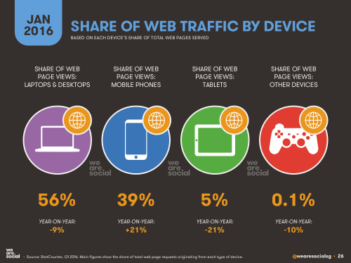
The percentage of mobile users on Digital Services Georgia websites has shot up from 11% of all traffic in 2012 to 30% in 2016.
Mobile devices accounted for 55% of Internet usage in the United States in January 2015. Moreover, 13% of Americans with an annual household income of less than $30,000 per year are smartphone-dependent. For a number of Americans, smartphones serve as an essential connection to the broader world of online information.
Mobile-only internet usage is also becoming more common, driven predominantly by Millennials, of which 21 percent are no longer using desktop computers to go online. Meanwhile, the 55-years-and-older consumer segment is actually the fastest growing faction of mobile users, increasing its combined multi-platform and mobile-only share of audience from 60 percent to 74 percent in the past year.
Global mobile data traffic will increase nearly eightfold between 2015 and 2020. Mobile data traffic will grow at a compound annual growth rate (CAGR) of 53 percent from 2015 to 2020, reaching 30.6 exabytes per month by 2020. The mobile access trend is moving upward while the PC access trend is moving downward.
Analysts predicted that by 2014, the number of mobile Internet users will surpass the number of desktop users. Indeed, the number of mobile-only Internet users has now exceeded desktop-only in the U.S.
Internet access has become a habit of convenience. People now access the Internet using the device that is closest to them. And most of the time, it’s their phone.
The challenge: How do we make our websites look seamless when accessed by different devices?
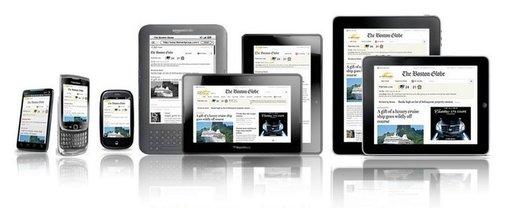
You’ve probably noticed it yourself: Websites look different on different devices. Sometimes, on your phone, you’ll have to scroll sideways or zoom in to read something. A site doesn’t work right in Firefox. Or sometimes, the site will look totally different on a mobile device, and you can’t access all the content.
Each device on the market operates slightly differently - they all feature various browsers, operating systems, screen widths and heights. What may look good on one device may not translate well to another device. Your site may look great on a desktop, but lousy on an iPhone. Designing for each scenario is impossible - especially when you consider that during the first nine months of 2012, GeorgiaGov was accessed by 2,810 different mobile devices.
In the past, common practice called for a separate mobile site to be created that would meet the needs of mobile users. But that’s become a lot harder to do, and many times, developers would just leave off content that they thought mobile users didn’t need. We needed, as ZURB’s Jonathan Smiley said, “one code to rule them all.”
That’s where Responsive Web Design comes in.
2 Responsive Web Design
What is Responsive Web Design?
Responsive Web Design is a collection of techniques that changes the layout of a website automatically to fit the screen width of the device that is accessing it. By using a set of queries, the site determines the width of the browser asking for the page, and based on that, the browser delivers a version of the web site optimized for that browser. This mechanism will also rearrange and order the content blocks, images and navigation, depending on the screen width and browser.
With Responsive Web Design, your users will all access the same website, and the layout will change according to the device you are accessing. There isn’t a second “mobile” site.
Try accessing the following sites from your smartphone and your desktop and see the differences in navigation, layout, text sizes, etc.

Georgia.gov is using Responsive Web Design.
bostonglobe.com - Image courtesy of upstatement.com.
Advantages of Responsive Web Design
-
Users don’t need to do anything, and neither do you. Everything is automatic.
-
Only one site to maintain. Using Responsive Web Design means you keep track of only one site. It’s also easier to change or edit content in one place, minimizing risks for content discrepancies.
-
Saving Time and Money in Development. Developing one website instead of two is cheaper and less time consuming.
-
Device and browser agnostic. Responsive Web Design techniques work with multiple platforms with most browsers - iOS, Android, Internet Explorer 7 and above, Firefox, Chrome, Safari, Opera, etc. No more “best viewed with...” Users can access the web site from their device of choice.
3 Maximizing your Experience
What can I do to maximize the Responsive Web Design experience?
Your site is already responsive! But, there are a few things you can do to help your site accommodate mobile users:
Think about dividing your content up into “chunks,” using subheads, bullet lists and images to break up long amounts of text.
Try to adopt a “mobile first” mindset around your content - write for the mobile user first, keeping the content brief and clear. This style can also be adapted for the desktop experience, making your content even cleaner and simpler.
Focus on speed. The faster your site loads, the better you will hold visitors' attention. This is especially important for mobile access.
Content first: Make every word count. Get rid of clutter and unnecessary content, especially on the homepage.
Write your content in inverted pyramid style, with the most important information at the beginning and trickling down to the least important information.
Don’t bury content deep within your navigation. Get users to your content within the fewest number of clicks as possible.
Get rid of large images and compress them whenever you can. Doing this will reduce the size of the entire page and reduce the amount of time it takes for a phone to download a page over a data connection. Try TinyPNG, a free online tool that optimizes and reduces your image sizes.
Only use tables for tabular data (numbers and charts), not layout.
Limit your use of PDFs, labeling those that you need and eliminating long lists of documents. If it’s less than two pages, consider using a Site Page instead.
Last thing, keep your content clean and concise. Do not muck it up with unnecessary content. Think responsively!
Sources:
Number of Mobile-Only Internet Users Now Exceeds Desktop-Only in the U.S.
Cisco Visual Networking Index: Global Mobile Data Traffic Forecast Update, 2015–2020 White Paper
Mobile Internet Usage Skyrockets in Past 4 Years to Overtake Desktop as Most Used Digital Platform
Number of Mobile-Only Internet Users Now Exceeds Desktop-Only in the U.S.