How To Read Your Google Analytics
This web guide provides a simple tutorial on how to read your website’s Google Analytics and how to translate the numbers.
You'll learn about:
- Why Google Analytics is important
- The important of content and mobile analytics important
- Content inventories and audits
- Using analytics data to create a better user experience
- Simplifying with dashboards
- Staying on top of trends
Also check out our blog post: What Analytics Should You Care About?
1 Google Analytics
So you’ve gone through the Getting Started on Your Website web guide, and you’re feeling pretty great about what you’ve put together—content, images, a logo, and even a few press releases. Congratulations! Your job has just begun.
As beautiful as your website might be, it’s not a museum artifact. It’s a service for the public, and just as the needs of the public is constantly changing, so should your website. If your website doesn’t keep your users happy, they’ll stop visiting, and what is the point of a website without visitors? If you want to ensure your website is successful, you need to keep it well-managed, relevant, and updated. Luckily, there’s got a free, comprehensive tool to you to do just that—Google Analytics!
Google Analytics comes standard with all GovHub websites and is part of our services to our agencies. Google Analytics data can tell you a lot about who’s coming to your site, what they’re looking at, and whether or not they’re finding what they need. You can use this information to help drive your decisions on everything from content to web design. And as you probably know, getting approval on changing anything in government is much easier when you have the numbers to back it up.
Get started by logging into your Google Analytics account. If you don’t have an account yet, open a support ticket with your Gmail login credentials and the web address for your agency website.
2 Content Analytics
The first time logging into Google Analytics can be overwhelming, but don’t be disheartened. We’ll break down the basics and demystify these the seemingly random tables, graphs, and charts.
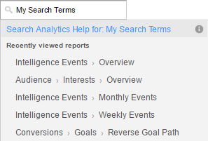
A note on the Search Box
Google Analytics has frequent updates, so the menu structure and organization of the reports change often. For this reason, we’ll rely on the search function to find reports and other features whenever possible.
Clicking your mouse into the search box window loads a dropdown menu with a list of the most recently viewed reports. Type the name of a report, dashboard, or shortcut, and a dropdown menu loads with the search results.
If you don’t see the report you’re looking for in the results, click on the blue text above the search results to search Analytics Help for more information.
The Audience Overview Report
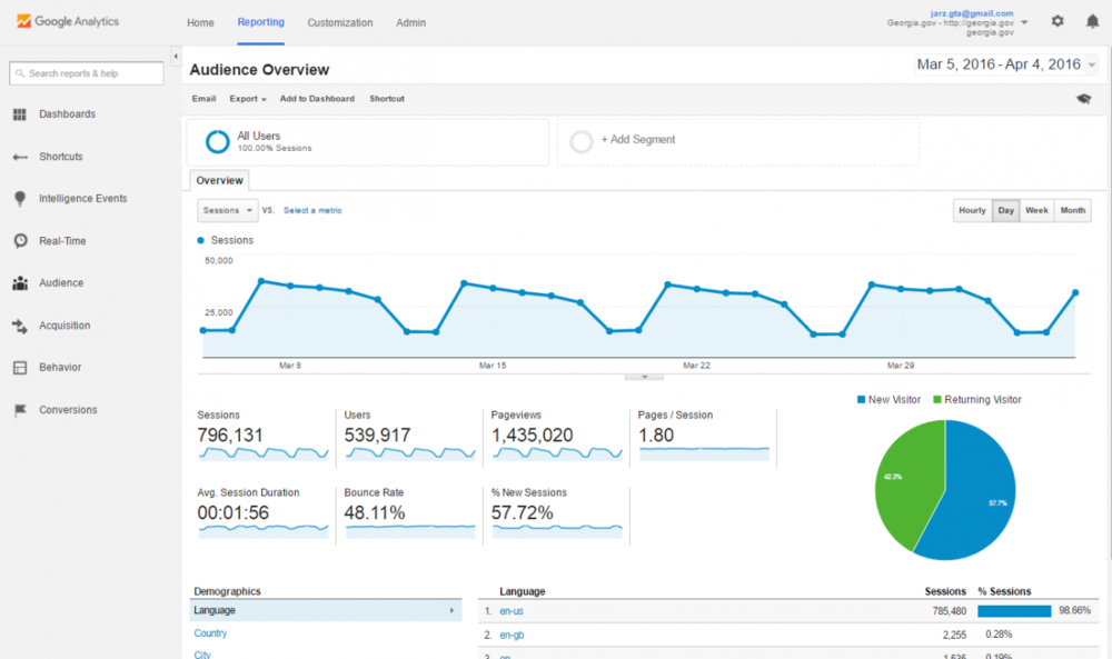
The Audience Overview is the default screen you’ll see when you access your site’s analytics reports. This report gives you a glimpse at who your visitors are. It includes graphs, percentages, and pie charts on pageviews, unique visitors, average time on page, entrance, bounce rates, and exit rates on your website as a whole. You can adjust the date range for the totals with the date selector in the top-right corner of the page. You can also break the time interval of the graph to be in hours, days, weeks, or months.
Here are some key definitions you’ll need:
- Pageviews - A view, or load request, of a specific page. It’s the total number of times visitors downloaded a page during a specific date range. This includes the same person looking at your page 15 times in one session, or 15 different people looking at your page one time.
- Unique Pageviews - These are pageviews made by unique, or individual, visitors in your specific date range. This number represents those 15 different people looking at your page in one session (15 unique pageviews), rather than the one person refreshing or reloading their screen (one unique pageview).
- Average Time on Page - The average time visitors are staying on that page. This may not be something you need to be overly concerned about, but it is a good indicator if people are sticking around (let’s say on a blog or press release page, you’d like this number to be higher than normal) or if people are finding what they need quickly (on an FAQ or Forms page where visitors are finding what they need and leaving, you’d like this number to be low).
- Entrance - The number of visitors entering your website through that specific page. Your homepage should have the highest number of entrances, unless there is an internal page that ranks high in Google search results.
- Bounce Rate - This percentage shows the rate of single-page visits to your website. If someone visits a page of your website, and then exits that same page (leaving your website completely), that counts towards your bounce rate.
- Exit Rate - Not to be confused with the Bounce Rate, this rate is the percentage of site exits from your website, regardless of how many pages a user has viewed. It’s calculated by dividing exits into total pageviews, and therefore is never 100%.
- Unique Visitors - This is the number of users visiting your website. The initial session by a user during your specific date range is counted as a visit and a visitor. Much like the unique pageviews, this only counts visits by users once, and not every time they visit the website during your specific date range.
- Visits - The number of individual sessions started by all visitors to your website, no matter how many sessions they start. If a user is inactive on your site for 30 minutes or more, any future activity is attributed to a new session. Users that leave your site and return within 30 minutes are counted as part of the original session.
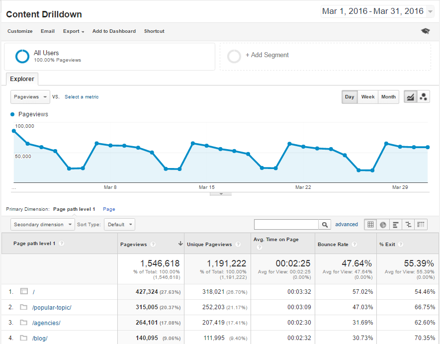
The Content Drilldown Report
To see how individual pages on your website are performing, type “Content Drilldown” in the search box to load the Content Drilldown report. The report shows the highest level pages of your website. If your folder has a “/” at the end of its name, that means there are children pages within it. Click the folder to access the lower level pages.
Site Search Report
You can also use Google Analytics to see what people search for when they get on your website. Type “Search Terms” into the search box and select the Search Term report for Site Search. There you’ll find a list of the most commonly searched terms when people use the search box on your website. This information can be really useful, especially when you’re considering restructuring or reorganizing some of your content.
Putting it all together with content inventories and audits
We’ve covered enough to get you started on a content inventory. Download this template and list all the pages and media content of your website and their associated Google Analytics values. To perform a content audit, analyze the strengths and weaknesses of all of your inventoried items, and use that assessment to see what needs adding, what needs tweaking, and what needs removing.
As your team runs through the inventory, you should ask yourselves questions like:
- Is some of the content irrelevant? If you’ve got pages and media that barely get any traffic, ask yourself if they are necessary to the website. If you can delete it, you should, because extraneous content wastes storage space, clutters your directories, can confuse your team, and is a liability with search engines. Outdated forms, pages for defunct programs, and any redundant files are all examples of content you should delete.
- Is there an important file or form that needs to be moved so it can be easier to find? If you’re seeing low traffic on important pieces of content, you may need to move it elsewhere in your navigation to get it the attention it deserves.
- Are users frequently searching for a certain document or page? If you’re seeing a lot of people using search to find content, you’ve got a problem. If the content isn’t available on your website, you should add it. If the content already exists, you should reconsider relocating where the content is in the menu structure or highlight it on your homepage for quick access.
- Is my content or navigation making it too difficult for users to find what they’re looking for? Look at the Pages report for Site Search to find out what pages your visitors are on when they give up on your navigation menu and just use the search box. You may want to consider restructuring and reorganizing the content.
3 Mobile Analytics
From 2013 to 2015, the percentage of mobile traffic on government websites jumped from 20% to 34%—that’s a 70% increase in just three years! And mobile’s share on the web is only getting bigger. By 2018, the majority of internet access will be on a mobile device. Mobile devices are quickly becoming the new personal computer, so it’s important that government websites accommodate them.
To see your device statistics, search for “Mobile Overview” and select the Overview report.
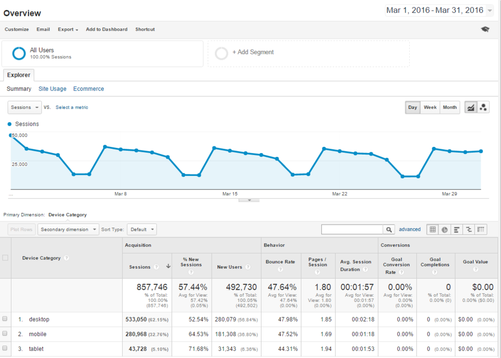
There are likely more people accessing your site on mobile and tablet devices than you anticipated. You should make mobile a priority when creating content for your site to ensure your content is accessible for everyone.
Read the Learning About Responsive Design web guide to see what we’re doing to improve GovHub’s appearance on mobile and tablet devices and how you can get started.
4 Creating a Dashboard
The more you poke around Google Analytics, the more tips and tools you’ll find. It’s easy to get bogged down by the idea of trying to juggle so many different reports and findings. Luckily, the folks at Google came up with a way to make monitoring a lot of diverse information easier for you!
Google Analytics dashboards are collections of widgets that allow you to quickly visualize your data. Dashboards let you monitor many metrics at once, so you can quickly check the health of your accounts or see correlations between different reports. Dashboards are easy to create, customize and share.
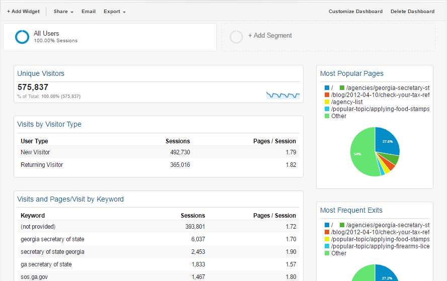
To create a new dashboard, click the +New Dashboard button within the Dashboards menu. You can add any widget of information Google provides to one screen, up to twelve widgets per dashboard. You can have up to 20 dashboards on your account, so you can target different dashboards for different tasks.
Don't leave your data to rot
We recommend checking your analytics data monthly. That’s a large enough sample for you to see meaningful patterns but specific enough to monitor the effects of any changes you put in place. If you aren’t able to commit to a monthly review, you should at least take a look every quarter if you want reliable insight. If you are planning any significant changes to your website such as moving, adding, or removing content, you should make a point to schedule follow-up analytics reviews to see how those changes affected your users.
With the rapid changes in technology and the constantly evolving needs of the public, web analytics provides a streamlined, highly effective tool to help governments develop websites and web services more easily, quickly, and inexpensively than ever before. Don’t let the newness of the technology deter you—the time and effort you put in has many returns!