Jan. 2016 - Slide
An official website of the State of Georgia.
The .gov means it’s official.
Local, state, and federal government websites often end in .gov. State of Georgia government websites and email systems use “georgia.gov” or “ga.gov” at the end of the address. Before sharing sensitive or personal information, make sure you’re on an official state website.
Still not sure?
Call 1-800-GEORGIA to verify that a website is an official website of the State of Georgia.
If you haven’t heard, mobile is big. Really big. Consider these statistics:
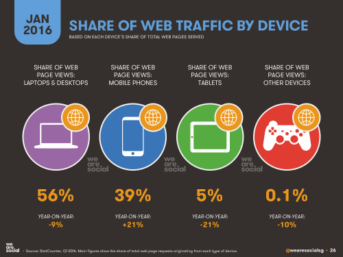
The percentage of mobile users on Digital Services Georgia websites has shot up from 11% of all traffic in 2012 to 30% in 2016.
Mobile devices accounted for 55% of Internet usage in the United States in January 2015. Moreover, 13% of Americans with an annual household income of less than $30,000 per year are smartphone-dependent. For a number of Americans, smartphones serve as an essential connection to the broader world of online information.
Mobile-only internet usage is also becoming more common, driven predominantly by Millennials, of which 21 percent are no longer using desktop computers to go online. Meanwhile, the 55-years-and-older consumer segment is actually the fastest growing faction of mobile users, increasing its combined multi-platform and mobile-only share of audience from 60 percent to 74 percent in the past year.
Global mobile data traffic will increase nearly eightfold between 2015 and 2020. Mobile data traffic will grow at a compound annual growth rate (CAGR) of 53 percent from 2015 to 2020, reaching 30.6 exabytes per month by 2020. The mobile access trend is moving upward while the PC access trend is moving downward.
Analysts predicted that by 2014, the number of mobile Internet users will surpass the number of desktop users. Indeed, the number of mobile-only Internet users has now exceeded desktop-only in the U.S.
Internet access has become a habit of convenience. People now access the Internet using the device that is closest to them. And most of the time, it’s their phone.
The challenge: How do we make our websites look seamless when accessed by different devices?
You’ve probably noticed it yourself: Websites look different on different devices. Sometimes, on your phone, you’ll have to scroll sideways or zoom in to read something. A site doesn’t work right in Firefox. Or sometimes, the site will look totally different on a mobile device, and you can’t access all the content.
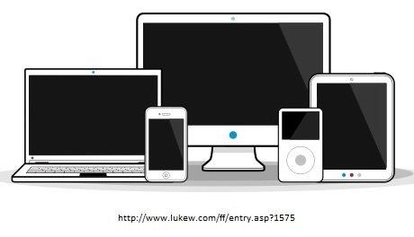
Each device on the market operates slightly differently - they all feature various browsers, operating systems, screen widths and heights. What may look good on one device may not translate well to another device. Your site may look great on a desktop, but lousy on an iPhone. Designing for each scenario is impossible - especially when you consider that during the first nine months of 2012, GeorgiaGov was accessed by 2,810 different mobile devices.
In the past, common practice called for a separate mobile site to be created that would meet the needs of mobile users. But that’s become a lot harder to do, and many times, developers would just leave off content that they thought mobile users didn’t need. We needed, as ZURB’s Jonathan Smiley said, “one code to rule them all.”
That’s where Responsive Web Design comes in.