September 04, 2013
Like Our New Look?
gagovrefresh.gif

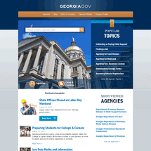
The analytics showed that we were on the right track, but in some cases we didn't go far enough with our design decisions.
- Search
We knew that search was big — just look at Google's success. But we still wanted to hang on to the old browse-as-you-go menu style. Our data showed that few people used this, and those who did tended to bounce around the menu items looking for the right place.
So we replaced the old subject-oriented navigation with links to our more popular areas of the site — Agencies, Cities and Counties, Popular Topics, and Elected Officials. Now it's much clearer what each link is taking you. - Popular Topics
Popular topics are just that and more. We should call them Really Popular Topics. One out of every three clicks on the home page was to one of the five popular topics listed. So we expanded the number to 7 and made it more visible on the home page. - Blog Posts
Our blog posts used to rotate every few seconds; what our data found was that people read the first post but didn't stay on the home page long enough to see the other ones; as a result, readership of posts fell dramatically once a new post was published. So we listed the 3 latest posts so that users can scan what's happening.
Two takeaways from our redesign:
- Don't ever stop tweaking. Don't rest on your laurels and let the site stay stagnant. There is always room for improvement.
- Base all your decisions on analytics. You have a reason for doing everything, you can measure improvement and also make the case for change more easily.
