
Re-imagining Georgia.gov
Putting the power of information in the hands of Georgians

Challenge
The mission of Digital Services Georgia (DSGa) is to make people’s interaction with Georgia state government frictionless, empowering, and symbiotic. In the summer of 2011, we began bringing that mission to life for Georgia.gov, the main website for the State of Georgia.
Each year, about 5 million people visit Georgia.gov, accounting for about 8 million sessions. Our goal in 2011: transform the out-of-date site into an intuitive, user-friendly digital destination that gives Georgian’s quick, easy access to the information they need.
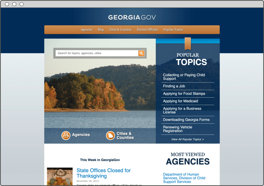
Guided by continuous user feedback, research, and analytics, we rehauled the site from top to bottom and, in 2012, launched it. Then we immediately moved onto the critical task of monitoring, measuring, and assessing its performance. What we discovered was a mix of good news and bad news.
Analytics, research, and user input revealed that — yes — users liked the new design of Georgia.gov. However, when it came to giving Georgian’s quick and easy access to the information they needed, the website was underperforming. Nearly 60% of users surveyed said they didn’t find what they were looking for. Visitors to the site were also relying too heavily on search to locate information — and with inconsistent results. To complicate matters, we realized we were assuming users were coming to the site with some preexisting knowledge, which data revealed was rarely the case.
We needed to rethink our approach.
Solution
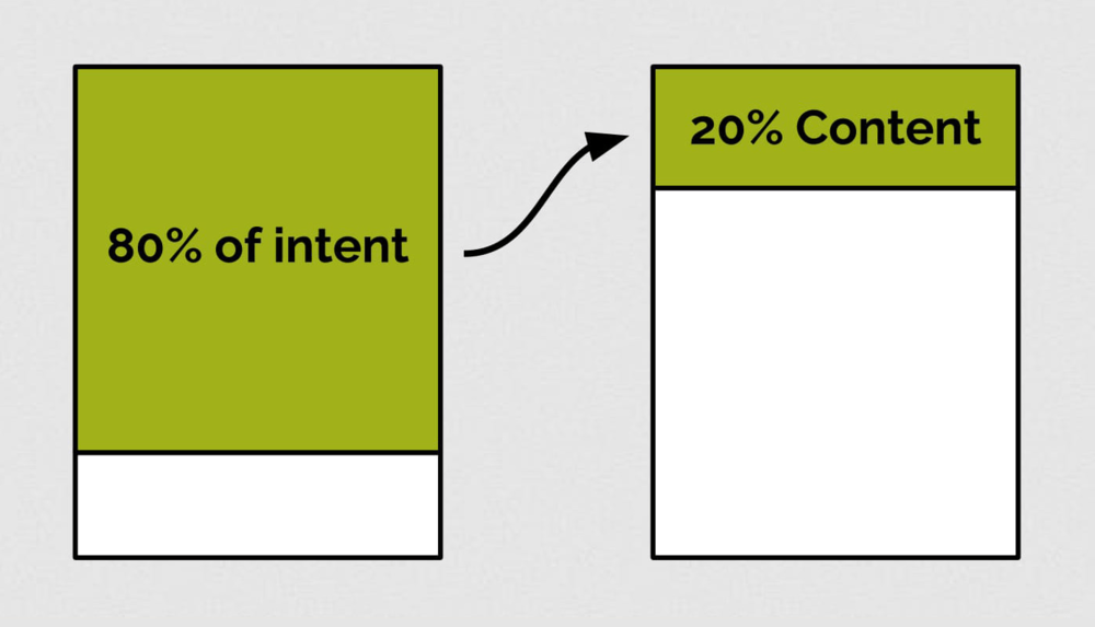
Unlike most digital destinations, users don’t often come to a government site like Georgia.gov to “hang around.” In fact, analytics revealed that approximately 1 of every 5 users came to Georgia.gov in a moment of crisis — looking for emergency assistance, getting a restraining order, applying for unemployment, etc. So, how could we get our fellow Georgians to the information they needed as quickly as possible? By ensuring that 20% of our content is meeting 80% of our users’ intent (aka the 80/20 rule).
We already knew that 80% or more of our users were coming to Georgia.gov to take a specific action. Yet these specific actions — apply for food stamps, get legal help, start a business, become a driver, get married, etc. — are in reality complex processes involving multiple steps, agencies, and organizations.
This is where Georgia.gov could shine.
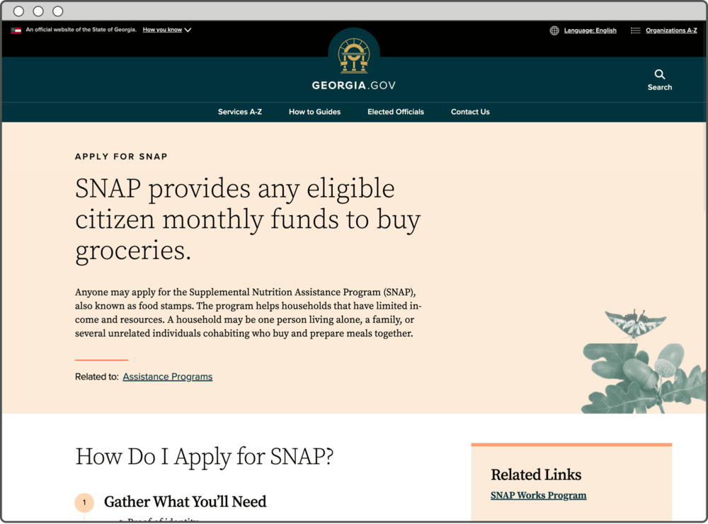
As a hub for all of Georgia’s agencies, we could be the “one true source” of information, connecting every step, agency, document, and application involved in getting a constituent from the point of intention to a final transaction. To achieve this, we’d need to re-architect our homepage and create content that clearly guides users through a step-by-step process organized around their top needs.
To help us bring this vision to life, we partnered with accomplished industry leader Lullabot. Working hand in hand with them, we explored and developed new types of content and micro-content, each with clear rules and parameters to ensure a consistent user experience.
We created guides for top-accessed services, like assistance programs, business services, voting, and taxes. And for each of these guides, we provided step-by-step instructions to help users do things like apply for food stamps, reserve a business name, track a tax refund, register to vote, and more. Most importantly, we assumed our users had no pre-existing knowledge. We focused on meeting them where they are, clearly explaining concepts and processes and guiding them through their entire user journey.
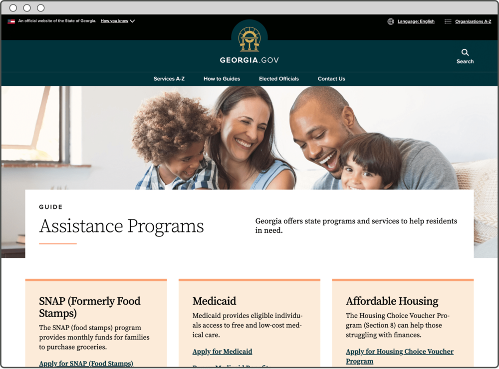
We also designed our information architecture (IA) to be flexible and scalable, so we could easily expand and add content whenever and wherever needed. Finally, we scrubbed and contextualized our content to make it findable and understandable for our users. More than 70% of Georgia.gov’s traffic comes from Google and other search engines. So, to optimize search, we eliminated governmental jargon and irrelevant, out-of-date information, and replaced it with our constituents’ vocabulary. For example, even if “SNAP benefits” is the official name of a program, most people search using the term “food stamps.” We made it a point to understand our users’ intent and tailored our content accordingly.
Results
Georgia.gov’s content, main navigation, and general structure now focus on ensuring our users can find whatever they need easily and quickly.
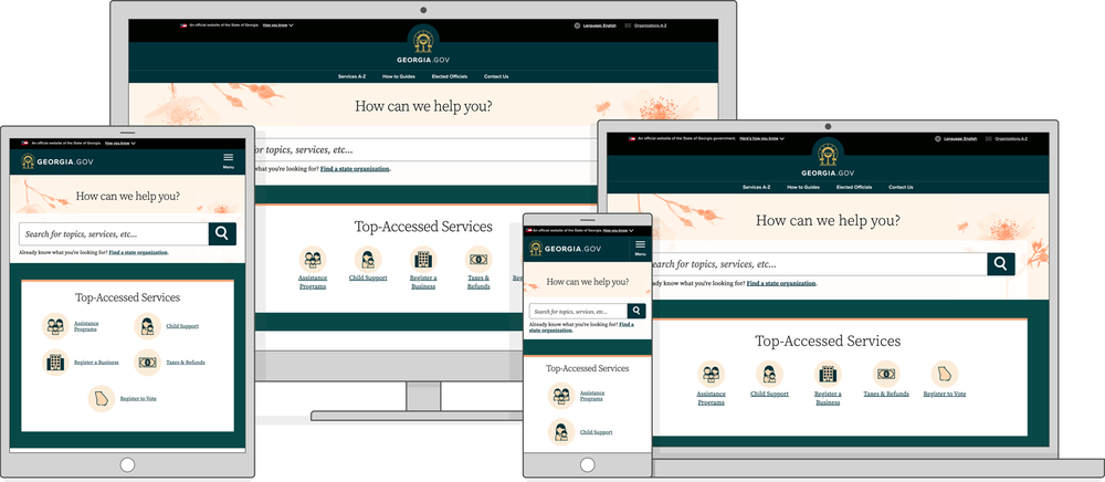
We’re seeing heavy engagement with the step-by-step guides we created based on top user scenarios, like applying for food stamps (SNAP), starting a business, and registering to vote. Traffic to these pages is increasing as well, and users are navigating through them without needing to rely on internal site search. Additionally, data shows that our efforts to drive search engine optimization (SEO) are working: When people conduct searches on Google, Bing, and Yahoo using terms like “food stamps,” “absentee ballot,” and “LLC,” they're being sent to the Georgia.gov homepage — or, even better, directly to the appropriate page within Georgia.gov. Also, when users leave Georgia.gov, more often than not, they’re going to an agency site or tool we’ve directed them to (e.g., Georgia Gateway, Georgia DRIVES, and the Georgia Department of Labor).

The new information architecture (IA), flexibility, and robustness also proved invaluable when the COVID-19 (coronavirus) health crisis hit Georgia. The reengineered site enabled us to pivot quickly and, within 24 hours, we were providing critical information to Georgians about how state agencies were responding to the global pandemic.
By re-imagining Georgia.gov from the perspective of our users, we’ve put the power of information in their hands. As Georgia.gov continues to evolve, we’ll be developing and adding more of this user-centric content, all designed to guide Georgians through these processes with as much ease as possible.