Need a UX Upgrade?
Uncovering the Need for an Improved User Experience
Challenge
The Georgia Department of Revenue (DOR) has a large and complex website that users must navigate to find policy information or take care of important business. The agency wanted to better understand their users’ behaviors and to take steps toward improving their users’ experience.
The website is packed with critical information from each of its divisions, including taxes, motor vehicles, alcohol and tobacco, and local government services. But accessing all this essential info — packaged across various forms, policies and updates — can present immediate complexity for users. DOR sought to make sure its users could easily find what they were looking for. They had an inkling that the way the Rules & Policies section was designed could be causing confusion, but they weren’t sure why or how to solve the issue.
When people experience success on state-run websites, it helps build trust between government and its constituents.
That’s why DOR reached out to us. As experts in digital accessibility and usability, we know that state agency websites have the important job of connecting constituents with information and resources they need. When these sites are easy to use, residents can quickly accomplish their goals, such as paying bills or completing applications online. It's our mission to help state agencies provide access to quality digital services that work — because when people experience success on state-run websites, it helps build trust between government and its constituents.
DOR asked us to conduct a usability study that would help them better understand their users’ needs and to suggest improvements based on our findings. Our project team included UX Analyst Julie Fay, UI Designer Rachel Hart, and Content Strategist Mary Liebowitz.
Solution
After recognizing the complexity of DOR’s operations, we sought to ensure a seamless experience for users. To achieve this goal, we conducted two rounds of usability testing with three distinct user groups and further analyzed website structure and navigation to propose an updated information architecture.
Additionally, we designed new layouts along with page templates that would enable smoother transitions between granular levels of content — all while encouraging cross-division collaboration via workshops focused on establishing best practices for successful user experiences.
This case study explains what we did, how we did it, and what we learned in the process.
Step One: Identifying the User
“The first step we undertake in any UX research situation is to find out who is using the website so we can put ourselves in their shoes,” said Julie.
With the breadth of information on the DOR website, content had to be clear for each of its diverse audiences.
For example, taxpayers may be searching for tax refund dates. Other users may be looking for car registration information, while business owners may want to know if they require special license plates when transporting cars across state lines. Meanwhile, internal employees are trying to stay abreast of policy changes and specialized cases.
After we had loosely defined who uses DOR’s website, we had to determine if DOR’s content met their needs.
Step Two: Identifying What’s Broken
“Before we could fix anything, we first had to identify what was broken,” Julie said. To do this we used what’s called a heuristic evaluation which allowed us to identify what needed corrective action. A heuristic evaluation is a way to test how easy it is to use a product or, in this case, a website. We look at the design and user experience to see if there are any problems.
For the DOR site, we evaluated the most visited pages and the Rules & Policies section against best-practices criteria so we could pinpoint any concerning trends across the site. Additionally, our team delved into more than two years' worth of analytics spanning January 2020 through June 2022 to gain even deeper insights into user behavior.
Step Three: Sorting Cards
During our analysis of the Motor Vehicles content, we realized that relying on search terms didn't give us much user intel. To fix this problem and create more user-friendly categories for browsing, we invited a group of testers to participate in an open card sort.
UX analytics are a bit of a psychological artform that requires interpretation and compromise.
Card sorting is a research method that helps us understand how users perceive and interact with information. It involves presenting a set of cards containing terms, topics, or ideas to the tester and asking them to group them into meaningful categories.
We wrote popular DOR tasks on digital cards. We then asked testers to classify those cards by dragging and dropping them into different categories. Through this exercise, our testers had the ability to name their own categories as well as structure them according to what made sense from their perspective – not ours and not the agency’s. At the end of the card sort, we use a dendrogram chart to gain insights into how users think.
Card Sort Diagram DOR Case Study
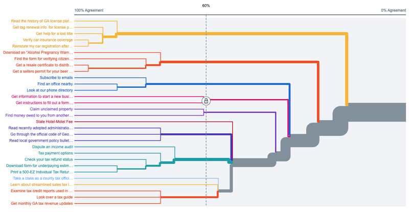
A dendrogram is a type of diagram that shows how different elements are related to each other. It usually looks like a tree, with the different branches representing different levels in the hierarchy. The length of each branch shows how similar two items are, with longer branches representing more similar items. Dendrograms are often used by data analysts to visualize and analyze data sets, especially ones with a lot of information.
Step Four: Testing Trees
Next, we conducted a tree test to explore the navigation structure of the website. A tree test involves presenting the user with a hierarchical structure, such as a directory menu, and asking them to find items on it. This helps us identify potential issues with the navigation structure, discover missed features, and ensure that users can find what they're looking for quickly and easily.
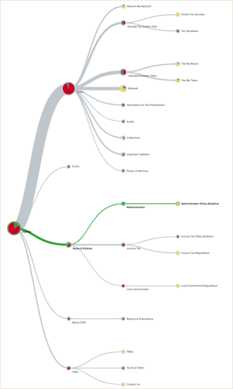
Tree diagram DOR Case Study
Caption
Figure 1 In this case, the idea was to find out if users could locate specific information efficiently by testing whether they could reach their goal within the framework of the site's existing structure. For example, if someone is looking for tax refund information, we check whether they'd find that on the How-to Videos page or under Where’s My Refund? We then mark each as a correct answer based on established criteria.
But before we determined which answers were correct, we had to make sure that we’d set up appropriate questions for these tests. Crafting an effective tree test comprises more than just creating questions. It involves putting yourself in the user's shoes to understand their perspective. Therefore, we like to create tree test questions to mirror real-life scenarios.
For example, rather than asking a user how they might register a new business, we give them an example and let participants imagine they’ve decided to open their own aquarium store, asking questions tailored to that realistic context such as “How would you categorize your aquarium store when registering it?”
Figure 1 is a visual example of what happened to the site navigation after we did some reorganization.
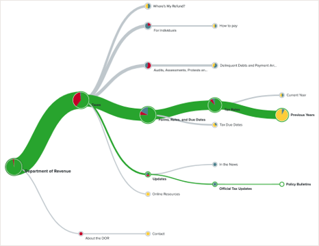
Tree diagram_DOR Case Study_03.png
Caption
Figure 2 The green line in these trees shows how many people went down the correct path at some point in their journey. Notice the green line in round one, shown above. This shows that the correct answer was under Rules & Policies. Clearly, very few people took that route.
The thick gray line shows that users were ignoring the Rules & Policies section in favor of finding all policy answers under their respective topics.
For round 2, the image below, we eliminated the Rules & Policies section and placed these answers where users naturally gravitated in round 1. This is what made the green success path so much thicker.
What you see on the round 1 chart is a 3% success rate. And what you see in round 2 is a 69% success rate for the same task, as shown in Figure 2.
We use our tools to measure total successes/failures, directness of the path taken, and how long each task takes. “For example, if someone got an answer wrong but they took a direct path straight to it and said ‘yes’ this is my answer, we can hypothesize they were confident they were correct. If a lot of people take the same incorrect but direct path, we may examine why they did so a little more closely,” Julie said.
Step Five: Counting Clicks
Another test we used on DOR’s site is called a First Click Test. A First Click Test assesses the effectiveness of an interface's design and intuitiveness for new users.
In this test, we presented participants with a website and asked them to click on the first place they think would be most relevant to their task. This provides data on how long it took users to find what they were looking for, enabling us to identify any issues with the interface that may be hindering user experience or efficiency.
We chose frequently visited pages and created tasks that could be completed on each one. Then, we took an image of the page so users would have to navigate it without knowing what was there previously.
We learn as much from failures as we do from successes. Counting failed clicks can teach us as much, or often even more, than successful clicks.
Our testing tool records whether their click landed in one of the highlighted regions for success or elsewhere for failure, giving us insight into where people naturally gravitate when starting a task. “In a few cases, the new page layouts didn’t actually test any better than the originals, but looking at where test participants actually clicked can still be informative,” said Rachel. At that point, we bring in UX best practices and present DOR with an updated layout.
Turning Data into Actionable Change
Some of our key discoveries are helping DOR drive meaningful and measurable change. From audience-based segmentation to an unexpected paradox, we uncovered some interesting insights that demonstrate that user-centered design is essential for creating positive user experiences.
For example, we learned that users ask for details but click on general labels!
Additionally, it seems no one visits the Rules & Policies or Forms pages after all. The results from round 2 showed that by eliminating the Rules & Policies section and placing policy answers in areas where the testers naturally gravitated in round 1, scores improved dramatically. The success rate jumped from 3% to 69% success for the same task.
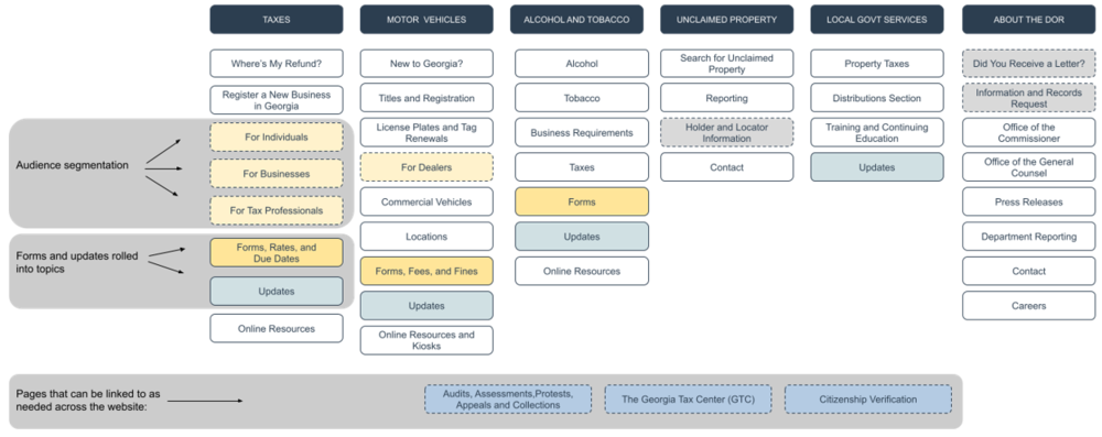
The layout below shows how we applied audience segmentation within the navigational structure and ways that we rolled forms into other areas in the site. We also recommended adding the links shown at the bottom as needed across the website.
Proposed DOR Navigation
Key Takeaways
Here are some highlights of what we learned and ideas that you can apply to your website:
- When it comes to website navigation and content, less is truly more.
- Focus on the user journey first and foremost.
- Organize content into categories that make sense for each step in the flow to allow you to guide users through a meaningful experience.
- A good content audit serves as a great kickoff point for any redesign project, with its effects being felt immediately.
- To ensure that pages are short and concise with less links, only the most common tasks should be highlighted while others should send users through a clear series of actions.
- Forms and updates can be split across categories in the site structure, and placing them in side-navigations, breadcrumbs trails and adhering to meaningful URL schemes can also significantly improve user journeys.
- Use templates to help you better approach your redesigns.
- Look for what's redundant and outdated to consolidate further or eliminate; then get your users to their next step quickly.