August 13, 2020
Icon Lists
Previously, we looked at Tiles as an option for linking to key information from your homepage or a Landing Page. If you recall, at the time of posting we had recently added a third layout option for Tiles: Icon with Text.
If your content will work well with icons, but Tiles are too big and prominent, maybe an Icon List can help.
Basically, an Icon List is made up of links, each with their own icon. Icon Links can link to both external and internal pages. You can give the list a title, description, and “more” link. It can be displayed with or without a card, on a Landing Page.
Icon List Display in GovHub
The GovHub system is set up so you can easily create an Icon List that’s responsive and usability-tested. You’ll just select an icon from our enterprise library, add a link, title, and whatever other information you need in the block, and the system will handle the layout. Our icons have a stroke, fill, and background circle; all three of these will automatically match your site’s color palette.

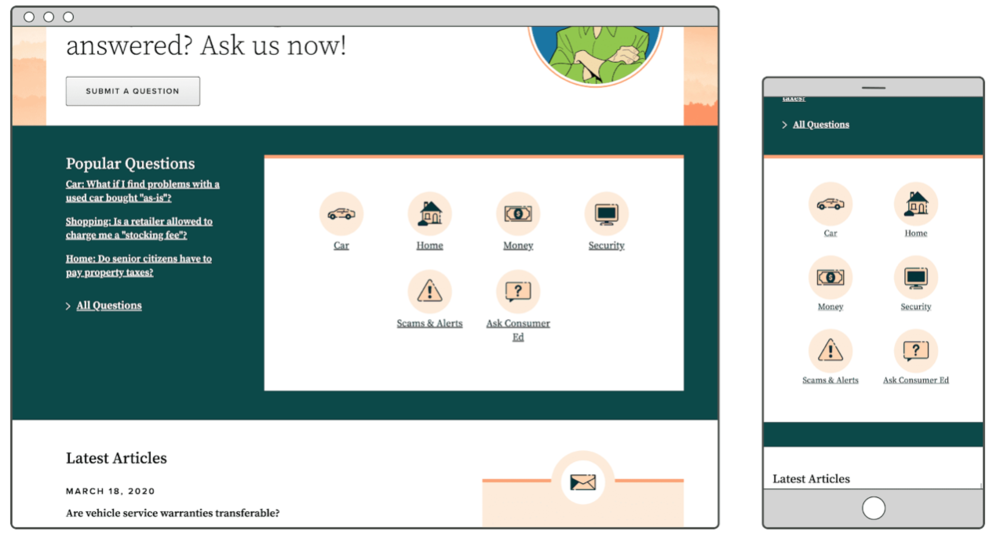
See this Icon List on the Consumer Ed homepage.

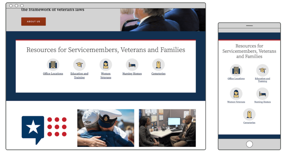
See this Icon List on the DVS homepage.
You Might Be Thinking …
“… so this is basically a Link Collection with icons?”
Pretty much! Though there are only a few small differences, they are important to consider when deciding which block is more appropriate for your links.
- Icon Lists are good for content that page visitors will understand with only a few words. The most effective Icon Links communicate a simple idea, like “Apply” and “Contact.” The more obscure or specific the idea, the less an icon will help users find what they need.
- Link Collections are better for content that needs extra explanation in description text; for example, programs that can't be easily distinguished by name only. They’re also a better option for linking to documents since they will automatically include the file type and size for better usability.
“… exactly how is this different from a Tile with the Icon and Text layout?”
The difference really comes in their visual weight.
- Icon Lists are for things that are fairly important. You also might highlight more links, up to 8, in a single list.
- Icon Tiles are like Icon List’s bolder, stronger cousin. They feature, without question, the most important information on the page. And while you technically can include up to 8 in a single list, we generally recommend just 3 or 4.
“… I’m not sure you’ll have the icon I need.”
If you need a custom icon, first ask yourself if this is a link that really should be using an icon, or if it’s too obscure for that. (See the advice above for Icon Lists vs. Link Collections.) Then if you still say “yes, definitely,” open a support request and we’ll see what we can do.
Start Using Icon Lists
What links are on your homepage or another Landing Page that might work well as part of an Icon List? What straightforward ideas do you need to communicate to your audience with a simple visual?
As you use icons, just make sure that they always support the state brand personality attributes: pragmatic, inclusive, empowering, official, and charming. Our icons use a generally friendly and positive style. Be wary of using icons with serious or solemn topics.
For more on how to create Icon Lists, check out our online Icon List training.
