Structured Content and Flexible Layouts
When we migrated from Drupal 7 to GovHub, we considered how we might provide editors with options for consistent, re-usable, structured content while maintaining the freedom of flexible page layouts. Together with our partners at Lullabot, we developed a new landing page design tool to garner the best of both worlds. Editors can now customize their homepages, landing pages, and service information while using a structured content model to keep critical information up-to-date across websites and automatically expose rich metadata for search engines.
Challenge
The GeorgiaGov Drupal 7 (D7) platform provided agencies with a common toolset for managing content. This was a great first step toward providing the consistency needed for an accessible and constituent-centric presence across dozens of Georgia’s websites.
However, this shared technology didn’t change the governance model for this content. Our agency partners are subject matter experts who know their content and constituent needs better than anyone else. That said, we see a variety of web expertise in editors, making it difficult to enforce content guidelines and standards.
In an attempt to create the best possible experience for Georgians, our default mindset was often to lock things down. Several content types available in the D7 platform were fully structured and allowed very little room for variation. For the most flexible content type — Landing Pages — we kept strict permissions based on user role so that editors needed to work through a higher-up on their team or DSGa directly to make any significant changes to the page.
That left editors with one main content type that gave them near limitless control all in one big text edit field. As a result, this content type was overused and created wide inconsistencies.
Through agency partner interviews, we learned about the existing editorial experience, where it fell short, and what could be better. Editors will sometimes ignore accessibility or usability guidelines in order to format the information in a way they see as more digestible. As a result, our authors would rather repeat the same process they’ve used in the past for everything, even if there might be another, better option.
In auditing a handful of D7 sites, we saw that editors used workarounds for their unwanted site restrictions, and ultimately created the types of situations that those restrictions were put in place to avoid. There were lots of ways to do the same thing, and some things that could be done which probably shouldn’t be done. This creates an inconsistent look and feel, but also presents accessibility issues like incompatibility with screen readers and illegible contrast for type.
To add to the problem, all of the content on a website was unique. For the most part, everything that existed would live on its page and its page alone. For example, if there was a link to an application on several pages throughout the site, and that link needed to change, editors would scrub through their site content manually to find all instances of this link and update its destination. These siloes of disconnected content left much room for error and for content to fall out of date.
Process
In the move to GovHub, we wanted to do things right. We didn’t want to just move boxes from the old system into the new one without reorganizing them and throwing out a few.
We wanted to use GovHub itself to balance the needs of technically savvy editors, editors with very little web experience, agency stakeholders, and of course, end users.
Our goals were to:
- Build a system that allowed for a range of customization to meet a diverse set of agency needs
- Support easy content maintenance over time
- Make content creation more intuitive and user-friendly
Hypothesis
Now that we’ve defined this goalpost, how might we reach it?
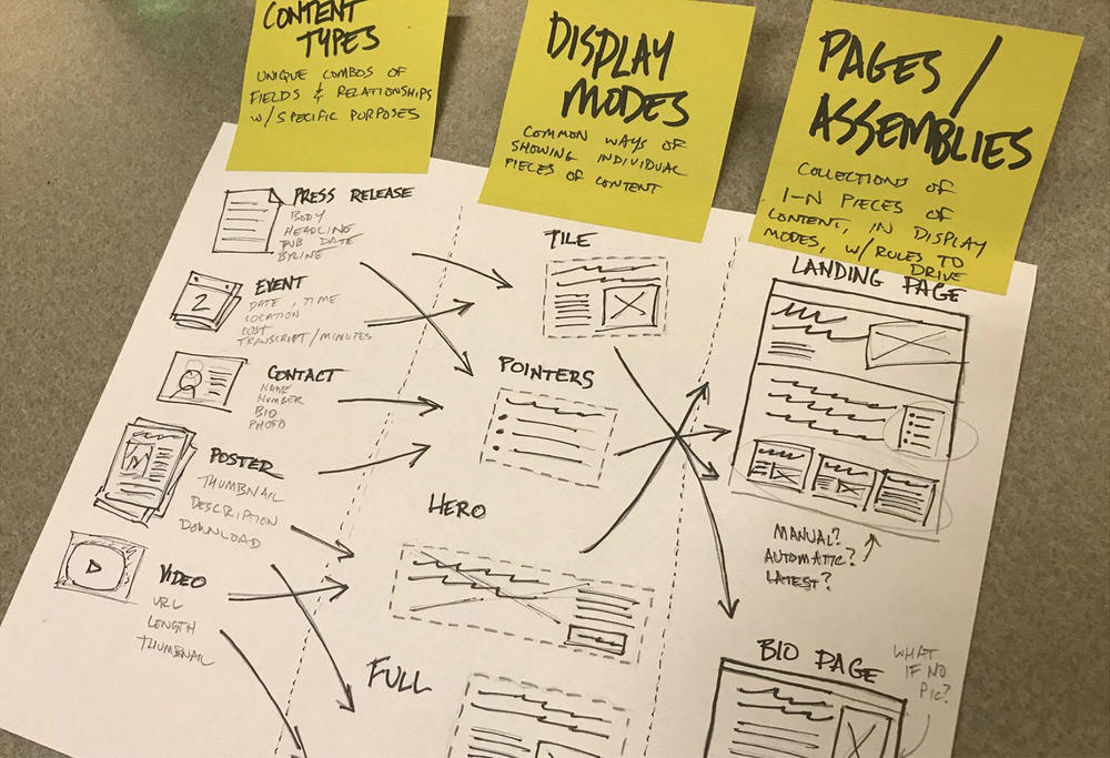
The underlying piece of technology running our hypothesis was the concept of multiple display modes for each content type in Drupal. So for every content type provided, we can have a full detail page and an automatic teaser block.

If we build GovHub to make use of these various display modes, editors can create structured content, then reuse it in various locations and displays throughout their website.
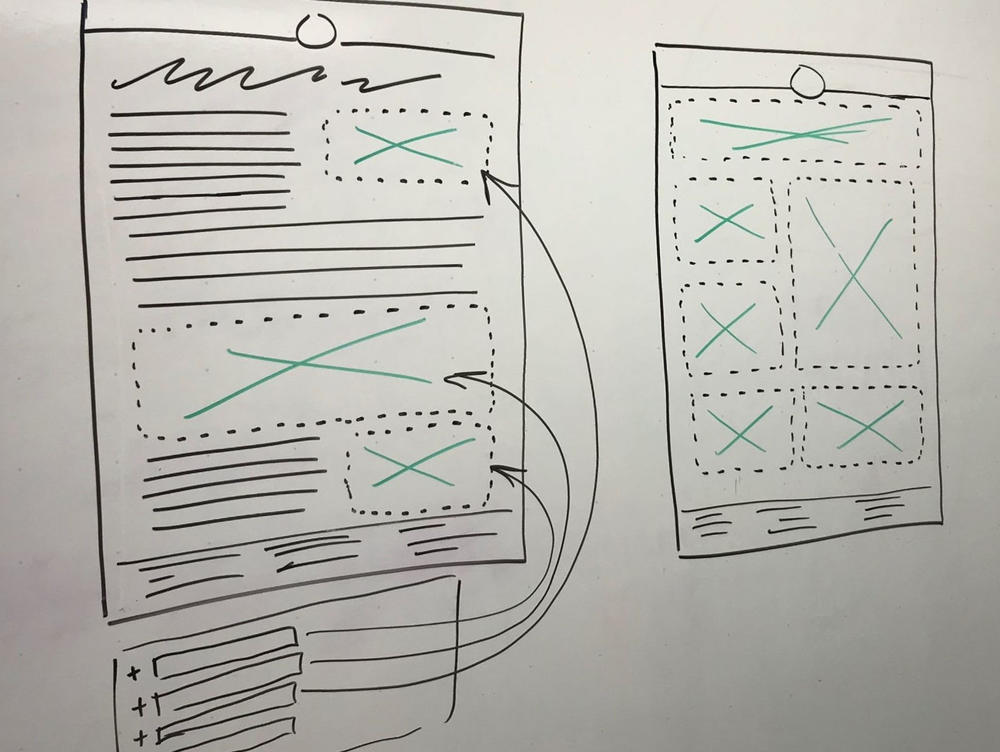
We hypothesized that pages could either allow embeds within the standard flow of text, or they could be made up entirely by individual blocks. This eventually led us to two broad categories of pages:
- Text-based pages — Your standard longform text page, but with other content optionally embedded into the text in different ways.
- Custom layout pages — An aggregation of content from throughout the site, displayed in different blocks.
Further, we also started thinking of content in two distinct groups:
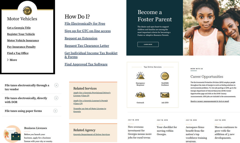
- Content — A full item that lives at its own URL (e.g., News, Event, and Contact)
- Micro-content — A block of content that does not live at its own URL but can be embedded or placed throughout the site (e.g., Call To Action, Link Collection, and Icon List)
Individually, each content or micro-content item would have a structure of defined fields, whether that’s as simple as a title and link, or as complex as street address, city, state, hours, and more. Both types of content would be reusable throughout multiple pages of the site. And thanks to the clear structure, we can predict and control how each item would display in various contexts from a system level.
We thought these concepts provided an enormous amount of flexibility for editors and could help provide consistency across siloed people and teams. Now we needed to find out how editors would understand and use it. We wanted their buy-in.
Testing
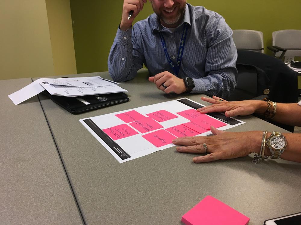
To evaluate the hypothesis, we brought paper prototypes to editors. These low-fidelity workshops showed us how editors wanted to build key pages. We came into these workshops with a few components sketched out already, and left with a better understanding of which editors would use and how. This exercise also helped us understand what was flat-out missing.
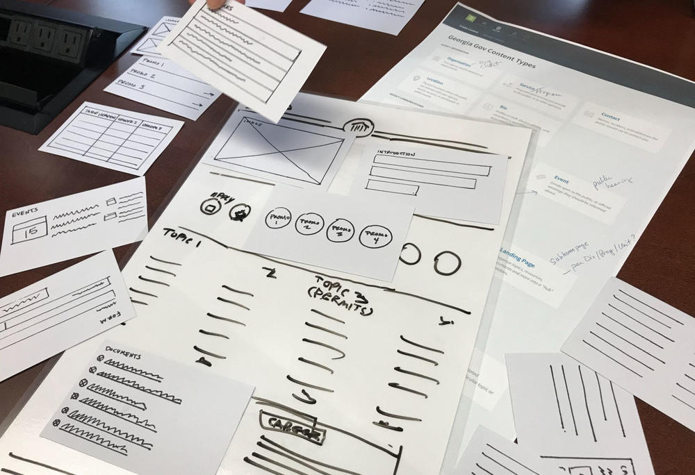
While there was plenty to tweak, we ultimately learned that the drag-and-drop workflow gave editors much of the flexibility they needed and could work well with real content.
“Nothing is getting broken, and everything is a step in the right direction … It looks great, a lot of options and a lot of flexibility. I don’t see anything we currently have that couldn’t be reproduced.”
— State Agency Staff Member
In addition to the prototyping workshop, we conducted surveys and additional interviews to check the overall content model; this included the labels and functionality of all proposed content and micro-content types. We also checked whether editors could map their existing D7 content into the new model.
Our big takeaways from testing: the new content model and drag-and-drop layouts could recreate all existing content and looked promising for future needs.
Solution
The GovHub content management system we launched in 2019 followed the concepts introduced in our hypothesis. Our broad categories evolved into dozens of content and micro-content types. “Text-based pages” are now most often built using the Topic Page content type, and “custom layout pages” are what we call Landing Pages. Then there are several more content types with more specific purposes and structures, like Locations, Events, and Bios.
For nearly every content type in GovHub, editors can use a full detail page and at least one automatic teaser display. Along with micro-content, editors can place these teasers on Landing Pages or embed them into a Topic Page text box. When the information needs updating, they edit a single node and the change instantly updates across the whole site.

Results
Let’s return to our goals and see how we stacked up.
Custom Layouts for Key Pages
With the help of Drupal’s Layout Builder and GovHub’s large variety of micro-content types, editors can fully customize their key Landing Pages to exactly what they, and their users, need.
However, Landing Pages are bound by layout rules and skinned with the Orchard Design System. This system provides guardrails that help editors comply with usability and accessibility standards. The layout consists of horizontal sections that are divided into one, two, or three columns. Content blocks are then placed within those columns.
This building block approach gives editors the flexibility they want for their most highly-trafficked pages.
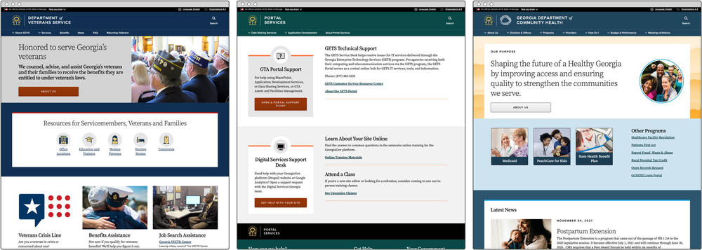
That said, every GovHub site is skinned with the Orchard Design System, clearly placing them in the same family.
Content Reuse for Easy Updates
A massive benefit that we’ve seen since migrating to GovHub is the ability for content to be reused across multiple pages. Beyond saving time in the initial set up, this reusable content really comes into play when something needs an update.
For example, every agency website has a primary Contact. It might have a phone number, email address, social media links, and more. This shows up:
- On the Contact’s detail page
- On the website’s “About Us” page
- In the footer (optionally)
- As a teaser block placed on another page (optionally)
- On the organization’s page on Georgia.gov
- On any services on Georgia.gov associated with that organization
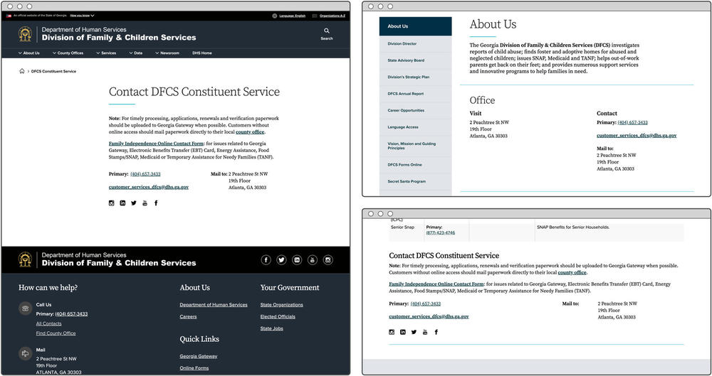
Imagine now that your agency gets a new primary email address. What could be a headache and a lost afternoon now becomes one simple update on one piece of content that ripples across all these various pages.
Intuitive Content Creation: Still In Progress
Much of content management is going well. We worked closely with editors in the initial site migration, to give the site a good start and overall, editors have been able to keep up with changes since then.
That said, we’ve seen some challenges when it comes to reusable content. For example, when an editor is more used to thinking of their website in terms of pages than reusable chunks of content, they might be surprised to see their edits in one place changing content elsewhere.
There’s also the strategic piece of fully customizable pages that introduces new hurdles. Someone who only spends a small portion of their time updating the website and is used to creating a page with a very clear edit form might not always make layout decisions that lead to a great user experience.
We’re keeping the conversation going through our support desk, knowledge base, and training workshops. As we learn where editors are running into issues with the system, whether technical or strategic, we’re continually updating GovHub’s interface to make their work as easy as possible.