Goal of Accessible Documents
How to Create an Accessible Word Document
The information you publish to your agency website often starts as a Word document, such as policies, program information, and reports.
Everyone who creates documents in a government agency should create accessible documents from the start. This will help to reduce work later, and ensures people can access information at any stage.
Start With This Mindset
Creating accessible documents means building structure as you work.
Think of your document as a simple, well-organized outline that someone can:
- skim quickly
- navigate with a keyboard
- understand without visual cues.
Test Your Work
Use tools like NVDA, a free, open-source screen reader for Windows to review your work and get a sense of how it sounds using a screen reader.
Rely on the Basics
Microsoft tools such as Accessibility Checker may not be available or fully functional in your agency's version of Word - check with your agency's IT Administrator for more information. Other third-party automated tools may not identify all the issues.
We recommend using the following practical steps to create an accessible document from scratch.
Create an Accessible Word Document
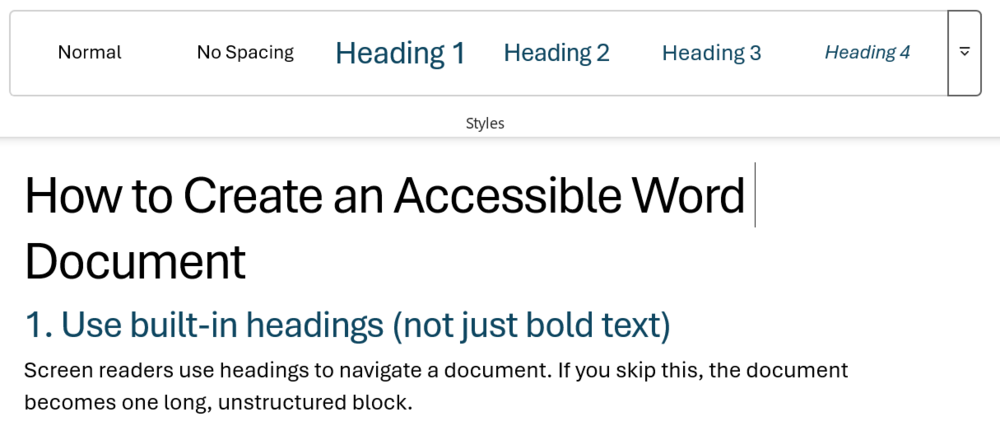
Step 1. Use built-in headings (not bold text)
Screen readers use headings to navigate a document. If you skip this, the document becomes one long, unstructured block.
Word Styles.png
Use Word’s Styles:
- Title → Title style
- Main sections → Heading 1
- Subsections → Heading 2
- Smaller sections → Heading 3
- Keep headings in order (don’t jump from Heading 1 → Heading 3)
- Use bold text in paragraphs for emphasis, not for headings.
Quick check:
Can you scan your document just by reading the headings?
Step 2. Write clear, descriptive headings
People using assistive tech often jump between headings. Vague headings make that impossible.
Instead of:
- “Overview”
- “Details”
Use headings that serve the user’s perspective and support their navigation:
- “Who this program is for”
- “How to apply for benefits”
Step 3. Use real, ordered lists (not typed dashes or numbers)
Screen readers recognize structured lists and announce them properly.
Use Word’s ordered lists, which include:
- Bullet list tool
- Numbered list tool
Avoid:
- Typing - or 1) manually
Step 4. Make links meaningful
Screen reader users often navigate by links alone.
Avoid:
- “Click here”
- Raw URL paths (not using descriptive link text)
Use:
- “Download the application form”
- “View eligibility requirements”
Step 5. Add alt text to images
People who can’t see the image still need the information it conveys.
How:
- Right-click image → Edit Alt Text
- Write 1–2 short sentences describing the purpose
Examples:
- Good: “Map showing clinic locations across north Georgia.”
- Bad: “Image of map”
If the image is decorative:
- Say “Decorative” or leave it empty
- Ask if a decorative image is necessary
Step 6. Use simple tables (only when necessary)
Complex tables are hard to navigate with assistive tech.
Use tables only for real data (not layout).
Keep them simple:
- No merged cells, if possible
- One clear header row
- Label column headers clearly
Better alternative:
- If possible, turn dense tables into lists or sections
Step 7. Use sufficient color contrast
Low contrast text is hard or impossible to read for many people.
How:
- Use dark text on a light background (or vice versa)
- Avoid light gray text
- Don’t rely on color alone to show meaning
Example:
- Do not say: “Items in red are required”
- Say: “Required items (marked with *)”
Step 8. Don’t rely on formatting to convey meaning
Bold, italics, or color may not be perceived by everyone.
Instead of: “Important items are in bold”
Use: “Important: Submit your application by June 1.”
Step 9. Use readable language
Accessibility includes cognitive accessibility.
How:
- Use plain language
- Keep sentences short
- Define unfamiliar terms and acronymns
- Break up dense paragraphs
- Use tools like Hemingway Editor to check your readability
Quick check:
Would someone understand this on a first read?
Step 10. Set document properties
Assistive tech uses document metadata.
How:
- Add a document title
- Set the correct language (usually English)
Final self-check (no tools needed)
Before sharing your document, ask:
- Can I scan this using headings alone?
- Are links understandable out of context?
- Do images have meaningful descriptions?
- Is the structure simple and predictable?
- Would this still make sense if read out loud?
If yes, you’re in good shape.
Note
If you’re going to be working on a document that you know will be turned into a webpage, it is easier to format the document in Google Docs. The formatting of Google Docs is closer to html and doesn’t carry over unnecessary formatting, like Word.