Georgia.gov Redesign Case Study
Scope:
Personas, Mood boards, Content strategy, Search redesign, User research, Data analysis, Card sorting, Information architecture, Wireframing, Usability testing, Responsive design, Visual design, Front-end development
Timeline:
1 year, 2011-2012
Members:
Nikhil Deshpande, Peter Lee, Christina Lingga, Kendra Skeene, Pooja Berrong, Noralil Fores, Jenna Tollerson, Venkat Adusumilli, Marc Xu, Andrada Erdoss, Kelly Sheffield, Donna Merit

Georgia.gov is the main website for the state of Georgia. Each year, about 5 million people visit the site, accounting for about 8 million sessions.
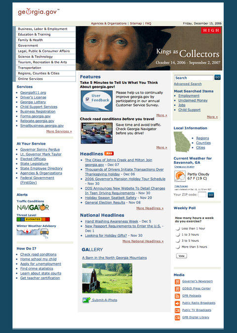
Back in 2002, the site was designed for users to browse by topic, click around, and eventually find links to information on other state websites. But state government is too big for that, and we knew we weren’t serving citizens.
With only a single refresh in nearly 10 years, the site was due for an update.
Where We Started
With the redesign, we wanted to do something new and redo everything, not just give it a facelift.
So we looked at every aspect of Georgia.gov — content, search, information architecture, platform, and design. What wasn’t working, and why wasn’t it working?
We had some ideas, but we wanted to base our decisions on real experiences from real citizens. We gathered data from several areas:
- Website analytics
- Site search statistics
- Georgia.gov customer satisfaction survey
- Information from the 1-800-georgia call center
What Were Users’ Experiences?
Here’s what we found:
- Citizens needed information that affected them personally.
They were looking for financial support for their children, copies of birth and death certificates, and jobs. - They couldn’t find what they were looking for.
The structure of the site was outdated, making citizens bounce around. - They became overwhelmed with too much information.
Trying to meet everyone’s needs, we tried to link to everything that might help. The result: Long lists of links that were difficult to go through.
Reinventing the Face of Georgia Government
After pouring over blogs, presentations, and the latest research in usability, search, design, and content strategy, we came up with a few fundamental rules:
- Focus on top priorities.
We can’t meet every citizen’s need. In January 2011 alone, citizens searched for a wide-ranging 25,000 terms. If we can serve 80% of citizens with 20% of the content, we’re left with a more manageable task. - Simplify.
We knew our homepage was too crowded and content heavy. As mobile strategist Luke Wroblewski told Forbes magazine, “I hear it over and over again, ‘The mobile site is so simple, I wish the desktop site was that easy.’” - Holistic approach.
We had to start from scratch, keeping nothing from the current site.
Search
As we mentioned before, the old Georgia.gov relied heavily on browsing. But more and more people are searching for information, not browsing for it. Georgia.gov uses the Google Search Appliance, an excellent search tool that’s sometimes too good. Searching for something like “child abuse” yields 30,900 matches.
We needed something a bit more intelligent. So we designed a search that would allow us to promote certain content based on keywords and synonyms. For instance, a user searching for “DMV” will get a match for the Department of Driver Services (DDS), since that's what Georgia calls the Department of Motor Vehicles.
We also noticed that people may be looking for different kinds of information. One person searching for “Child Support” may want to know how to open a case, while another may need to check their payment status. So we organized the search results page based on the type of information — online services, agencies associated with that search term, and popular forms.
Layout
“If something is on the screen and people aren’t clicking on it, we remove it.”
— Steve Hafner, CEO of Kayak
Our old design tried to be all things to all people. We crammed information on the page, hoping people would eventually find something that pertains to them.
Of course, this probably isn’t the best approach.
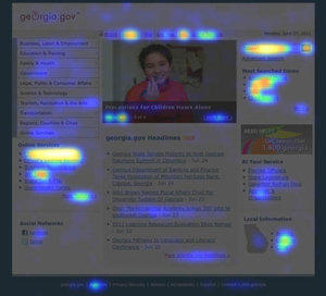
We decided to see what people actually wanted. Using a service called Crazy Egg, we were able to see where users clicked.
The results were eye-opening:
- Child Support and Jobs received 41.9% of all clicks, but together took up less than 1% of the page.
- Search was used in 13% of sessions but took up just .65% of the page.
- In contrast, the Headlines feature (latest news stories) took up 18% of the page but received only 3.6% of clicks.
Screen space is valuable, and so is our users’ time!
We began laying out the front page with a few rules in mind. The fewer words, the better. We allowed for lots of white space. We made search bigger, took away the Headlines from the front page and moved our features to a less prominent area of the page.
If it wasn’t important, it wasn’t going to be on our homepage.
Content
In the past, Georgia.gov had simply pointed the way to information on other websites. But given our new focus on search, we had to make sure that users found the right information quickly.
There were 2 problems with this approach:
- We couldn’t edit keywords and metatags to control search results from websites that were not hosted with us.
- There is sometimes more than one agency (or search result) with information about a topic.
The solution was to create our own content. We could show users the information they needed to see, direct them to the agency website for more information, and show associated forms, services, and documents. And with keywords and metadata, we could control how the content appeared in search results and steer users to the right content.
We scoured search logs, call center data and site analytics to find the 50 most popular topics requested by Georgians. We worked with the agencies that dealt with those topics and wrote summaries of each.
On each of these topic summary pages, we included:
- An overview
- What citizens need to know
- FAQs
- Associated agencies, online services, and documents
We also created consistent pages for each state agency, city, and county in Georgia.
Responsive Design
Responsive sites adapt to the device accessing it. A person with a large computer monitor will see a different layout than a person using a mobile device.
This is important for 2 reasons:
- Based on our statistics, our mobile users quadrupled in 2011. At the same time, our site is accessed by 191 devices and 86 browsers at 1,750 different resolutions. We had to accommodate these changing trends.
- To remain “content first,” we needed to consider how these devices accessed our content. Someone using a phone will use a site differently than someone on a desktop.
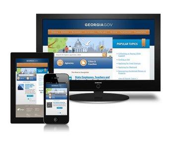
Responsive design allows the site to resize and reorganize based on the window and device size. We designed the site to accommodate 3 common screen widths:
- Large desktops (960px and above)
- Small desktops & tablet portrait (740px to 960px)
- Mobile (Below 740px)
For mobile users, we reordered some of the functionality, moving search to the top of the page and sending the navigation to the bottom. Why? Because mobile users don’t want to navigate, wait for each page to load, then click on something else. They search.
Usability
We paid close attention to usability during the whole design process:
- We added “search as you type” functionality to help users find relevant content more quickly.
- Links looked like links — blue and underlined — and were consistent throughout the site.
- Long lists of content — 600 cities and counties, and 120 agencies — filter as you type in a search box.
IA
Information architecture, or the structure of the website, was now taking a back seat to search. We joked that the new Georgia.gov would just have one big search field — no menu, no navigation.
Of course, we can’t do that (yet).
We used menus to direct users toward types of information on Georgia.gov, such as Agencies, Cities and Counties, and Popular Topics.
Design
We based our design decisions on careful research, testing, and analytics.
We began with personas — imaginary people who we thought were typical users of Georgia.gov. We quickly discovered that, unlike other products that have a niche or a target audience, our users were the entire State of Georgia. Urban and rural, rich and poor, young and old. How could we be all things to all people?
We discovered that in spite of the all-encompassing aspects of our task, there were some basic concepts:
- Friendly.
In spite of the size, we wanted government to possess small-town values and treat citizens as people, not numbers. - Informative.
People come to government websites for information, not a good time. Of course, this didn’t mean we needed to be robots (remember “friendly”), but we did focus on what our users wanted. - Concise.
We wanted to point the way, then get out of the way. Georgia.gov needed to show as little as possible while conveying as much information as the user needed.
Testing the Look
We didn’t design in a vacuum. User testing played a major part in the design process, helping us gauge how well we were meeting users’ expectations.
To gauge if we were meeting users’ expectations, we conducted 5-second tests. Users saw a snapshot of the homepage for 5 seconds, then told us what they thought the site was about, what types of feelings it conveyed, and what they noticed about it.
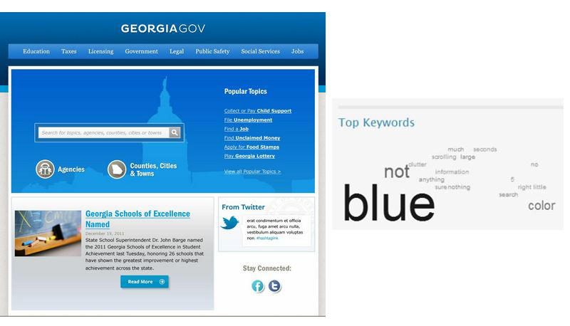
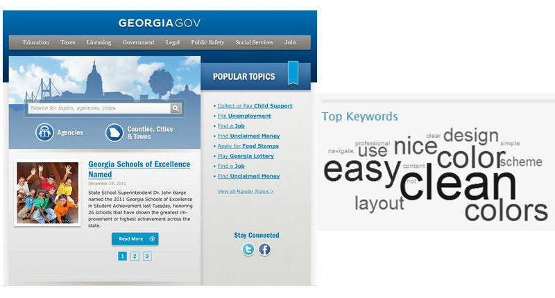
With just a few more tweaks, we were ready to launch the new Georgia.gov!