June 21, 2016
Making Our Sites Faster, Part 4: Three Things You Can Do To Make Your Site Faster
This is the fourth post in a 4-part series discussing performance on the GeorgiaGov platform.
I’ve been talking a lot about website performance — why it matters, how we measure up, and what we’re doing to improve our platform performance. Now it’s time to hit you where it hurts — and remind you that not all the burden of improved performance lies with the code.
We can adjust, aggregate, and optimize code all day long, but image sizes most heavily affect page load times across our platform. A few of these are images are “baked into” your design. Some themes are lighter than others because they don’t contain background images or other graphic elements. In fact, we recently optimized all our theme images to reduce their load, and we expect that to have a big impact across all the sites. Now it’s time to think about the images that are part of the content of the page.
This is where things get tricky. Many of our customers — the agencies these sites represent, and who manage their sites’ content — want nothing more than to add larger images, more rotating image carousels, and more bling to their sites. They tell us this will “capture millennials” and “help them win awards.” They don’t have data to back this up; just a general sense that more bling makes for a more engaging website. But if your users give up because your pages aren’t loading quickly enough, who are you serving?
To that end, each agency is responsible for its own site’s performance. What can be improved? I’m so glad you asked!
3 Easy Ways To Speed Up Your Website
- Kill your rotator
- Lose unnecessary images
- Optimize remaining images
Let’s get into a little detail on each of these.
1. Kill Your Image Rotator
Also known as an image carousel, the rotator on your site either takes the form of a block of rotating images, or an image with accompanying text and a link. It’s our worst offender for performance drain, because it loads many large images and a lot of extra JavaScript. In fact, adding that rotator to your homepage basically doubles the size of your homepage. That rotator sucks up a ton of bandwidth and provides visitors with very little value in return. Our analytics show that less than 1% of visitors click on the image banners. If your visitors are ignoring your rotator, then it’s not adding value.
Ready to lose the rotator? Contact us at digitalservices.georgia.gov/help, where we can remove your image rotator and help you figure out what type of content block would make more of an impact in its place.
2. Lose Unnecessary Images
Are you using a stock photo just to “liven up” your page? Or creating a large banner image because you want to use a different font than the ones your site theme uses? For each image you add to a page, ask yourself what value it’s adding to the page. If you don’t have a clear answer, remove it.
Now, before you write me off as someone who thinks all images are bad, I need to point out that we at Georgia.gov post images, including large infographics. What’s more, I’m about to add screenshots into this very blog post — because they add value and illustrate a point. What I’m encouraging you to remove are images that could otherwise be text, or wouldn’t be missed if they were gone.
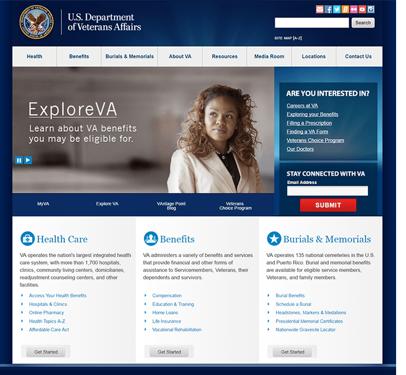
One extreme example of a state agency getting rid of images is the new pilot replacement site for va.gov. While the old site at va.gov looks very similar to many of our platform sites, the new pilot at vets.gov has stripped all the fluff and gets right to providing links to the services constituents need.


When asked about their choice to go light on the images, the team explained that the decision was based on usability testing — they talked to real users and found that their users preferred less imagery.
@kskeene @dannychapman We also went out and talked to users! Turns out they preferred less imagery for a variety of reasons.
— emily wright (@emilyville) February 16, 2016
3. Optimize Remaining Images
Now that you’ve removed images that don’t add value, and you’re confident in the images you want to keep, make sure they’re optimized for the web. All your images should be…
-
No larger than the size they will load on your website (remember, our platform layouts resize based on the screen width, so some images actually show up larger on the width of a typical tablet display than they do on a desktop display. None of your images will load larger than 900px wide).
-
Saved as the best file type (jpg, png, svg, or gif) and smallest size for the image style. If you have Photoshop, use the Save for Web feature to save your images. If you don’t have Photoshop, you can download the free image editing tool Gimp to perform these tasks. Not sure how these image types differ? Lara Hogan, senior engineering manager of performance at Etsy, created a detailed list of different optimization options per image format to help you choose.
-
Compressed again after you save them, using a free online image compression tool. Our front end developer recently started using compresspng.com and compressjpeg.com — both do an excellent job of compressing images, often with almost no discernable change in quality.
Implement these changes to all new images, of course. But you should also carve out some time — even 15 minutes a day — to review old images and update them whenever you can. You’ll be surprised how much you can compress some of your images.
Let’s Do This
Your content is the most important part of your site — it’s why visitors go to your site in the first place. Fast performance and quicker image loads are the icing on the cake that makes that visit painless. So let’s do this.
