Accessibility Case Study
Scope:
Accessibility, Visual Design
Timeline:
June 2015-January 2016
Members:
Nikhil Deshpande, Kendra Skeene, Jenna Tollerson, Jasmyne Dove
More and more, people turn to the internet for critical information. Today, important government information and services — unemployment benefits, veterans’ services, tax information, and so much more — is available online.
But can everyone access it?
More than 8% of Georgia residents under the age of 65 have some form of disability, and the percentage only increases when you look at older groups. At the same time, people over 65 are the fastest growing group of internet users. This is often the population that benefits most from online services and information … but only when they can access it!
We need to consider people with disabilities when building our websites.
For years, the federal government has required its agencies to make their online content accessible. As awareness spreads, Digital Services Georgia has been eager to lead the way for states, both for legal reasons and to address the needs of a growing population.
An Ally for Agencies
The Digital Services Georgia team has always valued making online content available to everyone. We want compliance to be easy for state agencies! That’s why we built the initial platform to comply with the federal Section 508 standards for technical accessibility.
Over time, we learned that while our web platform was fairly accessible, we still had room for improvement.
Making Accessibility Our Top Priority
In 2015, we kicked off our accessibility initiative. To ensure equal access for all citizens, we used the same “measuring stick” the US Department of Justice uses — Web Content Accessibility Guidelines (WCAG) 2.0 (Level AA).
Web accessibility can be tricky. You may think of people who are blind, deaf, or have other noticeable impairments. But there’s actually a wide range of reasons someone might have difficulty accessing online content.
To make sure we covered everything, Digital Services Georgia turned to the experts. We partnered with Georgia Institute of Technology’s AMAC Accessibility Solutions & Research Center and the State ADA (Americans with Disabilities Act) Coordinator’s Office. Together, we reviewed the Digital Services Georgia platform code and 13 design themes used by nearly 60 agencies.
How We Made the Digital Services Georgia Platform More Accessible
So what did we actually do to make the platform more accessible? Advised by AMAC and the ADA’s office, we made the following changes to the platform code:
- Increased Color Contrast
Text needs to contrast with its background enough for users with low vision and color blindness to be able to read it. Previously, some of the text in our themes had too low of contrast to pass WCAG 2.0 AA standards. We used WebAIM’s Contrast Checker to narrow down our theme colors and select only accessible combinations for text and background colors. - Better Font Legibility
We knew from the beginning that certain fonts are easier to read than others. When we took a second look at our theme fonts from an accessibility-focused perspective, we realized that some of our header and navigation fonts could be easier to read. - Improved Semantic Markup
A lot of the accessibility needs can be addressed simply by using semantic markup — that is, using HTML markup that describes what content is and does instead of relying on styled <div> or <span> tags for everything. By adjusting our use of heading tags for all heading levels, removing heading tags from non-heading content, and adding <label> tags to the search form, we made our websites more accessible and more SEO-friendly. - Improved Keyboard-Only Navigation
Sometimes, users need to navigate the web with a keyboard, rather than a mouse or touch-screen. We adjusted our semantic markup to make content easier to access when navigating solely with a keyboard or screen reader software. Some of these changes included adding a visible border around all links when a user tabs to them (called a “visible focus”), adding labels to form elements, and making the menus easier to tab through. - Enhanced Functionality for Screen Readers
For certain elements, we enhanced the screen reader experience with ARIA labels. Examples included adding ARIA accessibility labeling to “Read More” links across the platform to provide additional context to the link for screen reader users, and adding ARIA labeling to pagination links to provide more context for where each “Next” or “Back” link goes.
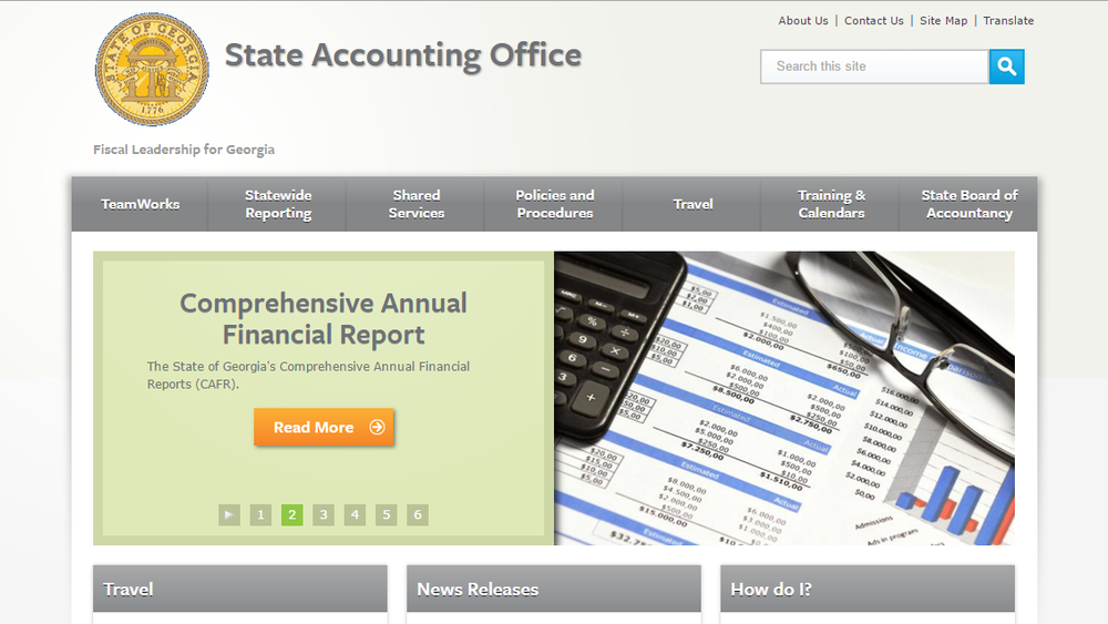
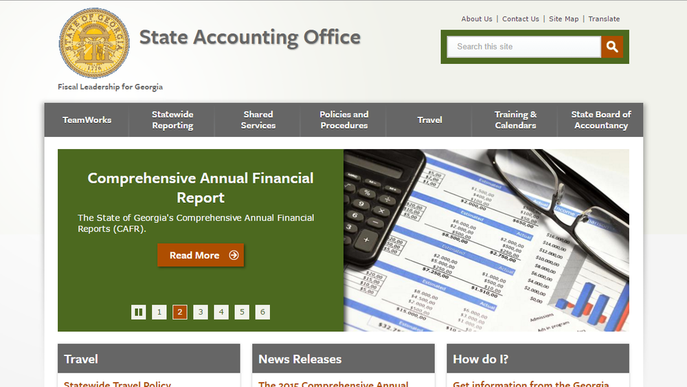
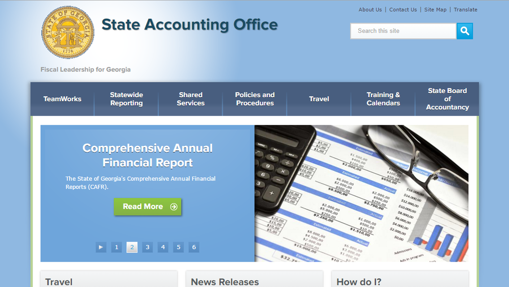
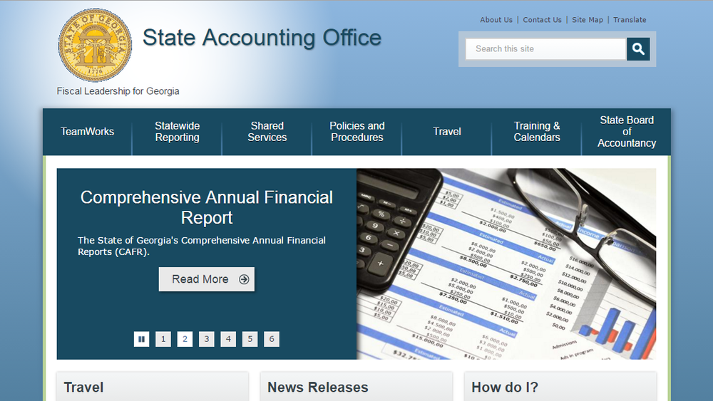
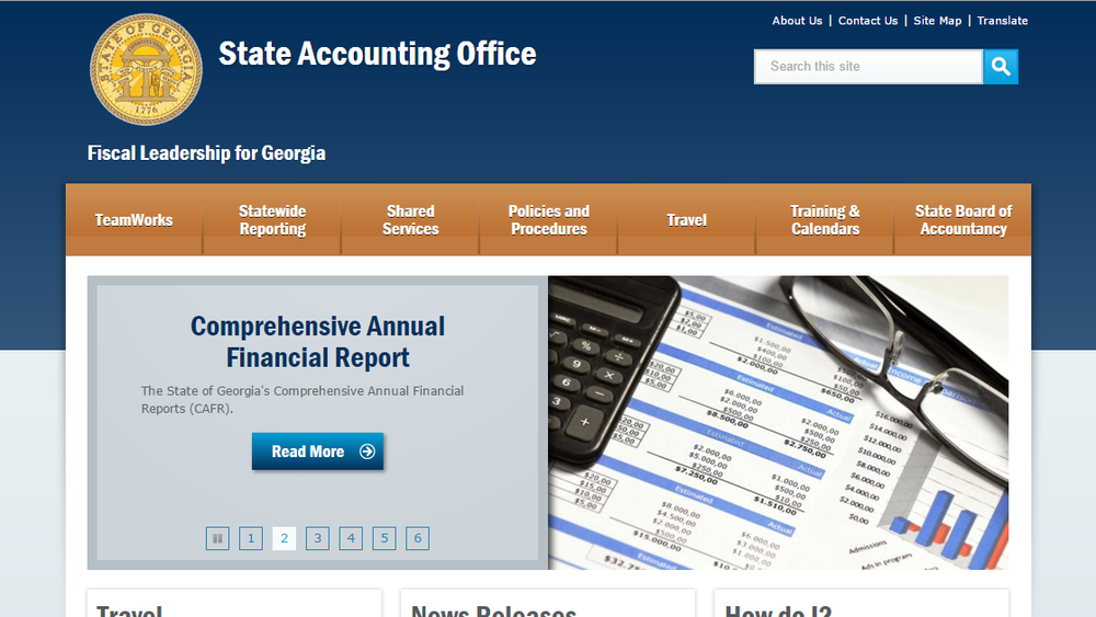
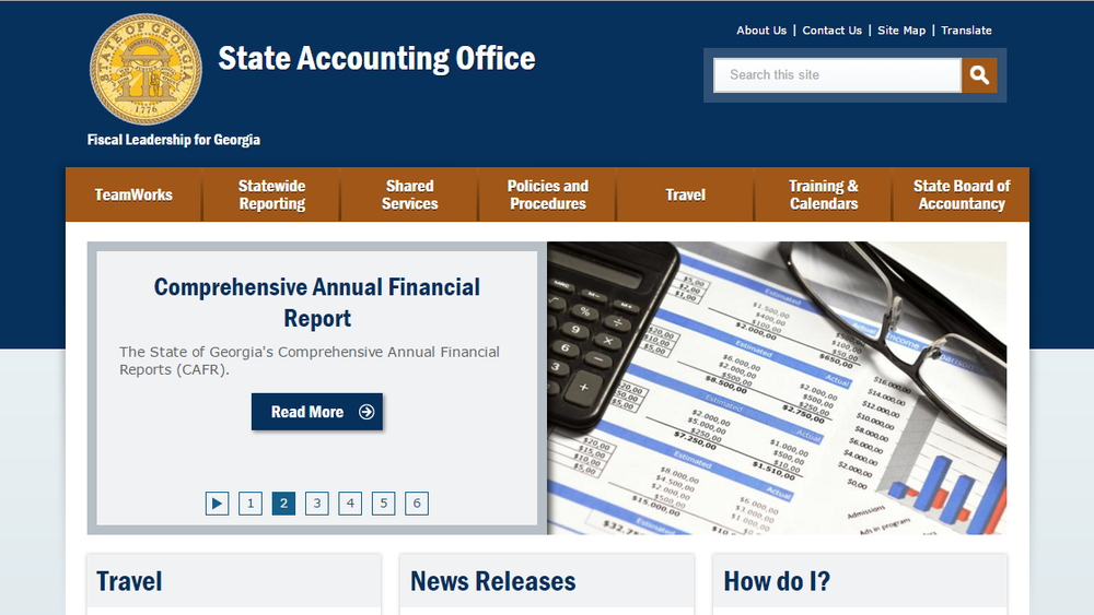
Before and After
Subtle, not huge changes were made to the themes’ visual appearance.
Accessibility for All
With these improvements, state agency websites on our platform now have accessible themes. We’ve also built accessibility into our process for designing and building new platform features to ensure that all future development meets our standards from the start.
However, the agency content managers play a critical role in ensuring the site’s information is also accessible.
Continued Help for Agencies
Knowing that improved structure and design are only one piece of the puzzle, our team continues to guide our agency partners toward accessible content management practices. Through blog posts, training, newsletters and GOVTalks conferences, we continually educate and encourage agencies to do their part in maintaining accessibility standards.
We focus our training and education on:
- Using clear and simple language
- Adding alternate text to images
- Using helpful text for links
- Reserving tables for tabular data only
- Applying semantic markup (mark headings in the body text, etc.)
- Making PDFs accessible
- Providing captions, transcripts, and audio descriptions for multimedia
Georgia's Agencies Are Accessibility Leaders
By the end of January 2016, all websites on our platform had color contrast and functionality to meet both the baseline Section 508 standards and the higher WCAG 2.0 (Level AA) standards. Georgia was one of the first states to make its sites compliant with these standards across its platform.