January 09, 2025
Table Talk: Is Your Data Accessible?

We have said over the years that state agencies know their content best, and if website managers can handle the content, we'll handle the rest. That's mostly true.
We do strongly encourage specific formatting practices, such as organizing heading tags in hierarchal order. These best practices for publishing content usually relate to complying with accessibility standards. That's where the usage of html tables fall under, and why we'd like to illustrate when and how to make the best use of them.
Consider this: You move to a new county in Georgia and need to establish utility service. When you access the utility company’s website to locate their offices, the information on their location page seems unorganized. There are no column headings and the data is not consistent. It’s hard to tell which office you need to visit to set up services.
A scenario like this can create a frustrating experience for users and may keep them from accessing the information that they need. Tables should be used for their intended purpose of displaying data in rows and columns and not as a style option. Using tables correctly ensures a user-friendly experience that is accessible to everyone who visits your website. Perhaps most importantly, when used incorrectly, tables can be problematic for screen readers to convey information across to users who rely on assistive technologies.
A Table in Disguise
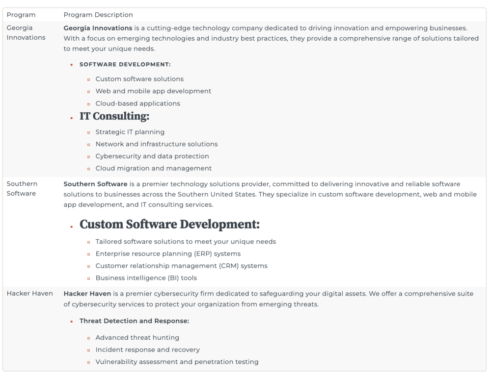
Our first example below looks like a typical webpage. What you may not be able to see is that a table is being used mainly for style to create spacing and alternating background colors. There are no column and row headers designated.

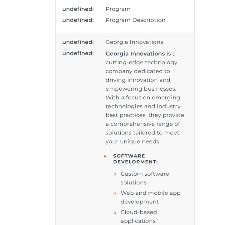
On a desktop screen, it’s not necessarily hard to read, but mobile visitors will see the table formatted differently. And that's important to account for because 60% of all visitors to GovHub sites in 2024 used a cell phone or tablet. Without column and row headers on a mobile device, the columns stack with undefined values. This provides a significant challenge for screen readers and makes the information inaccessible to visitors with disabilities.

Substance Over Style
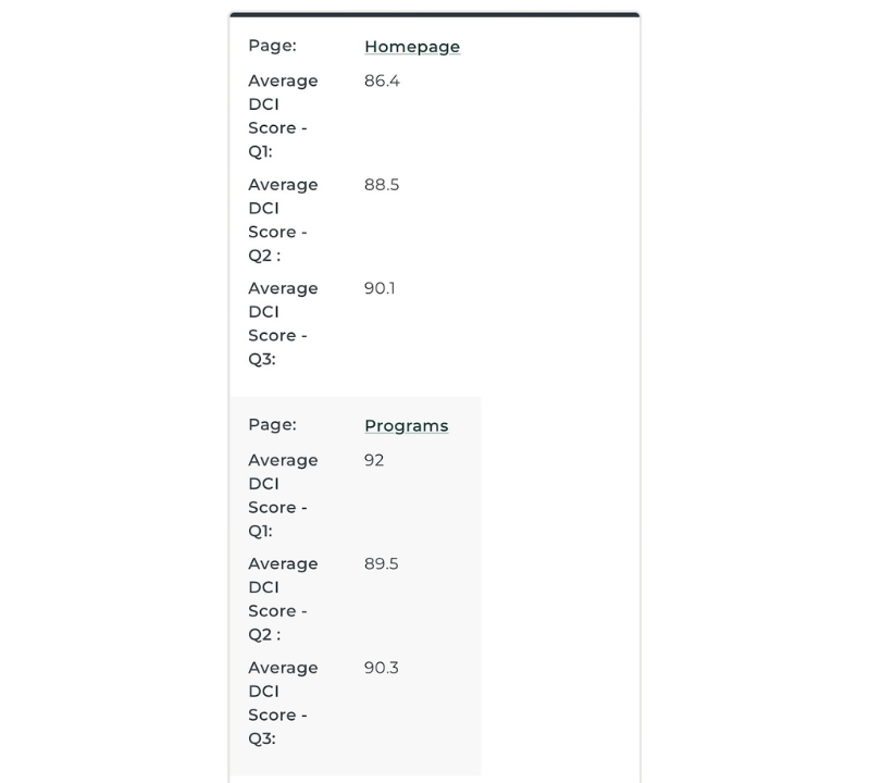
Now, let’s look at a different example. The table below has a clear purpose, providing scores for specific pages of a website. A defined header row indicates the quarter that each score was earned, giving context for each column of data. The information is presented concisely, focusing on a single data point so the table is not cluttered with unnecessary details.

On mobile devices, the data in the table is rearranged from rows to columns by grouping each page’s scores together. This makes it easy to read on mobile devices and is friendly for screen readers to understand the score that is associated with each quarter.

GovHub’s Accessible Framework
If your agency’s website is on GovHub, accessibility is baked into the framework of the websites so that you don’t have to worry about making them responsive or maintaining the HTML associated with the table. However, it’s up to you to ensure the clarity and accessibility of the information that you are publishing by keeping each cell to a single data point and using plain language.
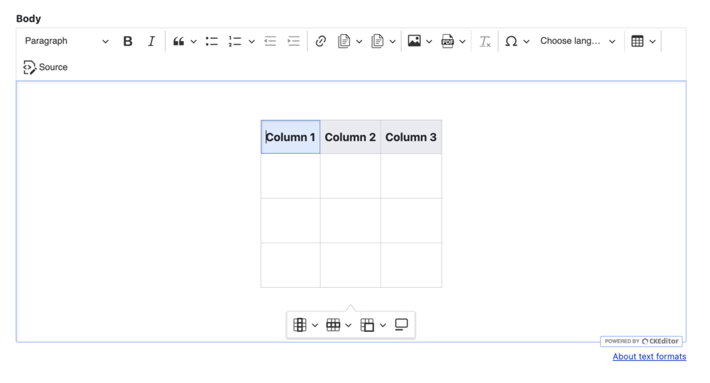
We also recently updated the WYSIWYG editor in GovHub to improve the experience of adding a table to a Topic Page. In the old version of the editor, you had to right-click on the table to bring up a menu to make any edits. The new version of the WYSIWYG places the editing menu on the page so that it is easy to add or remove columns, designate a header row or column, merge cells, and add a caption.

Helpful Tips
When creating tables on your website, there are a few things that you can do to ensure a good user experience:
- Focus on single data points to enhance readability and comprehension instead of using lengthy blocks of text. This helps users scan the table and quickly find the information they are looking for.
- Avoid nesting a table within a table and merging many cells together. This can make it difficult for assistive technologies to read the information. If an issue occurs within the table that causes it to “break”, nesting can also make it difficult to identify the cause.
- Be mindful of users who may visit your website on a mobile device since information will be displayed differently. Columns will display as stacked so designating a header row or column is important for conveying the purpose of the table. Read more about this on our knowledge base.
