pexels-davideibiza-11813187.jpg
by Davide Baraldi
An official website of the State of Georgia.
The .gov means it’s official.
Local, state, and federal government websites often end in .gov. State of Georgia government websites and email systems use “georgia.gov” or “ga.gov” at the end of the address. Before sharing sensitive or personal information, make sure you’re on an official state website.
Still not sure?
Call 1-800-GEORGIA to verify that a website is an official website of the State of Georgia.
May 09, 2025
In a previous post, we looked at how an individual agency approached us to find out what was creating confusion for users on a section of its website. Today, we’re going to look at how we practiced what we preached, and used usability testing to upgrade a feature all GovHub agencies use.
It’s frustrating when vital information, such as unexpected closure announcements or fraud alerts, get skimmed over by users.
Oftentimes website visitors, especially repeat visitors, will get in the habit of scrolling and end up ignoring a piece of content you’ve placed top-of-page, front-and-center, in the form of a news alert. If you’ve encountered this, your visitors could be experiencing “banner blindness.”
Here’s a look at how we used user testing to approach this Alert dilemma.
Users don’t come to an agency website looking for “alerts.” They usually have some other task that brings them to the webpage.
Asking someone questions about an Alert design requires them to focus on the Alert. This is the opposite of how users encounter Alerts in real life when their attention is focused elsewhere.
First, we created four tests. Each test had a different Alert design, and each tester only interacted with one design.
To mimic the real world as closely as possible, we showed testers a mock website and asked the tester where they would go to check out all the styles available to them if they wanted to get a specialty license plate. This first task had nothing to do with the Alert.
Before conducting testing, our news Alerts were designed to look aesthetically cohesive with the rest of the website with ample space to write a robust news paragraph. While that sounds logical in theory, user behavior showed us we needed to rethink the design.
In reality, the old Alerts blended in a bit too well with the color palettes. And if a second or third Alert was added to the page, on many screen sizes users couldn’t access the main information without scrolling. If repeat visitors always scrolled, they might miss newer Alerts, in addition to the annoyance of not accessing why they came to the site in the first place.

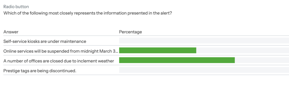
After testing, we discovered Alerts designed with a bright red or bright orange outline were out of the main color palette enough to make users take notice of them.
But color was not the only factor. Solid-colored Alerts tested poorly when compared to ones with only an outline with a light-colored interior.

And, the thinner size invited readers to read the one line of text with a link versus ignoring a thicker banner, with more text, resembling the shape and size of an advertisement.
Ultimately this is only one example of when usability testing can help a visitor’s experience. For your own website, here are some situations when you may find usability testing can save you time and resources: