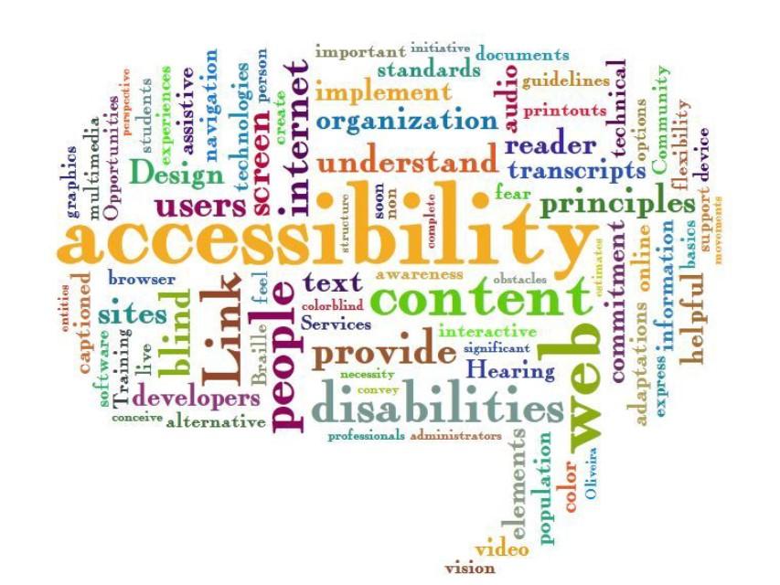
Inclusive Design_word cloud.jpg
An official website of the State of Georgia.
The .gov means it’s official.
Local, state, and federal government websites often end in .gov. State of Georgia government websites and email systems use “georgia.gov” or “ga.gov” at the end of the address. Before sharing sensitive or personal information, make sure you’re on an official state website.
Still not sure?
Call 1-800-GEORGIA to verify that a website is an official website of the State of Georgia.
March 28, 2023
Last month, Georgia’s Chief Digital Officer Nikhil Deshpande delivered a talk on inclusive design. The presentation was an updated version of a talk he did at the 2022 SXSW conference. DSGa Content Strategist Jane Roberts adapted this blog post from the presentation.
Inclusive design is an approach to creating products, systems, and services that are accessible and usable by everyone regardless of ability or circumstance. This includes people with disabilities as well as those who may be traditionally excluded due to their race, age, gender identity, or other characteristics.
An inclusive design considers the practical needs of different cultural contexts and languages to create an experience that is accommodating to everyone’s needs.
“Inclusive design doesn’t mean you’re designing one thing for all people. You’re designing a diversity of ways to participate so that everyone has a sense of belonging,” says pioneering designer Susan Goltsman.
For example, imagine these three scenarios: You need to connect with some audio content on a digital platform but you’re in a crowded subway without earphones, or you have an ear infection, or you simply have difficulty hearing. What do you do? If the designer of that content had considered accessibility and inclusivity in their design, you’d have no problem at all. Why? Because inclusive design thinks out of the box and makes applications accessible in all kinds of situations.
In terms of accessibility, this could mean adding captions or audio descriptions to videos for people who are deaf or hard-of-hearing; providing alternative text for images for people with visual impairments; or using plain language instead of jargon for people with low primary language literacy levels. In terms of culturally sensitive design, it means considering local customs and traditions when designing a product or service so that it can be used in multiple countries without alienating any group of users.
Universal design focuses on making products and environments accessible to all people. It means creating solutions that are usable by anyone, no matter their physical ability or mobility. On the other hand, inclusive design goes beyond accessibility. It focuses on ensuring products are accessible and usable but also that they provide an experience that makes people feel included regardless of any differences they may have such as language or culture.
Inclusive design does not mean creating products specifically tailored to certain individuals or groups; rather it is about designing solutions that accommodate multiple perspectives at once while still providing an equal opportunity for engagement from all users regardless of any differences they may have from the majority population.
It’s also not something you do once; instead, it is an ongoing process which needs continual observation and refinement over time to ensure everyone has access to your product, service, or website without feeling excluded or disadvantaged due to any differences they may have within society today.
For agencies whose mission is to serve their constituents and support an inclusive society, incorporating the principles of inclusive design into your websites can improve the experience for those who have needs or backgrounds different than the majority population.
But what are those principles and how can a content manager follow them? Here are a few guidelines to help you harness the power of inclusivity:
Before diving into web design, step into the shoes of your users. This means embracing diverse cultures, social backgrounds and accommodating those with disabilities or impairments that could make using the site difficult.
Consider how easy it is for people from different backgrounds to understand what you’re writing about. Use plain language that can be understood by everyone who visits your site. If some terms must be used that may not be familiar to all audiences, provide definitions or links to more information on the topic so readers can gain a better understanding of the subject matter if needed.
Keep in mind that individuals engage with your interface in a variety of contexts. Make sure that your interface offers a meaningful experience to all users, no matter their situation. Remember, users can be first-timers, regulars, at work, at home, on the move, or under stress — all of which can affect their interaction. For those with disabilities or who find interaction challenging, these factors may intensify difficulties. Try experimenting with color contrasts, context-specific assistance, and on-the-go captions to create a dynamic, inclusive, and user-focused design that makes your audience feel valued and prioritized.
User-friendly interfaces rely on established designs. Consistent design creates a cohesiveness throughout the interface. This pertains to every aspect, including functionality, behavior, content, and presentation.Consistency also helps users find what they are looking for quickly and easily without having to relearn where everything is every time they visit the site or use the service again.
Give people the power to interact with content on their own terms through features such as adjustable scrolling and playback controls for animations. This can also mean allowing users to zoom in or out of pages when necessary via pinch-to-zoom gestures on touch devices.
Make sure you think about both aesthetic appeal and usability so that visitors can navigate without getting overwhelmed by too much visual clutter on the page. For example, use simple navigation menus. Additionally, ask yourself if your content hierarchy makes logical sense. This will also help people easily find what they’re looking for without having to search endlessly.
Another excellent way to ensure your websites/services/products are designed thoughtfully with diverse populations in mind is by hiring a diverse team of professionals from various disciplines who understand how different populations interact with technology.
One great example of inclusive design is Microsoft’s Xbox Adaptive Controller (XAC). This innovative controller allows gamers with physical disabilities to customize their gaming experience by connecting various external devices such as switches and buttons to their console. The XAC was designed with input from hundreds of gamers with disabilities and has helped make gaming more accessible for millions around the world.
Another example comes from Google’s Voice Access app which uses voice commands to control Android devices and apps. This app enables users with limited mobility due to age or disability to navigate their device without having to use their hands which makes it easier for them to access online services such as banking or streaming media.
Canada has an impressive history of implementing ambitious gender initiatives to address systemic racism and gender gaps. They even changed their national anthem, “O Canada” to be gender neutral by changing the line “True patriot love in all thy sons command” to “True patriot love in all of us command.”
Some other best practice examples include Shopify’s diverse illustration guide featuring various skin tones in product illustrations and Fenty Beauty's broad range of makeup shades for women of all skin tones.
Inclusive design is about understanding user needs from both a technical perspective and a social perspective so that individuals feel included regardless of any differences they may have from the majority population. By incorporating these principles into your website designs, you can create equitable experiences for all users no matter their background or situation.