tiles-image-gsfc.png
An official website of the State of Georgia.
The .gov means it’s official.
Local, state, and federal government websites often end in .gov. State of Georgia government websites and email systems use “georgia.gov” or “ga.gov” at the end of the address. Before sharing sensitive or personal information, make sure you’re on an official state website.
Still not sure?
Call 1-800-GEORGIA to verify that a website is an official website of the State of Georgia.
December 16, 2019
When structuring a website from a user-first perspective, it’s important to connect related content, guiding users from one page to the next. You’ll ask yourself: “If someone is on this page, what else might they be interested in? What will help them achieve their goals?”
There are lots of ways to create a clear flow. If you’re considering an internal page on your site, you might think about the organization of the side menu and links throughout the main body. If you’re working on a homepage or Landing Page, you can choose from a variety of blocks like Promos and Link Collections.
This is the first post in a series considering the different types of content teasers you can use to help people navigate through your site and quickly find what’s important to them. Today, we’re looking at Tiles.
If you’ve worked with Digital Services Georgia for a few years, you might remember us introducing Tiles to the Drupal 7 GeorgiaGov platform in 2017. We’ve used Tiles as a way to visually feature multiple pieces of highly important content, often suggesting it as a replacement for the image rotator that your leadership loves and usability research says isn’t effective. Basically, they are big, bold, clickable blocks that stand out and call attention to key items.
On GovHub sites, we offer three Tile layout options: Image, Image with Text, and Icon with Text.
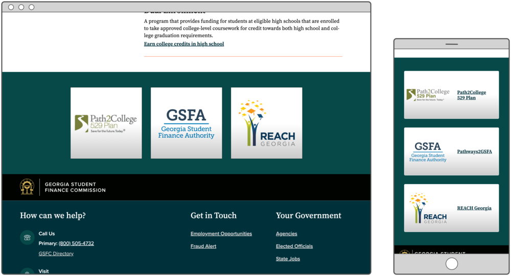
Image Tiles work best for recognizable, readable logos. If your agency offers branded programs or services, your audience knows them by their logos, and the logos include legible names for people who don’t recognize the graphic, this is the right option for you.
See these Tiles on GSFC’s homepage.
Image with Text is the most popular Tile layout because it can accommodate a variety of links. Maybe you’re linking to content that applies to a particular audience or to a program that doesn’t have a well-known brand. With this layout, you can let users identify with a person in the image or help the page feel more friendly, while also providing clear text to explain where it links.
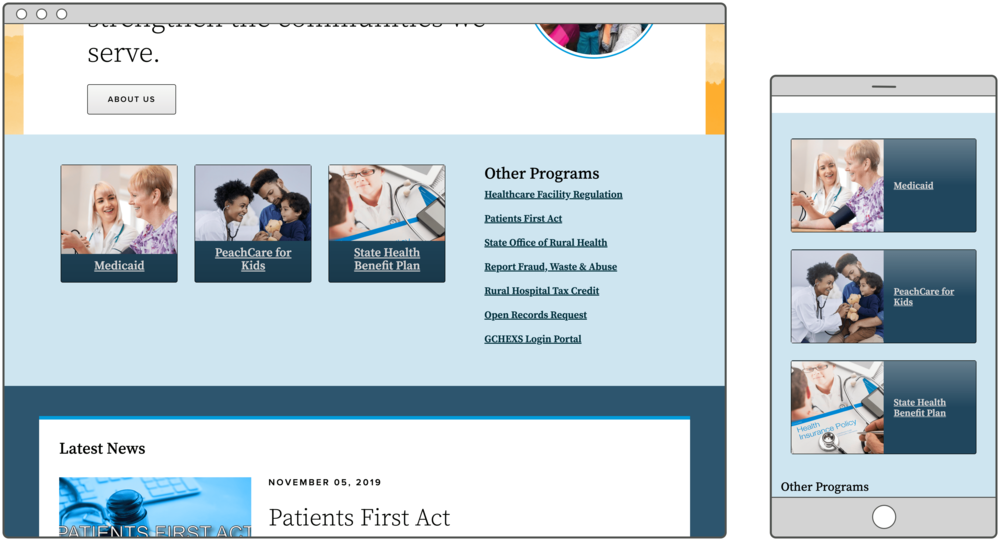
See these Tiles on DCH’s homepage.
Until recently, we only offered Image and Image with Text Tiles. Now, we’ve added the Icon with Text layout to the mix. These can be great if you’re linking to common information like a contact form or list of locations.
This updated design removes some pesky annoyances you might have noticed in Drupal 7, like weird spacing between the icon and the text. Now, as you add more text to an Icon Tile, the entire row of Tiles will grow taller to accommodate. No more overlapping or awkward gaps!
And this brings up a key point:
Don’t mix Icon Tiles with Image Tiles in a single set.
Image Tiles are always square and will not resize along with adjacent Icon Tiles. To keep things neat and tidy, pick either icons or images and stick with it for the entire Tileset.
But we’ll get more into the design logic in a future post. On to the thoughts burning at the top of your mind.
“… where can I link a Tile?”
Anywhere! Tiles can link to any internal or external page.
“… what if my logo is only a graphic, no text?”
If you don’t have any text in your logo, or if it’s too small to easily read, we wouldn’t recommend using Tiles with the Image layout. You might consider Image with Text, but check with your designer or brand manager to see whether it’s okay to overlap text on top of the logo. If not, you should probably try another content type that allows for text along with the image, like a Promo or Call to Action.
“… so it’s basically an Icon List?”
Icon Tiles are definitely related to Icon Lists. Both pair an icon with simple text to feature commonly-accessed content. The difference really comes in their visual weight.
“... these are great! I’m now turning my entire homepage into Tiles.”
Okay, maybe you’re not saying this. But I bring it up to make the point that Tiles are definitely not a one-size-fits-all solution. Let’s compare it to Promos and Link Collections:
As you consider your homepage and other Landing Pages on your site, ask yourself if there’s any highly-important, quickly recognizable content that might benefit from Tiles. And for a more in-depth look at Tiles and other Landing Page blocks, sign up for our class on January 23: Create Successful Landing Pages in D8.