March 09, 2022
Orchard design system too good not to share
For the first time, web developers across state government can access the specs and assets for the Orchard Design System from a dedicated website. We have always provided this design toolkit to all who request it, but now an agency’s technical team can get these resources without having to request them from us.
By now, you know how to identify one of the 60-plus Georgia state organizations that have built their websites on our GovHub content management system. You’re familiar with the branding, logos, icons, typography, and color schemes that signal an official website of the State of Georgia. Many of the state’s most-accessed agencies (but not all) are part of the GovHub family of sites. Whether renewing a driver’s license, registering a business, applying for assistance, or contacting the Governor, a unified system of visual cues helps you find what you need quickly with confidence you’re in the right place. We call this unified design system Orchard. We’ve written a lot about it in the past. So have others!
No matter if you’re reaching the site from a computer, smartphone, tablet, or screen reader, the design works beautifully. This is no accident. A lot of research went into creating Orchard. As the state’s digital presence continues to mature, agencies employ a combination of SaaS tools and specialized channels to serve constituents. Sometimes these are web applications powered by technology other than GovHub’s Drupal codebase. In other cases, an agency’s suite of digital products may include mobile apps or an intranet.
Ideally, the digital experience feels cohesive and seamless to users no matter the page, feature, or application they’re on – and no matter who built it!

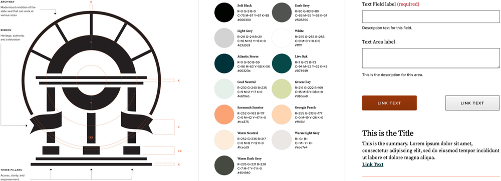
The new Orchard website puts everything related to branding, design, and typography in one ready-to-use place. Orchard’s pattern library collects various text styling, color, icons – and more complex combinations of elements – so designers and developers can match their builds to Georgia’s official brand identity. Logos and wordmark guidelines, along with usage standards can be downloaded along with colors and combinations that comply with proper accessibility standards. Guidelines for photography usage plus a thorough library of spot illustrations allow for a consistent look and feel across all applications. Components will change and evolve over time – no design system is static – so in the future, each Orchard version will include a unique token to be updated when a new version is released. DSGa will be reaching out to agency development teams as we grow the Orchard site to make sure it serves their needs.
Our goal at DSGa is for all Georgians to have a cohesive and successful digital experience regardless of whether the website or application was developed by us. A brand’s identity – paired with voice, messaging, color, art direction, and typography – sets the tone and ensures consistency, unity, and flexibility across all digital platforms, as well as other communication materials. Orchard provides a distinctive, consistent visual language. Providing these assets for easy download from the web encourages agency adoption, making it possible to have digital properties that are unique but feel familiar to Georgians as they interact with their government.
