pexels-rdne-8783531.jpg

Photo by RDNE Stock Project
An official website of the State of Georgia.
The .gov means it’s official.
Local, state, and federal government websites often end in .gov. State of Georgia government websites and email systems use “georgia.gov” or “ga.gov” at the end of the address. Before sharing sensitive or personal information, make sure you’re on an official state website.
Still not sure?
Call 1-800-GEORGIA to verify that a website is an official website of the State of Georgia.
May 09, 2025
When web users can both find information quickly and understand the information after they’ve found it, we say it has a solid Information Architecture (IA). On the surface, this seems reasonably simple, except for two common and ever-pervasive problems that permeate our everyday lives.
Too Much All the Time
Information overload is everywhere we turn. In a single day, a person could sort through dozens of news takes on the same story, thousands of movies and shows to stream, an endless scroll of social media updates, and an overwhelming amount of products on unending retail pages. You may have already encountered one, two, or more of these before reading this very web page. And there’s a good chance a visitor to your website has too.
Banish Brain Strain
One way to combat this information overload is to get your Information Architecture (IA) usability tested. This testing takes a snapshot of how quickly your website users find the information they need. Like a GPS map, it also checks how many wrong turns they took to get there. And the combo of that snapshot and that map, can suggest ways to tweak how your current content is arranged. Zoom out a bit and set your content up to grow with streamlined paths, even if there are a lot of content contributors paving a lot of roads.
Defeat Distractions
The second thing your site has to survive is the environments and mental states visitors will be in when they view it. A mobile phone user could be standing in line at the grocery store, waiting on a train platform, or sitting on a park bench. Can they complete tasks while looking at your content on a small screen? Meanwhile, a laptop user could be in a noisy coffee shop or on their sofa after a long, exhausting day. Could they locate what they need even when distracted?
Sometimes the government agency itself can be the source of overwhelm. Labels and categories that make sense to the agency might confuse the average citizen. Usability testing can uncover that gap and offer evidence-based solutions to bridge it.
Letting Users Lead the Way
One example of successful Information Architecture testing comes from a website vital for parents who need specific services early in their child’s development. Because of how important it is to identify if a newborn may need their services, the agency needed to make sure parents wouldn’t put off screening their children out of frustration with navigating the website. So we ran two usability tests specifically aimed at Information Architecture.
Starting the Journey
A visitor’s very first move on a website is an excellent indicator of their eventual success. When a website user’s first click is correct, they are nearly three times more likely to complete the task successfully. Clicking on the wrong thing first often leads to frustration and an incomplete task.

An example of how this worked when testing the original IA for the site showed almost half of testers selected a resources tab for their first click. Unfortunately, the resources tab would only help users complete one task out of the eleven they were given in the test. Having a catch-all category in your menu is common – after all it sounds logical from the agency’s point of view. But from the website visitor’s point of view, our tests show it often leads them astray.
Like a Website GPS
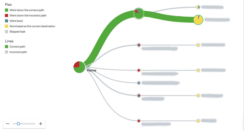
Of course, a visitor might have to click more than once, just as you might have to make more than one turn onto a road to arrive at a desired destination. In our example, we did a usability test called a “tree test” to make sure users could find their way. In the following image, you can see the goal was to give users one easy-to-follow route and not have them lost and backtracking among too many options. After conducting the tree test to show where users were both succeeding and not succeeding, changes were made to organize the site from birth through school age. This clarified what parents needed to focus on at every stage.
The green line shows how often the correct path was followed. Meanwhile, each yellow circle shows where someone expected the answer to be.
The new site also defines the difference between what labels like "language and literacy" mean to parents on a practical level right in the top menu. And, both professionals and partner organizations are easy to find.
Ultimately, for your own website, usability testing can be a part of a larger strategy or focused on a specific issue.
Here are some examples of when usability testing is a good idea: