September 27, 2016
Content Manager’s Guide to the 3 Principles, Part 1: Text, Tables and Documents

This is the first post in a 2-part series guide for content managers to adhere to Digital Services Georgia's 3 principles.
In the past few years, we’ve ran initiatives to make our agency websites responsive, accessible, and optimized for performance (what we call “performant”). Last month, Kendra Skeene explained our part in these initiatives. If you’ve read her article, you should know why we’ve focused on these 3 principles and how we make sure websites on our platform meet them.
You should also know that in order for our agency websites to meet these principles, part of the responsibility lies with you. We can tweak the code and make all of the platform-wide changes possible, but unless our agency partners follow through on their end, the websites might still fall short.
Text Content
The vast majority of content on your website is text. When people come to your website, they’re looking for specific information and nearly every time, they’ll find it in the text of your pages. So it’s extremely important to make sure that your text content meets their needs.
We’ve already taken care of a lot of the nitty gritty when it comes to making your text fields responsive, accessible, and optimized. In fact, for just basic text, you don’t even need to worry about taking extra steps at all to keep it responsive or performant. But when it comes to accessibility, there are still a few vital pieces to keep in mind:
-
Use the built-in headings to label sections.
-
Break up information with section headings, new paragraphs, bullet points and numbered lists.
-
Use descriptive hyperlinks (rather than “Use descriptive hyperlinks: http://webaim.org/techniques/hypertext/”).
-
Create FAQ pages with the Index List content type for ease of access.
For more writing tips, check out our Content Strategy Playbook.
Tables
Tables are actually a specific element of text content, but they can be a bit finicky when it comes to proper formatting for our three principles.
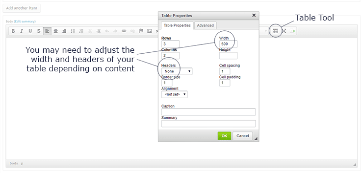
If you’re duplicating a table from another webpage or a document into the WYSIWYG (What-You-See-Is-What-You-Get) text field, you can’t just copy-paste or the table won’t format correctly. You’ll need to use the tool in the WYSIWYG to create a new table and paste each piece of information individually into the cells.

The default setting for inserting tables into the WYSIWYG on our platform is for them to be 500 pixels wide and have no headings. Often, these settings work just fine, but there may be times when you want to change them:
-
Remove the width dimension for tables to be full width at all times.
-
Specify a smaller width for tables that have little information (such as two-digit numbers) in each column.
-
If your first row or first column is a header, label it as a header in the Table Properties. This will allow screen readers to correctly read the tabular information to users with disabilities and make the table easier to understand for everyone.
Always double-check your tables before publishing. Resize your window to make sure the table will look appropriate for all screen sizes, and keep in mind that if your table has too many columns to fit in its allotted space, it will have a horizontal scroll.
And most importantly, only use tables for data. Data in this case includes numbers and other information that’s best understood when it’s organized into rows and columns. Never use tables to determine the layout of your page, as this causes issues with responsiveness and accessibility.
Documents
As a rule of thumb, we recommend that you limit the number of documents — PDFs, Word docs, etc. — on your site as much as possible. Documents take extra time to load (affecting performance), and they are often not accessible. Even when documents are accessible, the extra click to download is yet another step for users to go through before they can get to your content. Whenever possible, convert documents to text content on your websites.
However, there may be a time when you decide a document really is the best way to present a piece of information. When this is the case, it’s still possible to make your documents accessible with proper structure, alternative text, hyperlinks, and accessible exporting practices. Learn how to make your documents accessible with our web guide.
For the People
As much as we’d like to believe otherwise, only our mothers visit our websites to casually browse around and fill an afternoon. People come to government websites with questions and needs, and they want to leave with one more item crossed off their to-do lists. Our websites are vital to the people of Georgia. We have a responsibility to make them user-friendly with responsive, accessible, and performant practices.
Related Link
- Part 2: Images and Video
