UX Teaser Image
An official website of the State of Georgia.
The .gov means it’s official.
Local, state, and federal government websites often end in .gov. State of Georgia government websites and email systems use “georgia.gov” or “ga.gov” at the end of the address. Before sharing sensitive or personal information, make sure you’re on an official state website.
Still not sure?
Call 1-800-GEORGIA to verify that a website is an official website of the State of Georgia.
December 27, 2021
Testing features in GovHub is always full of surprises. We might go into a test with a hypothesis but end up with a whole new perspective after watching our test users. Sometimes the results will be tied, and we’ll have to search for tie-breakers. But the really interesting cases happen when the results in one test flat-out contradict the results in another. Let’s look at a case when the numbers told us one thing, but we were inspired by our users to declare a different choice the winner.
Designing a pleasant user experience is like designing a local neighborhood restaurant. Do your patrons want to walk around buffet tables or do they want to keep all their kids together in one place, tucked into a corner booth?
Recently we tested 2 versions of a GovHub menu that editors use to create and manage site content. Like a restaurant menu, we wanted to provide everything a user could do without overwhelming them with choices. For the first section of this test we showed users a short menu dropdown and a longer one.
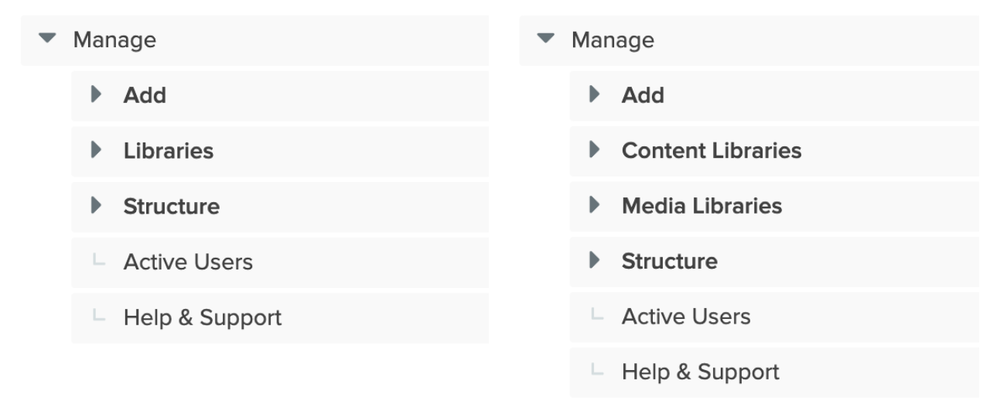
Test results showed the shorter menu was both faster and yielded slightly more direct answers. However, time after time, testers ranked tasks using the short menu as being either “difficult” or “very difficult” to complete.
We thought we were giving them a fast food drive-through experience with our short menu. But their actual experience was more like working as a restaurant delivery driver in a city with lots of one way streets. They found their answers but it took a lot of mental effort. The first test group marked tasks as “difficult” or “very difficult” 3 times as much as the second test group that used the longer menu. Meanwhile, the test group that used the longer menu was slower and only marked a task as “difficult” twice. It was as if these users wanted a few extra choices on the buffet. While this group was slower using the longer menu, they were more confident they found exactly what they wanted with less mental effort.
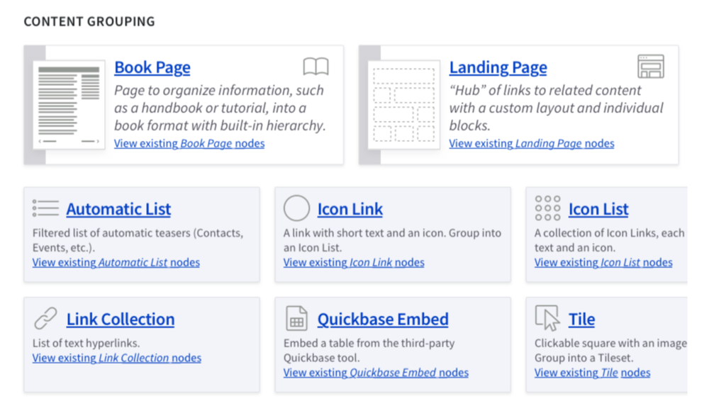
The second part of this test involved a visual menu we call “Type Tray.” One set of testers saw a version of the page (Option A) with Micro-Content types placed directly under the regular content types that often go together. It was like a restaurant menu showing all the side dishes usually ordered with a steak directly under the steak menu item.
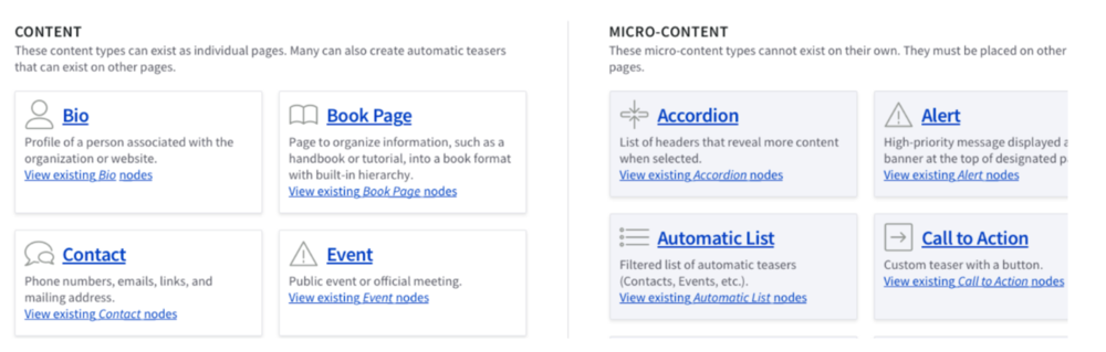
Meanwhile another set of testers saw a version of the page (Option B) with Micro-Content types kept together in a column on the right side. It was like a restaurant menu showing all the entrees listed together and all the side dishes listed separately on their own.
Contradictions emerged here as well. The A group completed tasks more quickly than the B group with a slightly higher success rate.
However, when asked for feedback, the A group was more likely to express confusion over how the content was organized. The testers proceeded to offer us their ideas for how to better organize the content. One even suggested the option we tested with the B group! We took note, since the tester did not even know there was another test group.
Meanwhile, the testers viewing Option B gave us entirely different feedback. They told us it was user-friendly, and most importantly, easy to understand. If anything, they’d make minor additions such as tutorial links. No one in the B group felt it necessary to offer up their suggestions for reorganization.
The first thing to do if you think you’re serving a 5-star dining experience but feedback says otherwise, is to look for unexpected factors. For example, in spite of using a randomizer, one group ended up with a lot more users who told us they frequently updated the website.
This experienced group struggled most with the short menu. This suggests their correct answers may have had more to do with the testers’ GovHub expertise than our new menu option
This behind-the-scenes look at how we test potential new GovHub features offers some everyday lessons for your website. When making content decisions and looking at your visitors’ feedback, be open to unexpected revelations. When you see signs that users are confused or are having a hard time finding things on the first try, pay attention! If you can eliminate confusion and keep paths as clear as possible, your site’s visitors will not only thank you for it, they’ll come back for seconds!