November 13, 2024
Building a Welcoming Gateway for Community-Building Services
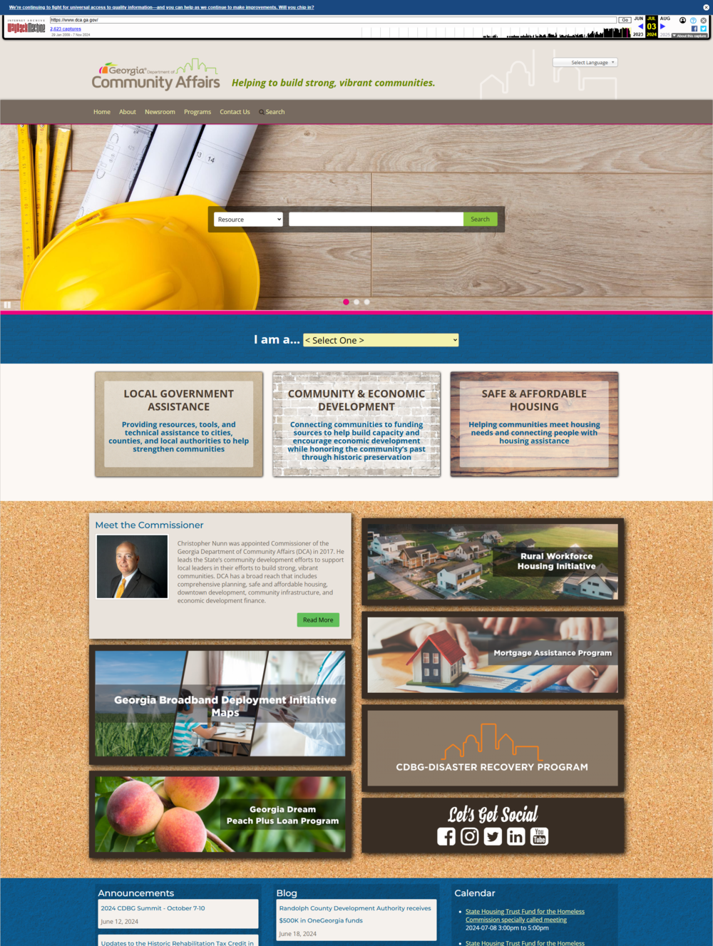
In every way imaginable, the Georgia Department of Community Affairs (DCA) is massive. Their sheer size, from programs to audience types to digital content, and the nature of their site structure, offered us large-scale challenges as they recently joined GovHub, the state’s digital publishing platform.
Opportunities and Challenges

DCA performs critical work for Georgians. From historic preservation to housing assistance, and community development to disaster relief, their goal is to build prosperous communities all across the state. As a result, the agency manages nearly 100 programs and serves many audiences, including program recipients, homeowners, local governments, and developers. They amassed a repository of more than 10,000 files on their existing website.
Further, DCA had numerous content editors and subject matter experts spread across various departments, all contributing to the website without an established, organization-wide content strategy or set of editorial standards. Onboarding required getting many people properly trained and on the same page. In that regard, DCA isn’t unique. We work with many agencies that have dozens of individuals across a range of departments all contributing to their agency’s website.
Then there were the technical issues to consider. DCA’s website was built with an older version of Drupal that sometimes worked in unexpected ways. While performing a site-wide content audit, we realized that their document content type could actually contain several files within one node, or content instance. So even if there were 7,000 document nodes, there could be 10,000 total documents, and we had no way of accounting for them or linking to them individually. (See? Content audits really do come in handy!)

DCA also developed unique content types for their needs. We needed to translate that into GovHub in a way that made sense for the agency. Pages to showcase their programs contained fields of structured content and tags to reflect relationships to other content, such as other programs or parent initiatives. Municipal planning documents were tagged and nested within a hierarchy of city, then county, then region, creating automatic lists of tagged content. It took some careful thought to recreate this in GovHub in a sustainable way.
To make matters even more complicated, over time some content editors had begun to use content types that were not appropriate for the content they were posting. This often broke the user path and disrupted uniformity across the website.
Consistency was a key theme throughout this entire project. We wanted to create a seamless user experience, no matter the audience. One of DCA’s biggest goals was to simplify the user journey, not just through editorial standards but more navigable paths through the site. Content on their site usually required clicking through many pages, with unclear next steps. Information could be buried six or more layers deep. Users would often give up and just contact someone at the agency.
And there was a hard deadline looming: the current site was running on Drupal 7, which was about to reach end-of-life. That meant we had to accommodate strict timeline constraints in order to get the new site up and running.
Consistency and Sustainability
Content Considerations
We approach every project as a two-way learning process: we need to understand everything the agency does and how they function while they are introduced to content strategy best practices.
Collaborating on the content audit was critical to understanding everything DCA houses on their site and how to best organize it all. It helped us discover the multi-document issue and develop a plan to migrate all the necessary documents.
Then we had to go a step further. Since DCA’s Drupal-based site contained custom content types, we took an inventory of the types and their functionality to map it to a corresponding content type in GovHub. If something didn’t work exactly the same way in both systems, we came up with a plan to achieve the same end result within ours, making sure these solutions were scalable, sustainable, and easy for DCA’s content editors to maintain.

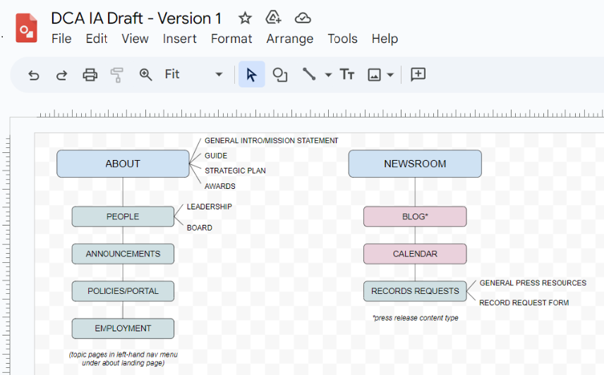
We went through several iterations of an information architecture. This wasn’t just the main navigation – we had to map out how all information would interrelate and what a user would experience when trying to complete a task. Each step in a journey had to be clear, including contacts and calls to action. We had to think carefully about how taxonomies could be used to tag information and create automated groupings of content.
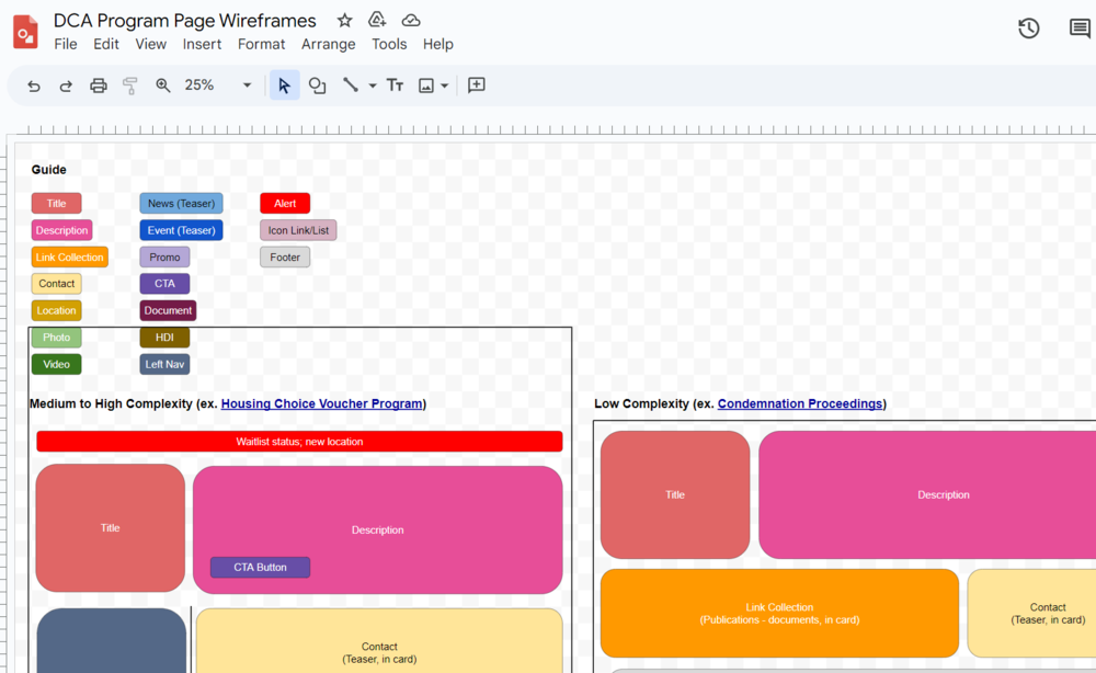
To standardize content, we created a series of templates for program pages – the bulk of their website content – that demonstrated how content could be displayed on program pages, depending on how much and what types of content were used. This helped maintain visual consistency while accommodating each program’s varying needs.
The benefit of creating these templates was two-fold: we reduced decision-making when building new program pages in GovHub by organizing information in a similar style. We could also hand over the templates to DCA as a guide for future content creation.

Technical Considerations
While GovHub onboardings are typically a manual process, this site and its many documents was far too large. So we asked our development partner to help automate some of the migration. Once we dug in, we realized what a major challenge this would be.
Not only were there thousands of documents to move, we also had to account for the way documents needed to be grouped together for display. The automated migration included building in custom tagging and functionality for grouping documents, and numerous custom views for display
Lessons for the future
It would be natural to assume that because we’ve onboarded nearly 90 sites to GovHub, we’ve seen it all. But that’s hardly ever the case. We learn just as much from how agencies operate and deliver services as they can learn best practices from us. Our work with DCA taught us a few new things, including:
Don’t just delve into the content, delve into how the content is managed. We’re used to having plenty of discussion with agency subject matter experts in order to understand the entire agency inside out and recommend appropriate content strategies. But we also needed to pick apart how their existing CMS worked so we could develop a comprehensive migration plan and flag any potential issues early in the process.
Put in the work early to standardize and streamline to make managing your site easier in the long run. Page templates, content workflows, user management plans, editorial guidelines: taking the time to develop these and educate everyone involved in the maintenance of your site will pay dividends over time. The benefit to users is a consistent experience. The benefit to your agency is less time spent on creating, editing, and archiving content.
Use content audits to your full advantage, but don’t make assumptions. There was a significant amount of content “hidden”. Only once we discovered this did we realize the true scale of the site and the work needed for migration.
Automate wherever you can. Automated migration of the more than 10,000 existing documents was a game-changer. If we had to do it over again, we’d actually automate more than just documents.
