September 28, 2023
Exploring the New GDC Website: A Glimpse into a Modernized Digital Experience
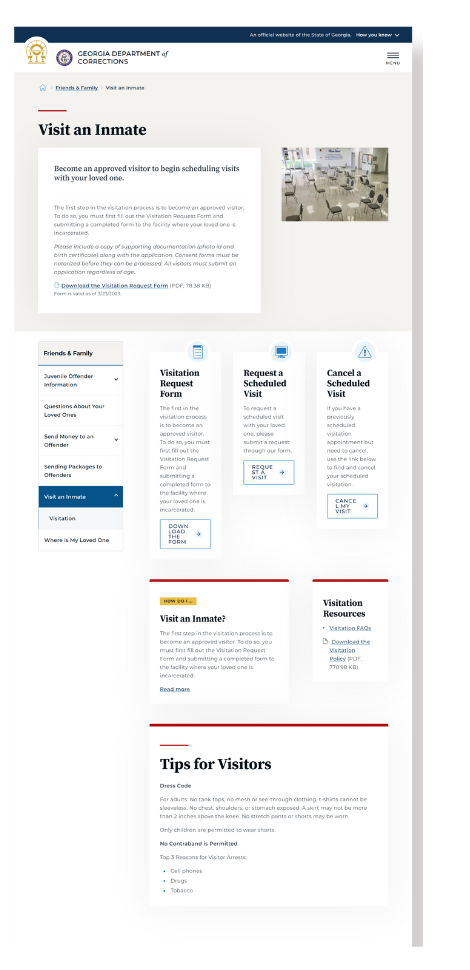
We recently partnered with the Georgia Department of Corrections (GDC), marking a significant shift from agency-informational to citizen-centric service. In their migration to GovHub, GDC placed a strong emphasis on ensuring good usability and easy maintenance. Through data analytics, we updated GDC's website to prioritize the needs and experiences of its users, particularly those seeking critical information about incarcerated loved ones. The site now highlights immediate accessibility to essential tasks like facility location and inmate visit scheduling, while strategically hosting policy and procedure links for internal use. This data-driven transformation underlines our commitment to creating accessible, transparent, and user-friendly digital platforms.
Let’s dig in and take a closer look at this collaborative transformation, starting with a quick look at the difference between the private and public sectors.
Private vs Public
In the private sector, the primary focus of a company's website is often self-promotion. They use their digital platform to showcase their accomplishments, unique selling points, and reasons why customers should choose them over their competitors. This approach aligns with their ultimate goal: to drive business and increase profits.
However, government agencies exist to serve the public. Our websites are not commercial platforms but conduits for public service. We have a distinct mandate: to provide information, resources, and services that citizens need to interact with the government effectively. This necessitates a fundamentally different approach to website design and content, one which makes it easy for visitors to find the information they need, understand how to access services, and feel confident that they're being served efficiently and transparently.
So, while private sector websites might say, "This is what makes us great," a government agency's site should communicate, "This is how we can help you." It's a shift from self-centered communication to citizen-centric service – a reflection of the public service ethos at the heart of every government agency.
Let’s look at the GDC website as a case study in putting users’ needs first.
Putting User Experience at the Forefront
Visitors to the GDC website often find themselves in critical situations, seeking important information about a family member or friend who is incarcerated. They may be part of a church community looking for ways to extend their support, or jobseekers exploring career opportunities within the Department of Corrections. Whatever their reasons, they visit the site with a clear purpose in mind.
Previously, the website focused on showcasing the agency's accomplishments, such as ranking as one of the top departments in the nation for the number of persons under supervision, whether in prison, jail, parole, or probation.
We used analytics to gain a deeper understanding of why people visit the site and what they aim to achieve. As a result, we understood that Georgia's ranking as one of the largest prison systems in the U.S. isn't what matters most to users. What matters is the well-being of their loved ones. They want to know how to find them, how to visit them, and how to send them money. This valuable insight guided the website revamp, shifting the focus from self-promotion to serving users better.

Form Follows Function
Through analysis of the agency’s functions, information, and data structure, the GDC site relaunched in July 2023, on the state’s GovHub platform. This change is not just about aesthetics; it's about ensuring that everyone, especially constituents in crisis, can easily access the information they need without frustration.
On the homepage, users are greeted with a clear layout that intuitively highlights the most essential tasks. Whether it's locating a facility, scheduling a visit with an inmate, or accessing important forms, the top tasks are readily available. This streamlines the user's journey, allowing them to complete tasks efficiently and hassle-free.
One of GDC’s major pain points with their old site was user navigation. The website didn’t offer a location-based hierarchy to show users where they were within the menu structure. Having users rely on the browser's back button can quickly turn an experience into a memory game. We created clearer navigation paths in GDC’s new GovHub site.
Another point to consider was how to handle the department's Policies and Procedures content. These pages were linked to but hosted on a separate domain and wouldn't appear in Google search results or the site's search function. We made sure these employee-specific links were out of public view, but still easily accessible to the internal team.
Empowering Content Managers and Collaborators
Behind the scenes, content management has been streamlined with updated information architecture (IA), making it easier for content managers and collaborators to keep information up to date. Using automatic listing pages with a strategic taxonomy, GDC ensures that information is structured logically and presented in an easily digestible format.
Transparency and Accountability
The GDC website demonstrates a commitment to transparency and accountability through sections like "About" and "Board of Corrections." Profiles of board members, meeting summaries, and comprehensive reports give Georgians insight into the agency's operations and decision-making processes. Our content audit enabled the team to identify information that may be required by law, and ensured it is accessible and presented in context with the rest of the agency’s content.
Lessons for Content Developers Everywhere
The transformation of the GDC website serves as an inspiration for content developers across government agencies. Here are a few key takeaways:
- Human-Centric Approach: Prioritize user experience. Understand your audience's needs and design with empathy.
- Accessibility is a Civic Responsibility: Ensure that your website is accessible to all, meeting standards for inclusivity.
- Clear Navigation: Simplify navigation and prioritize essential tasks to make the user journey seamless.
- Content Management: Streamline content management processes, making it easy for collaborators to keep information current.
- User-Driven Design: Tailor your website to the specific needs of various user segments.
- Transparency and Trust: Build trust with simple, natural navigation and by providing transparent information about your agency's operations and decision-making.
Maintaining Brand Consistency
A crucial aspect of our collaboration with GDC also involved providing them with our branding for the hat, header, and footer. The intention behind this move was to create a cohesive user experience (UX) across all GDC web applications and the newly redesigned website. We understood the importance of brand consistency in enhancing user recognition and trust. By matching the design elements across platforms, we not only strengthened GDC's brand identity but also ensured a seamless transition for users navigating between the various applications and the main website.
Embarking on a Digital Journey
GDC’s website transformation is more than a technical upgrade; it's a commitment to a more user-centric, accessible, and transparent future. As government agencies like the Georgia Department of Corrections continue to lead by example, the digital landscape becomes a space that truly serves and empowers residents, employees, and stakeholders alike.
