June 23, 2023
FAQs Are the Junk Drawer of Online Content
You know that junk drawer that lives somewhere in your house? It’s the one where all sorts of odds and ends that don’t quite fit anywhere are unceremoniously shoved, growing into an unruly mess that only gets worse with time. Pretty soon you’re digging through old receipts, 3 half-used tape dispensers, and keys to… you’re not quite sure what anymore, just to find that pair of scissors.
Well, meet the junk drawer of online content: the FAQ page.

While FAQs are found everywhere, public sector sites seem to be particularly reliant on them, likely due to the large amount of information agencies want to (or have to) make available to the public and the fact that many agencies don’t have staff who are able to work on their website full time. But just like that junk drawer lurking in your kitchen, FAQs usually become a dumping ground for everything that didn’t feel like it fit somewhere else.
FAQs make your content difficult to find and sift through. They often don’t relay information in a way that’s comprehensive and easy to understand. They demonstrate that the organization of your site isn’t working for your content.
Simply put, FAQs represent a failure of content strategy.
Why FAQs Represent Failure
Here’s a rule of thumb: if you know something is frequently asked, that’s your first clue that it should be part of your content, not hidden in a list. Provide the answer up front so your users don’t need to ask.
When FAQ pages are particularly lengthy, or a large number of them exist, it’s usually a sign that a site’s information architecture isn’t working. Information architecture (IA) refers to how information on a website is organized, labeled, and designed. If a lot of your content doesn’t seem to go anywhere, your organizational structure isn’t working for you.
Lengthy FAQs could also signal that your site hasn’t been maintained well enough over the years. Content may have piled up without ever being assessed for accuracy, relevance, or timeliness.
Are You Guilty of These FAQ Dumps?
Do you have an FAQ that says, “How do I contact someone?” Having an FAQ page for basic contact information is counterproductive since users shouldn't have to dig through a list of frequently asked questions to find a phone number or email address. Why isn’t the contact information on the homepage or in a designated "Contact Us" section?
Does your FAQ merely restate information already provided elsewhere on the website? The last thing you want on your site is redundancy. Let’s say you have a detailed product description page, including features, and pricing. If your FAQ page repeats the same information in a different format or wording, your user may get confused. And you will have difficulty maintaining it in both places when information inevitably changes. Instead, create a well-structured and clear product page that anticipates and answers potential questions. And then, no need for FAQs.
How to Clean Up Your FAQ Junk Drawer
Like any good organization project, you first have to decide what stays and what goes. Ask yourself: do we really need this content? What is out of date? What is no longer relevant? Who is the audience for this content, and do they really need the information?

You can answer many of these questions by digging through your analytics. Agencies on the GovHub platform have access to Siteimprove, a powerful analytics tool. Take a look at what content is getting the most traffic and what doesn’t generate much interest. Review what people on your site search for. Analyze heat maps, for example, and scroll depth to figure out where users are reading and clicking.
Always assess your content from your users’ point of view. Do they actually care about this information? Is it easy for them to find what they’re looking for? Is it explained in a way they understand? Analytics will give you some idea of who your audience is and how they interact with your website, but to get more detailed information, consider site surveys and feedback forms. If you can, conduct focus groups and user testing.
Perform a content audit with key members of your agency to review all the content on your website and decide what to do with it. It’s as simple as setting up a shared spreadsheet document with a line for each page or piece of content and marking whether you’d like to keep, delete, combine, or split that content. Get subject matter experts, content managers, and key stakeholders to pitch in. Organizing your content will be much easier once you’ve established what you can purge, what’s important, and who you’re talking to.
Now that you’ve assessed your content and audience, look at your IA. How is information on your site grouped and organized? How are topics presented? Have you thought about the way a user will move through the site and interact with your content? Read through our information architecture blog post to learn more about creating an effective IA. If you’d like to work with us to tackle your IA project, send us a message!
Chances are you have some (or a lot of) information in your FAQs about the services your agency provides. That can easily be lifted out of your FAQs and grouped with service information in other GovHub content types. It'll be easier for users to find, which is handy since most users are likely coming to your site to access some kind of a service. And don't forget: providing information can be considered a service too!
Think in terms of pain points. Good content creators understand their users' pain points and design their content accordingly, rather than thinking up questions that users will ask. If you know what users will ask, then provide that information where they would expect to find it, rather than dumping it in a catch-all FAQ page.
Converting your information from a question-and-answer format may also help you decide where it fits. You’ll find that the Q & A format often isn’t necessary to explain a topic. Turn those answers into short, plain-language explanations or instructions rather than creating expansive questions and lengthy, hard-to-follow answers.
Structured Content Types to Use Instead
GovHub has several structured content types that may be more appropriate for your content than FAQs.
Program or Service Page
A Program/Service Page allows you to outline a service your agency provides to the public or other agencies. You can explain the available service, who it’s for, how to access it, and other important details.

How Do I
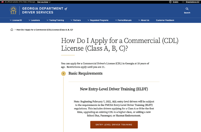
How Do I’s allow you to explain complex, multi-step processes in detail. You can even add relevant contacts, deadlines, and forms. This content puts all the information in one place for the user. It also reduces the number of calls and emails you’ll receive, asking similar if not identical questions.

Landing Page
If you have a lot - and we mean a lot - of information about a particular topic, a well-organized landing page might be appropriate. By far the most flexible content type, a landing page devoted to one topic will allow you to share and link to various pages, highlight important deadlines, call attention to specific information, and even include forms, contacts, and documents.

Hopefully this inspires you to dig into that virtual junk drawer of yours and create more user-friendly content for your agency’s website.
