December 11, 2020
How We Use Alerts on Georgia.gov During COVID-19
Alerts are an effective way to make sure important content is seen, but that message gets lost if you ignore best practices. We thought it would be instructive to highlight how we rolled out the Alert feature on Georgia.gov early during the COVID-19 pandemic, and how we adjusted our approach as time went on.
We often use the Alert feature when something occurs that’s not business as usual. Examples may include when the Governor declares a state of emergency for a hurricane or when office hours change due to a holiday. Perhaps a public comment period is open, and you want that message to be the first thing users see when reaching your page.
During the COVID-19 pandemic, many state agencies made changes to normal protocols and day-to-day operations. Due to the extraordinary and abrupt nature of these changes, many sites — including Georgia.gov — chose to use the Alert feature to direct users to the most recent information about the pandemic’s impact on state services.
Alerts are designed to be used in special circumstances. COVID-19 certainly qualifies. However, this old adage applies here: If everything is special, nothing is. As you’ll see in our example on Georgia.gov, we got carried away and broke some of our own rules in our zeal to help Georgians during the pandemic. We’ll show you how that ultimately may have been counterproductive.

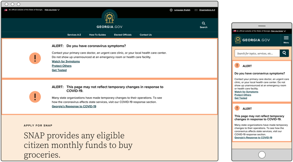
At the start of the pandemic, we coordinated with the Department of Public Health on messaging and focused our main Alert on health questions. At that time, it was important for people to understand what symptoms to watch out for and how to protect themselves and others. We created an Alert that read, “Do you have coronavirus symptoms?” and included links to three different pages on DPH and the Centers for Disease Control and Prevention. We placed this Alert at the top of every page on the entire Georgia.gov site. We justified it by saying this was an extraordinary circumstance, and we pulled out all the stops.
At the same time, because state services and operations had abruptly changed, many of our service pages on Georgia.gov suddenly had outdated information. We built a new resource page that tracked changes to state services — from unemployment insurance to professional licensing to elections. Because changes to things like in-person appointments, deadlines, and processes would surely be temporary, we didn’t want to undertake the arduous task of updating every service page on Georgia.gov, only to have to update them all again a short time later. Of course, we were overly optimistic at the time about how long this would last. We figured we’d solve the issue by posting an Alert explaining the temporary changes, and direct users to our one-stop service page reflecting all changes due to COVID-19.
If everything is special, nothing is.
Our heart was in the right place, but on many pages this resulted in two stacked Alerts, a UX no-no. This makes for a particularly bad experience for users on mobile devices. Our overly wordy messages combined with multiple links made these Alerts less effective than they could’ve been.
Our own analytics showed that users barely clicked on any of the three links provided. In addition, we repeated the same content about symptoms, safety protocols, and testing elsewhere on the page. Furthermore, we began asking ourselves if visitors to Georgia.gov were looking for or expected this information from us in this way. As usual, our users gave us the answer with their behavior. They weren’t clicking on the links.

With some distance from our initial heightened sense of the situation, we started to understand COVID-19 would be with us for a while and we needed to evolve toward a new business-as-usual approach.
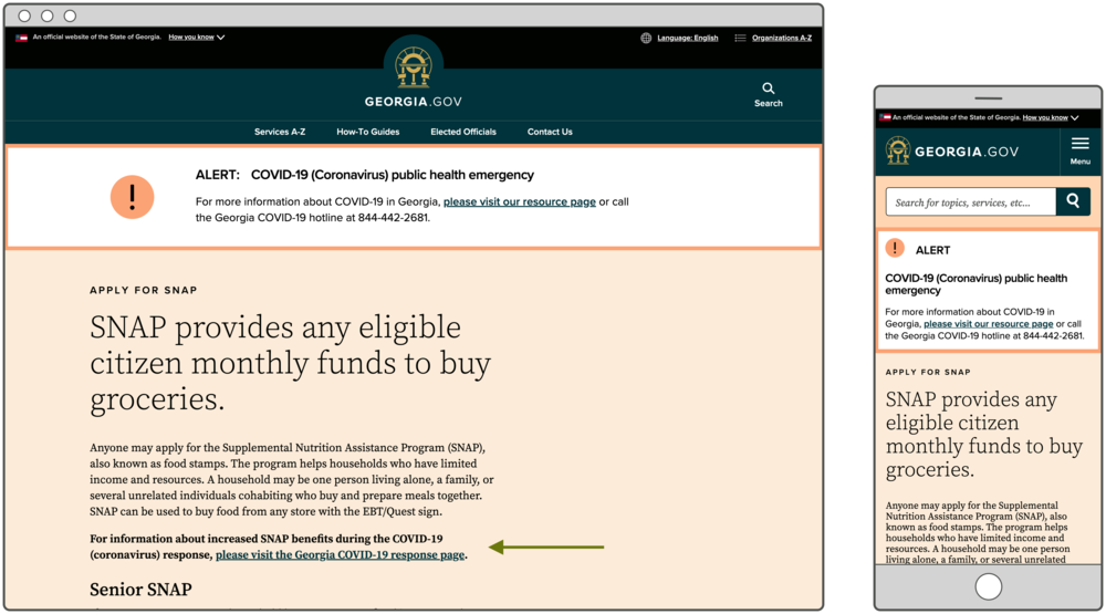
Given that we are still in a state of emergency, we felt an Alert was still justified across Georgia.gov. But we shortened the message (and imposed a 250 character limit) and linked to a redesigned resource page that included only the most pertinent and accessed information. We eliminated the second Alert that was appearing on some service pages and included an in-page link to address changes to services only where applicable. Users looking for information about state services are more likely to see it within the context of the page.
We made a spreadsheet of every page that had content potentially affected by changes due to COVID-19. If we had information about those changes on our resource page, we added an in-context link to the resource page we’d be updating daily. And we’ll continue with this process while state services are affected by the COVID-19 pandemic.
While our initial implementation of Alerts provided timely information, it wasn’t as effective as we could make it. Armed with data and reminders of best practices, we changed our approach. We encourage you to consider these guidelines as you use Alerts on your site:
