January 17, 2019
From Personas to People: Usability Testing GPSTC’s Redesigned Website

Personas Influencing Design
A little over a year ago we helped the team from the Georgia Public Safety Training Center (GPSTC) develop personas as they prepared to redesign their website.
Even though GPSTC isn’t using the GeorgiaGov platform, they wanted to leverage our expertise in content strategy and user-centered design. A few of us spent the day at the GPSTC headquarters in Forsyth learning about their users, then developed their personas based on the gathered data.
The purpose of the project was to help GPSTC understand their site’s audience. At the time, the site was full of helpful content but it wasn’t organized for users to intuitively find what they needed. Like several agencies we’ve talked with, the GPSTC team got a lot of unnecessary phone calls about information that was on the site, but that users couldn’t find.
Referencing the personas and recommendations from our team, GPSTC set out to make their site user-friendly and approachable while preserving trust with users.
Testing the New GPSTC Site
Fast-forward to fall of 2018 and GPSTC completed their site redesign. However, they still had questions about the site’s usability.
Adam Ham, GPSTC’s Chief Technology Officer, reached out to our team to see how we could help. We started this 4-step approach:
- Intake
- Analytics
- Heuristic
- User Studies
Step 1: Intake
We knew we had to test the site with real users. But first, we had to know what to test.
Since the GPSTC team could name what their users struggled with in the past, we knew they would have specific scenarios in mind. During Intake, we learned these scenarios and their business goals for the project.
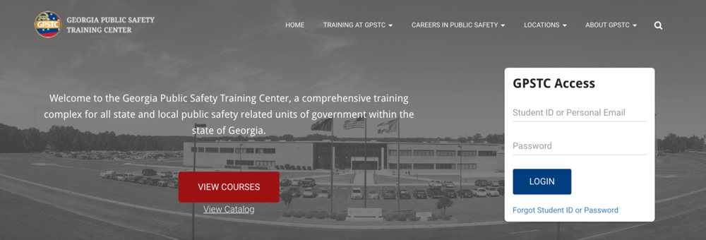
For example, they added a box to the homepage to let returning users sign into their training dashboard and wanted to find out if people were using it.

That takes us to step 2.
Step 2: Analytics
Last year, we gathered usage data from the old site to help develop the personas. After the redesign, the question was how that changed. Rachel, our UI/UIX designer, looked at how people get to the site, what pages they view, and how they moved from one page to the next.
At this point, a lot of this information was just good-to-knows. Without a specific goal in mind, data is not actionable. But now that the content team knows the “Become a Firefighter” page has significantly gained in popularity while the “Basic Law Enforcement Training Program” page has decreased, they can infer how changes to site structure and organization has impacted user patterns. Set your goals, tweak the site, and see how data changes over time.
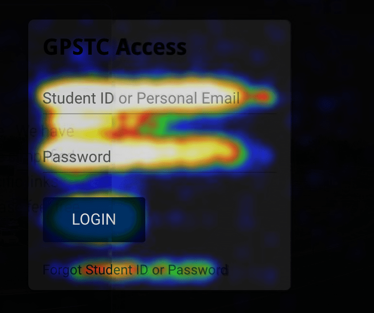
And that login box? With one glance at a click heatmap of the homepage, we saw that people clicked on that box more than anything. Question answered!

Step 3: Heuristics
The data could answer a few simple questions and give the content team some pieces to watch for in the future. But numbers can’t answer everything.
Before we could test with users, we needed to establish a baseline. A heuristic evaluation lets us identify quick fixes and areas for specific analysis. If you’re interested in learning more about heuristics, Jasmyne, our testing lead, wrote a blog series where she explains what a heuristic evaluation is and how to create a usability testing plan.
But for this project, we wanted to:
- Test against standard usability best practices
- Identify low-hanging fruit
- Determine specific areas that may need further analysis
While Rachel dug into the numbers, Jasmyne examined the site’s usability through the lens of universally-recognized best practices. The new site received a 92% rating, getting 258 points out of 280 possible points.
Jasmyne put together a list of issues, based on the results of the heuristics test, that needed to be fixed to improve the score of the site. We presented our findings to the GPSTC team so they could consider and remedy simple issues before usability testing.

To better understand what a heuristic report looks like, check out the one we put together for this project:
Step 4: Testing With Real Users
It’s important to test with people who accurately represent the range of real users for the specific site. Based on GPSTC’s personas, we knew that a variety of people need their site: from trainers, to current firefighters and law enforcement officers, to people who want to be firefighters and officers. We needed to test with:
- Frequent users (used the site at least once a week)
- Occasional users (used the site at least once a month)
- New users (never used the site)
The GPSTC team did a great job gathering the right people in each category.
Based on their feedback and results of the heuristic evaluation, we carefully crafted 6 tasks for participants to complete – 3 for desktop and 3 for mobile. We also identified a few potential problem areas to see how users would respond. Scenarios included:
- Finding a particular GPSTC location
- Contacting a specific GPSTC division
- Registering for training
Using screen recording software to capture desktop interactions, a video camera to record non-verbal interactions, and a kit to film interactions on mobile devices, we conducted usability testing with 6 users. By watching users in action and hearing why they navigate in a particular way, we could see patterns and find what’s working and what’s not.
Overall, users agreed that the new site:
- Feels trustworthy
- Is not jarring to old users
- Has a useful search functionality
- Contains all the information they might need
We left GPSTC with 3 main takeaways for improving the site. However, we gave the team all of the notes and data from testing so they could comb through individual responses for surprises that only the subject-matter experts would catch.
GPSTC was thrilled with the outcome of the project. Their team was a pleasure to work with, as always, and came into the project with open minds and a willingness to capitalize on the feedback they received. We’re excited to see how their site continues to improve and get easier for everyone to use.
