September 07, 2017
The Business of Helping Citizens, Not Building Websites

When you think about GeorgiaGov Interactive, you probably think: websites. You might even think about our accessibility initiative, user experience design, GOVTalks, or Georgia.gov. A service you might not consider is: consulting.
Let’s rewind for a moment to GOVTalks: Fall 2016. One of our featured talks was “Getting the Most Out of Your Content.” The interactive presentation allowed attendees to start creating one of their personas. Discussion centered around how personas can help inform the information architecture and content of your website. Because we offer GOVTalks events to all state and local agencies — whether they’re on our platform or not — attendees from the Georgia Public Safety Training Center (GPSTC) heard our message that day.
The GPSTC team has been in the process of agency rebranding and site redesign in an effort to reach younger users and better serve their current users. GPSTC knew their site had an overwhelming amount of information, but they didn’t know how to start sorting, organizing, and restructuring it. They came to GOVTalks to learn how to make their content more efficient prior to their redesign.
The Goal
Even though GPSTC isn’t currently on the GeorgiaGov Interactive platform, we were excited to help! Platform or not, our number one priority as a team is to help agencies reach their users. Therefore, we didn’t hesitate when they asked for our feedback and recommendations on their current site.
Although consulting is a big piece of all of our project engagements, it’s never been the sole component to a project.
The main goal with the site redesign was to make training registration easier and offer more robust opportunities for online training. In our personas conversations, we uncovered a few other user goals and frustrations that we addressed with homepage recommendations and information architecture.
The Engagement
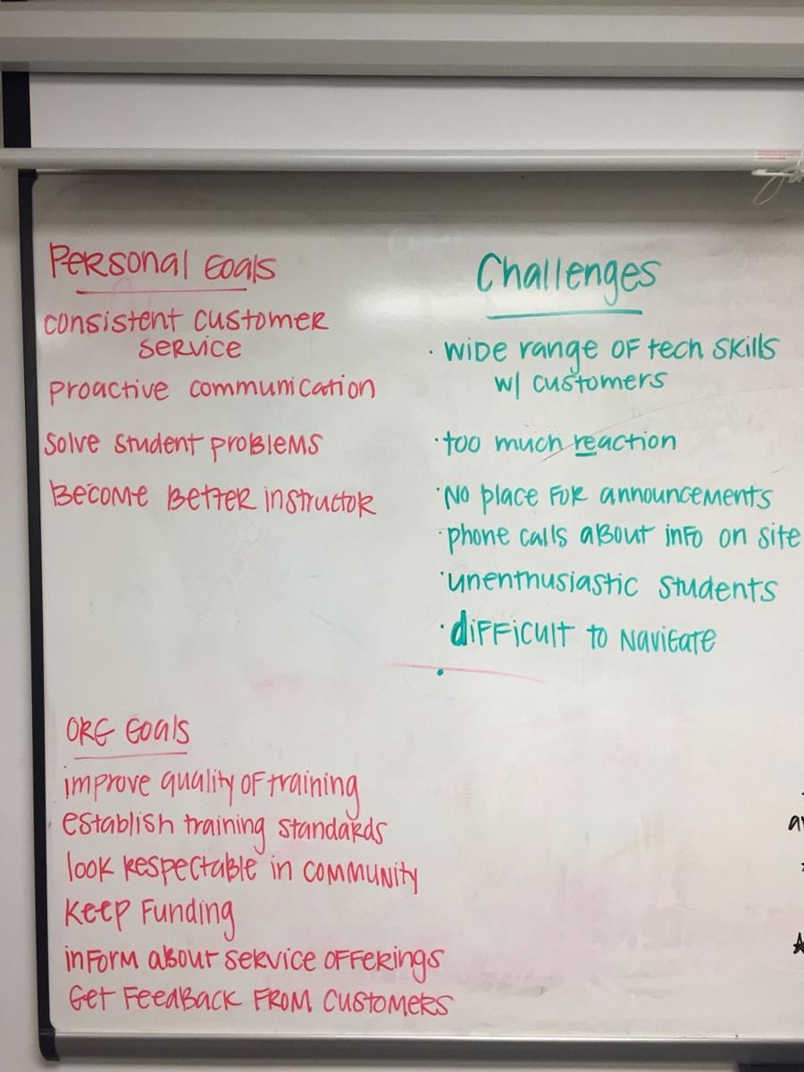
To kick off the project, our team spent half a day in Forsyth learning from those at GPSTC who work with their users the most. We covered their user’s biggest frustrations, identified user goals, discussed demographics, and recognized areas where their current site is failing.
One of the most effective worksheets we went through was the Homepage Gut Check.
Looking at their homepage from a user’s point-of-view, they were quick to identify that what is currently displayed in the most valuable areas on the homepage is not user-focused. Conversely, some of their most important content, like — logging in or how to become a police officer — was buried in other places on their site. In fact, we discovered links to how to become a police officer or a firefighter were not even visible on a tablet or mobile device.
The Personas and Recommendations
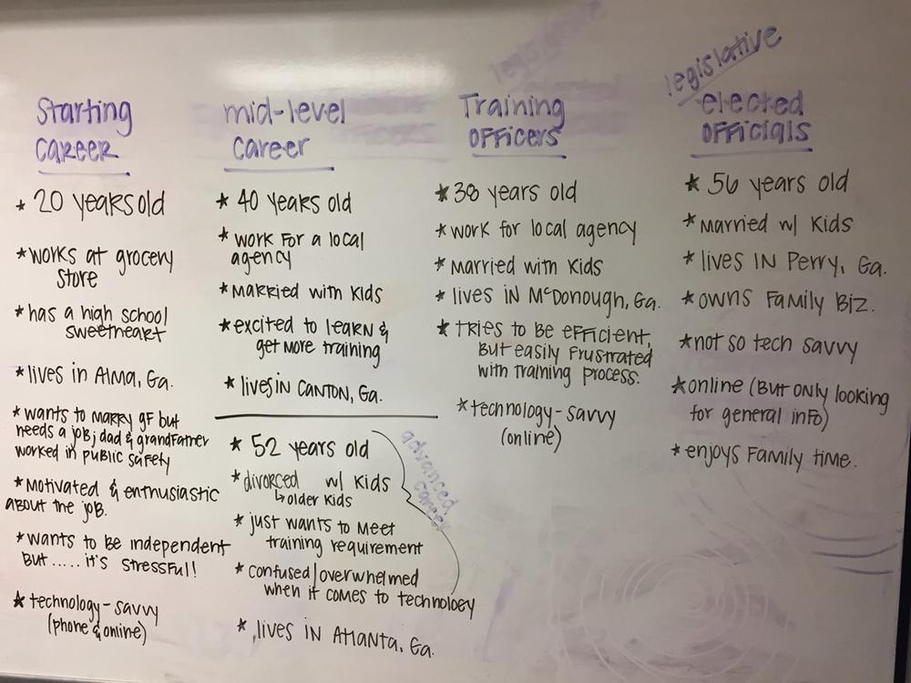
We brought back the personas worksheets and, as a team, categorized and defined their personas. We looked at the goals of the users and the organization, took the questions and frustrations from their users, and developed personas based on this information.
Deliverables
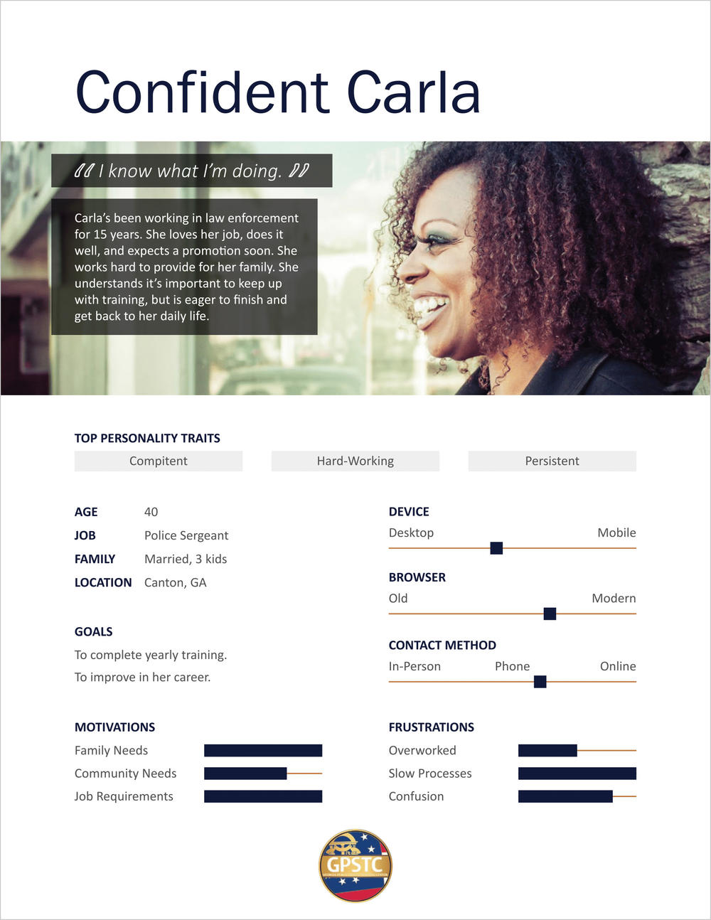
Our final presentation to GPSTC included:
- 4 personas,
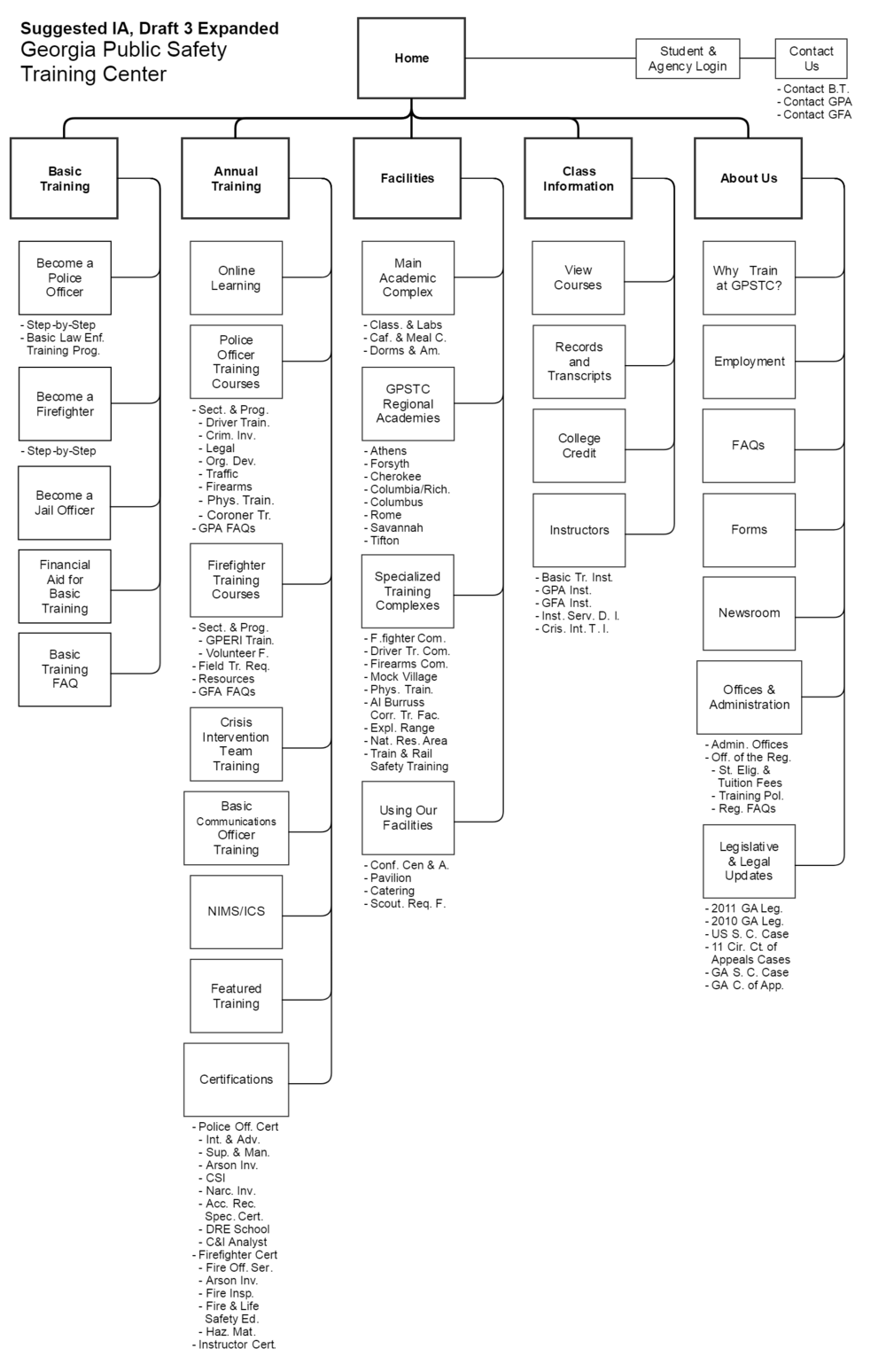
- A new information architecture,
- Some homepage recommendations, and
- Walked through some general usability and accessibility best practices.
The GPSTC team openly received our recommendations.
Our team enjoyed working with GPSTC. We’re excited to see how our findings and suggestions come into play as they move forward with their site redesign. In the near future, we may even provide accessibility or usability testing once they launch their new site.
We learned a lot through this process too. Our mission is to make government services and information available to all citizens — despite location, income, or disability — by educating and empowering agencies to meet users where they are. This project shows us that we are capable of reaching any agency. We may not be able to provide a platform for everyone, but we can share our knowledge to make the best impact on Georgians. If our mission is to make all services available to residents of Georgia, we can’t afford to be stingy with what we know. Citizens need services now, not when it’s convenient for us.
Resources to Create Your Own Personas
Interested in learning more about your user and creating personas for your agency?
If you're ready to dive in on your own, you'll find slide decks, exercises, and templates in our Digital Academy.
