December 22, 2020
Promos
When’s the last time you walked through a grocery store? You’re scanning the aisles, looking for a bag of frozen peas, and then you come to an endcap packed with ice cream. And it’s not just any ice cream. It’s the ice cream you want. Only the best flavors and the best brands. You and the store managers all want you to buy it.
I suppose the person organizing the store could stack hundreds of 4-ounce cups, each one different from the next. But then you’ll either stand there for an hour trying to make a decision, or you’ll just continue on and decide it’s not worth your time.
Now, maybe I’m not feeling chocolate marshmallow truffle or brown butter bourbon today (as if) and I want to check out all my options before I settle on the same thing I get every week ... I can walk down the aisle and see it all. But I know from just the endcap what goodies this aisle has in store for me.
The store is your website; The freezer section is one topic on your website; The best and brightest ice creams are the Promos.

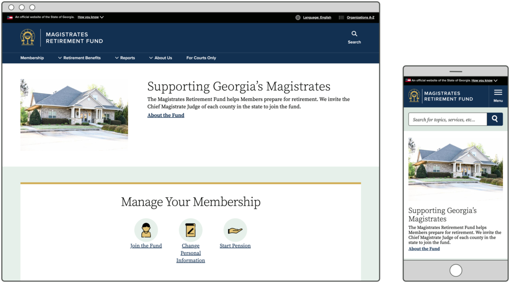
See this Promo on MRF’s homepage.
Promo Options in GovHub
A Promo is a type of micro-content; It can’t exist on its own, but you embed it as a block onto other pages. At its most basic, a Promo can contain the following information:
- Title
- Description
- Link (internal or external)
- Image
Put simply, it’s a way to briefly introduce specific content and guide users down the right path. We’ve talked in the past about ways of grouping links — in Link Collections, Icon Lists, and Tilesets — but sometimes you need just a single item to stand apart from the rest.
Think of a section on your homepage that’s focused, say, on a specific service your agency provides. A single Link Collection of 20 links to all pages related to that topic is like a freezer full of single-serving ice cream cups: overwhelming and tough to navigate. But you know that the main reason people are looking at this section of the homepage is for something specific, say, an annual renewal. Secondarily, new users may need to sign up or learn more about the requirements, but 80% of your traffic for this service goes toward the renewal page. You can feature the link to renew as a Promo, and list a few less-needed items next to it in a group.
We’ve established that the content in a Promo is generally more important than the content in a Link Collection. But even within the Promo, you have a few display options to further prioritize the right information.
Promo with Normal display
Your first option is probably what you’d typically imagine from a content teaser. The title is big, and the description and link text are the size of normal page text. If you include an image, it’ll display above or to the left of the text, depending on where you place the Promo. Like most other micro-content, you can place a Promo in a card to make it a little more prominent on the page.
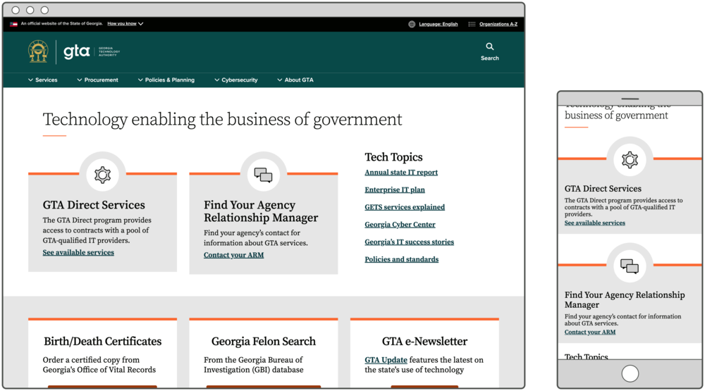
See these Promos on GTA’s homepage.
Promo with Big Description display
Now, if you really want this teaser to stand out, you can choose the “Big Description” display style. The title will be smaller, the description text will be much larger, and the link will display as an outlined button. If you add an image to a Promo with the “Big Description” display, it will display to the right of the text in a circle.
Since the description text in this option is so large, it pulls a lot of attention. It’s like if the store wanted to show off their pumpkin spice ice cream for the season, and created a special display case. Make sure you don’t use this display option more than once on a page, and only use it for very important information.
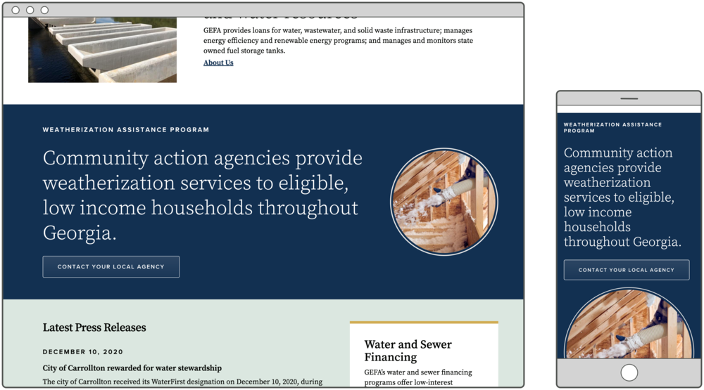
See this Promo on GEFA’s homepage.
Placement options
More than likely, you’ve seen Promos on website homepages. There are probably a few on your homepage. But in reality, it’s possible to place promos on most pages of a GovHub website.
Like some other micro-content blocks, you can embed Promos on Landing Pages, the bottom section of Program or Service pages, or within certain text editor WYSIWYGs like the Body field of a Topic Page or News. Learn more about embedding micro-content in our Knowledge Base.
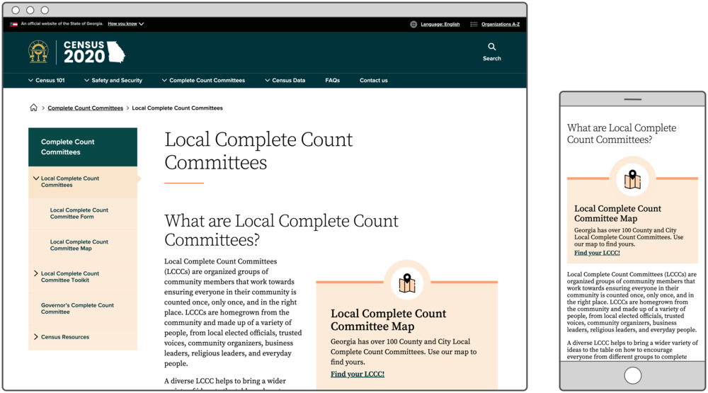
See this Promo on the U.S. Census in Georgia website.
Within the context of something like a Topic Page, a Promo embed can really help break up the “wall of text” and keep your users quickly and easily moving through the content they need.
Customize Your Promo
When setting up your Promo, pay attention to these features:
- “Hide title” checkbox
There might be times where the Promo is paired with other content or maybe something like a Section Title which provides all the needed context, making an additional heading redundant. In those cases, check the box to hide the title. As an editor, you’ll still find the Promo in the micro-content library with this title, it just won’t be visible to end users. - Link default text
Usually when you add a link, whether in a Promo or anywhere else, you provide descriptive link text explaining where the link will go. (You would never dream of using “Click here,” of course!) With Promos, there might be times where the best link text is the same as the block heading. In those cases, to avoid redundancy, you can use the default link text, “Learn more.” To do so, don’t type anything in the Link Text field. That way, the system will know that you want to display the default text, and it will provide additional information from the block title for people using a screen reader.
Start Using Promos
In a store full of food, how do you make sure people find the yummiest options? You feature them in the endcap. And on a website full of information, how do you make sure people find what they need most? Make them stand out, maybe in a Promo.
Promos are not the only way to feature important content. Depending on what you need, you might use a Hero, Alert, Call to Action, or some other micro-content block. That said, Promo is one versatile option to give users a little context and ease their online experience.
Check out our online Promo training for more information and open a support request if you need help getting started.
