October 24, 2017
Write for Alexa — Even if You Just Have a Website

You’re a busy person. You use whatever technology will make your days easier. So you manage your lists and tasks with an Amazon Echo. And when you heard about the new Ask GeorgiaGov Alexa skill, you knew it was for you.
Now it’s fall and you realized you haven’t gotten your annual hunting license.
So you start up the skill and ask, “Alexa, how do I get a hunting license in Georgia?”
That’s a pretty simple question, right? And it deserves a simple answer. How annoying would it be if, in response, Alexa went off about boating permits and fishing licenses?
Well that’s what you would’ve heard if we, the managers of Georgia.gov, hadn’t updated our content to adapt to the new technology.
Making Georgia.gov’s Popular Topics Alexa-ready definitely had a learning curve. So I’ll take you through some of our lessons learned on preparing good content for conversational interfaces.
Not planning to develop an Alexa skill? Keep reading anyway, because these tips will help your content no matter how you present it. But more on that later …
Not All Good Web Content Is Good Auditory Content
When looking at our website, it made perfect sense for us to group together boating, fishing, and hunting licenses on a single page. All 3 are handled by the Department of Natural Resources, they probably attract a similar audience, and they even have some overlapping information.
And if someone came to our website on a computer, they could skim around and quickly skip to the information they need. We even bolded key words, used bullet points, and broke the content into sections to help them out. This is just good practice for the web.
But when we started going through our content for the purpose of connecting it to an Alexa skill, we realized it was time for an update.
What is Alexa-Friendly Content?
Broken Up Information
For starters, we knew that we needed to break up our content more. The way we connected the Alexa skill with Georgia.gov, it would read content one page at a time. And if someone asks Alexa about hunting, they’re probably not interested in hearing about fishing. Not until springtime, at least.
So, we took that 1 page, with too much loosely-related information, and broke it into 3 pages. Easy enough.
And it’s more than just how the content is broken up from one page to the next, but also how it’s organized within a single page. Ask GeorgiaGov is configured specifically for the Popular Topics content type on Georgia.gov. These pages have a very specific layout. From top to bottom, they have:
- Title
- Blurb
- What You Should Know (bullet points)
- FAQs (with a question and an answer)
Our development partners at Acquia Labs set up the skill so that when you ask a question, Alexa will:
- Say the title
- Alexa: “Does this sound helpful?”
- You: “Yes.”
- Say the blurb and the “What You Should Know” bullets
- Alexa: “I have a list of related information. Would you like to hear it?”
- You: “Yes.”
- Say just the question part of an FAQ
- Alexa: “Does this sound useful?”
- You: “Yes.”
- Say the answer to that FAQ
On some of our pages, we realized that certain information — detailed and needed by only a subsection of people accessing this page — should be in the FAQ section of the page. That way, Alexa users can skim through it more easily if it’s not what they need. And other information — needed by nearly everyone listening to this topic — needed to move up to the bullet points.
Of course, this is all very specific to our Alexa skill. But the takeaway here is to think about how users will interact with your content on a conversational interface and how you will make that interaction easier for them. We don’t want them to skip past anything they need to know, but we also don’t want them to sit through lots of information that doesn’t apply to them.
Clear Labels
Along a similar line, we needed to clarify our labelling.
Remember the process Alexa takes to go through a topic? It’s very back-and-forth (even “conversational,” you might say). As the user, you need to say “Yes” to each of Alexa’s questions to keep going. If you say “No” to a topic, Alexa will give you different options. If you say “No” to an FAQ question, Alexa skips to the next FAQ, and the next, until you say something sounds helpful or Alexa runs out of questions.
When the user chooses what they want to hear, they need to know exactly what they’re committing to. We need to make sure that our labelling — for both titles and FAQs — is clear.
Concise Language
We all have lives. Your end goal is to go hunting, not to talk to the speaker in the corner of your room.
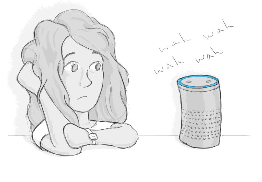
When we listened to our content, it started to feel like we’d never get there! And, of course, the longer you wait to hear what you came for, the more your mind drifts toward dinner plans and Alexa sounds like Charlie Brown’s teacher. (Or is that just me?)
In our Content Specialist Certification Course, I preach concise, readable language. Cut the fluff and get to the point! As it turns out, the need is just so obvious when you listen to it yourself.
Explained Links
Something else we knew we needed to address was links.
A conversational interface like Alexa can only give the information it has. It can’t link to another website and start reading from that.
And while we want our skill to answer as many common questions as possible, we don’t want the topic to be a mile long. It was a careful balancing act — one that we’re still perfecting — between too much and too little information.
So to keep the amount of content in a topic manageable, we link to other sites. But telling Alexa users that they can find more information online wasn’t going to help them unless they know where to find it.
This doesn’t mean that you need to write out the full URL. Even while considering Alexa, we want to keep using contextual links on a website.
So don’t write:
- “Click here for more information.”
- “Go to georgiawildlife.com/licenses-permits-passes for more.”
Do write:
-
“See all hunting license options on the Georgia Wildlife Resource Division's website.”
This benefits everyone. Sighted website users will know at a glance what the link is for. Screen reader users can jump from link to link and know what they’ll find by following each. And Alexa users know where to go once they pull out their computer or phone.
What if you don’t have access to a computer, it’s difficult for you to use, or you just prefer to get answers over the phone? To guide the experience to the next step, Alexa gives users the phone number for each topic’s related agency.
Good Auditory Content Is Good Web Content
Even if you aren’t planning to hire a tech team and develop your own skill, I’d highly encourage you to listen to your content.
There are a few ways to hear your website:
- Install a text-to-speech browser extension, like Select and Speak or Speak It.
- On an iPhone, go to Settings > Accessibility > Speech and turn on either “Speak Selection” or “Speak Screen.” You’ll find iPhone’s simple usage instructions there.
- On Android, go to Settings > Accessibility > TalkBack. When you turn on TalkBack, you’ll learn how to use it with a tutorial.
- Ask a coworker to read the page to you.
For one, this’ll give you a better idea of how screen reader users might experience your content. While they can often skip around by heading, paragraph, and link, they can always choose to stop and listen to any particular section straight through. And of course, what’s stopping anyone from accessing this content with one of the methods you just used to test it?
Beyond that, if we can make our content quicker and easier to understand, why wouldn’t we? We can’t control how our users access our content, or what situation they’ll be in when they do. If a single mom is running from work to soccer practice to run an errand, she won’t give our website her full attention. So keep it organized, clear, and concise.
It’s like we say all the time with accessibility; a website that’s better for someone with limitations is better for everyone.
Related Link
State of Georgia launches its first Alexa Skill: Ask GeorgiaGov
