August 06, 2019
Why Use Wireframes?

If we’ve helped you with your homepage, you have probably seen a page with grey boxes and basic outlines.
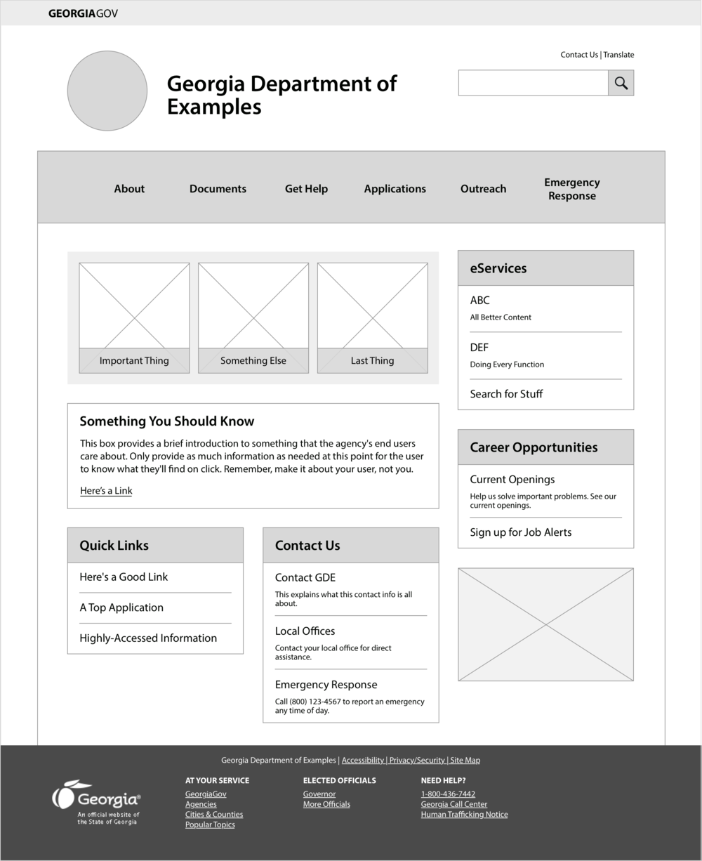
Before we showed it to you, you probably sat through an explanation of why it’s going to look the way it is so we can ward off questions like...
“What’s that grey box?”
But we know that during these meetings, you’d rather skip ahead and see the fun colors and layout, already!
In case your in-meeting anxiety got the best of you, here’s a refresher on why we like to pause putting on photos and colors and start with wireframes.
What is a wireframe?
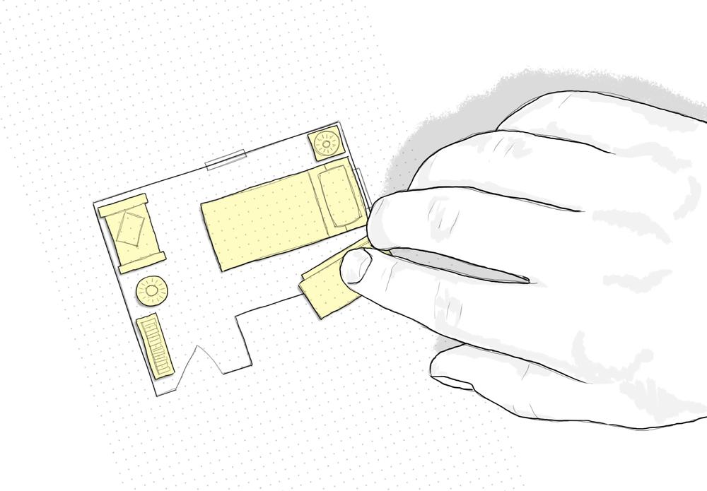
Think of a home blueprint. It doesn’t show your wallpaper, the color of your carpet, or the pattern on your throw pillow. It shows your stuff and where it all goes.
When I was a kid, my mom helped my sister and I rearrange our bedrooms. Awesome as she is, she put together to-scale outlines of our rooms on graph paper, and gave us paper cut-outs for all our furniture.
I guess she could have taken aerial shots of all our furniture or even built a 3D model out of balsa wood, but that would’ve taken way more time and distracted us from the point of it all: the content.
Simplify to amplify
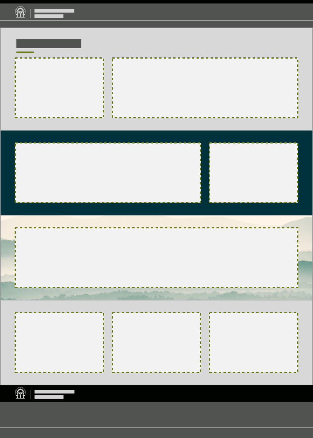
When we’re talking about wireframes, it’s time to focus on content. At that point in the project, we don’t want to discuss fonts or colors or the corner-radius on a button.
All that, while important, is meaningless if the words around it don’t do what you and your site users need them to.
If you attended my breakout session at this spring’s GOVTalks, you already walked through a quick process of identifying and laying out content so it works well and uses the GovHub system appropriately. We went through these six steps:
List everything
Prioritize
Rough sketch
Identify block types
Build it
Fine-tune
Steps 1 through 4 describe the process of putting together a wireframe. You can do it yourself with just some sticky notes and a pen. The point is to focus on the words and the types of content.
You’ll notice we don’t even think about colors and specific imagery until the last couple steps. That’s the paint on the wall, but what matters most is the foundation.
Collaboration for the win
One thing I love about wireframes is how they foster collaboration. Please don’t work in a vacuum. At GOVTalks, groups of three to five people, some of whom had just met, worked together to think through the layout of a landing page.
You can quickly wireframe your landing page by writing individual topics on sticky notes, and laying them out on paper, like "blocks". #GaGOVTalks pic.twitter.com/ebpJ4utFC0
— Digital Services Ga (@GeorgiaGovTeam) May 22, 2019
Because of the stripped-down nature of a wireframe, literally anyone who knows something about the subject-matter can make one. The deeper you get, the more it helps to know what content types are available, but at the most basic level, you just need to know the necessary information and its order of importance.
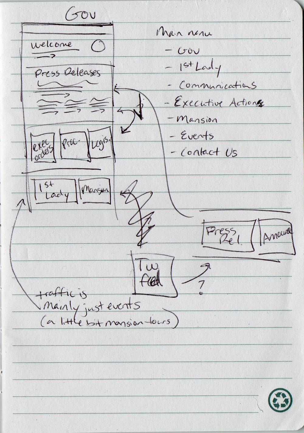
Sure, the wireframes we normally present during agency projects are created in a certain software with consistent boxes and text sizes. But even though I’m fluent in design software, I still start every page design with a handwritten list and sketched boxes. The point is focus on the right things and save time (which we all know is money).
I’ve also led a few meetings where we just need to talk things through and rough it out in marker as we go. In fact, the quicker and dirtier you are at the beginning, the less “precious” it feels, and the more willing you — and project stakeholders — will be to tear it apart and paste it together until it’s right.
So get sketching! Are you planning the landing page for a new campaign or a section of your site? Trying to figure out what to put on a program or service page? Or even trying to get us feedback on our proposed layouts for your site? Pull out a pen and paper, talk with your team, consider the needs of your users, and make something that you can look at and discuss.
And if you need help, you know where to find us: Open a support request.
