December 15, 2017
GOVTalks: How To Structure Content for 5 User Types

As you may have heard, we’re preparing to re-architect our content management platform in the next version of Drupal. In our preparation, we want to make sure that we do more than copy-and-paste the old sites into the new system and call it a day. We’re using the re-platforming as an opportunity to take a closer look at what we have and what our users are getting out of it.
As part of this effort, we partnered with a few vendors to help us find what’s working and how we can improve. One of these vendors is User Insight, an Atlanta-based team dedicated to understanding users and their behaviors. They dug into the usage of Georgia.gov and a few highly-trafficked state agency websites, and presented some of these findings at this past GOVTalks: The Future of Your Website.
Who Are Your Users: 5 Archetypes
As you refine your digital strategy and communication efforts, you know you have a few different audiences. You might group your audience based on demographics — age, location, occupation, etc. These segmentations can be helpful, but they don’t always tell us what we need.
User Insight shared a different approach to understanding our users. They’ve grouped users into 5 different behavior patterns that cross demographic lines.
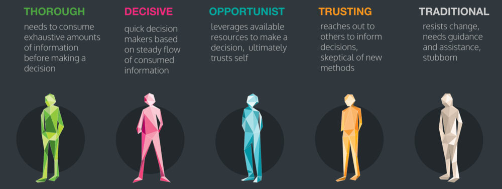
Let’s see how each of these user types make a decision.
Thorough
When picking where to get dinner, a Thorough will research every restaurant, diner, and cafeteria in a 10-mile radius, and organize their findings in a spreadsheet. They are now an expert on nearby eateries.
- Highly cautious
- Highly confident
- Self-trusting
Decisive
Decisives act quickly. Ask them where to eat and they’ll have an answer in 1 minute flat. They come with a list — i.e. it serves burgers, it’s $10-15, and it’s no more than 15 minutes away. And once they find a place that checks every box, they’re good to go.
- Highly impulsive
- Highly confident
- Self-trusting
Opportunist
When you ask an Opportunist where to go for dinner, they’ll say “Oh, you decide.” They take the path of least resistance, and would rather not make the decision themselves. When they must decide, they wait until the last possible minute.
- Neither cautious nor impulsive
- Neither unsure nor confident
- Need guidance
Trusting
A Trusting will turn to the reviews. They’ll read every Yelp, Google, and Facebook review, and then ask their friends what they’ve heard.
- Fairly cautious
- A little unsure
- Need guidance
Traditional
If you’ve gone to dinner once with a Traditional, there’s no need to ask what they want. They want to go the same place as last time so they can get that same amazing chicken dish.
- Highly cautious
- Highly unsure
- Need guidance
Making Decisions Based on the Archetypes
Well now we know who to ask for a dinner recommendation — Thoroughs … always ask the Thoroughs — but what does that mean for your digital services?
Once you understand how each archetype interacts with your content, you can make design and content decisions that will get them to their goals.
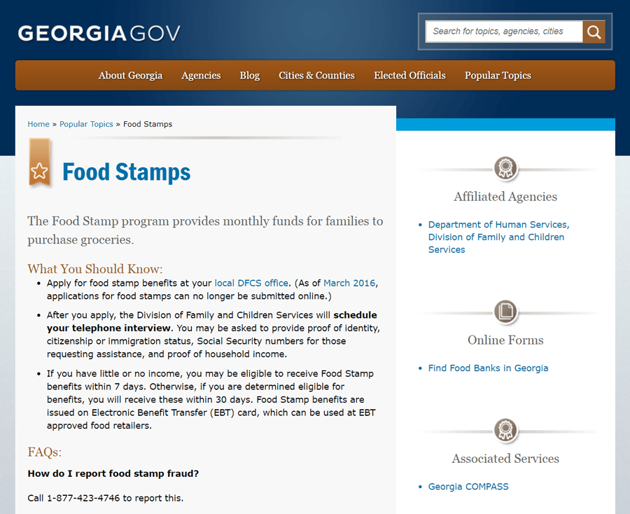
Take a Georgia.gov Popular Topics page, for example.
Opportunists won’t read the page; they’ll just go straight to the links on the right.
Thoroughs will carefully read the whole page.
Decisives will probably skim through and look for applicable keywords.
Trustings will jump to the FAQs, looking for quick steps and links.
Traditionals might never see this page. They’re already on the phone with their local office.
5 Archetypes … Need Them All?
One piece to keep in mind with your archetypes is that not every page will attract every type of user, nor should it.
For example, let’s say you are required to provide legal information on your site explaining what types of requests you’ll accept. So think to yourself: “What type of user cares about this?”
Decisives and Opportunists are in too much of a hurry. Trustings would rather read bullet points that tell them what to do. Traditionals, again, would rather call or visit your office. So that legal information is really there for your Thoroughs. They will read everything until they understand the topic as well as possible.
Even if the legal information is above the webform, most users will scroll straight to the submit button, and you’re still getting requests that you can’t accept. For these users, it might as well not be on the page at all. And all the while, Traditionals, Opportunists, and Trustings are overwhelmed and frustrated with the huge block of text!
The problem isn’t with the information, it’s with how it’s presented. You can still have this required information on the site, just move it to a separate page where the lawyers and the Thoroughs can find it. And then on the webform page, distill key ideas down to just a few bullet points. Disperse it as short descriptions throughout the webform itself. And always use simple language.
Now that you have a page targeted for Thoroughs, use that page to support them. Give them everything they want — full legal text, relevant links, facts and figures.
Addressing Multiple User Types on One Page
Though we can sometimes break information into separate pages for different types of users, there’s no denying that some of our pages need to communicate to a few groups at once.
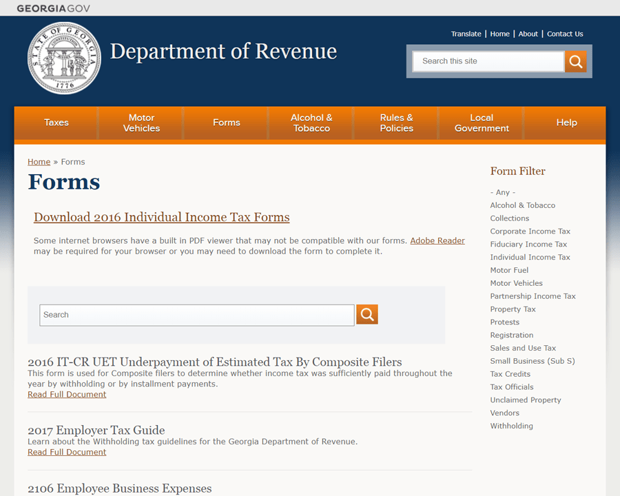
One page that User Insight found particularly successful was the Department of Revenue’s Forms page. It offers a 3-pronged approach to information for different types of users: a quick link to the most relevant information, a full list of forms, and the ability to search or filter the forms.
As you think about how to structure your content, consider how you can provide multiple paths to the same information to resonate with different types of users.
Don’t Scrap Other User Classifications
These 5 archetypes are only one way of grouping your users. With this type of categorization, we’re looking at behavior patterns. How do these people interact with your agency and your digital services? These user types can help you identify how to structure content. You can anticipate what types of content will resonate with what types of people.
But it doesn’t tell you what the content should say.
When we consulted with the team at the Georgia Public Safety Training Center, we uncovered 4 primary personas using their website. We based these personas off of each group’s goal for using the website and their attitudes coming into it. This will help the team name who is coming to various sections of the site. And it will help them identify what information on the site users need most, and what can be deleted or deemphasized.
Next, we can look at these groups and see which of the 5 behavioral archetypes are most related to the personas.
Confident Carla is excited to attend training, but she’s still ready to do the task and get back to her daily work. That’s certainly not a Traditional or a Thorough. So now, let’s think about how we can structure the information she needs so that Decisives, Opportunists, and Trustings will find it most helpful.
Key Finding: Users Don’t Care About Your Brand
Beyond teaching us about the 5 behavioral types, User Insight tested GeorgiaGov sites with real users.
Turns out, users don’t care who you are. They just want to get their stuff done [paraphrased] @nikofthehill #GaGovTalks pic.twitter.com/PZnBkAQUP4
— Rachel Hart (@RachelH_Design) November 14, 2017
When a user comes to a state agency website, they have a goal. And typically, that goal is not to see what your logo looks like or how your menu bar is colored.
Are these design choices still important? Of course! We offer a variety of themes with different fonts and colors so that your website can accurately represent your agency. The Environmental Protection Division has a different feel than the Governor’s Office, and it should.
But more important than distinctions between agencies is our unified brand as Georgia’s state government. Users don’t see us as agencies; They see us as “the government.”
So as we move forward, let’s keep in mind the need for consistency between how we present ourselves. Users trust the state seal. They appreciate when one government site looks similar to the others. Next step? Let’s see if we can more tightly connect our agency sites to help users jump naturally from one to the next. If your agency deals with information similar to another agency, consider adding links to the other site where relevant so that users find what they need.
More From the Event
Want to learn more about user types and the GeorgiaGov study? Watch User Insight’s full talk, presented by Shaw Strothers and Kevin O’Connor.
GOVTalks: The Future of Your Website
See all talks from the event, blog post recaps, and slide decks in our archive page.
